TattoosAI
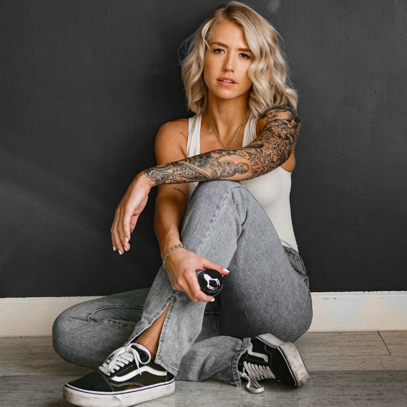
You've probably got a common problem with an inner bicep tattoo. The spot feels personal, looks strong, and stays hidden when you want it to, but it's hard to tell which designs will still look good once they wrap over moving skin and go through healing.
That's why this placement gets so much attention. The inner bicep is widely treated as a high-control placement because you can cover it or show it depending on what you're wearing, and tattoo-focused guidance also points out that the flatter inner face works especially well for text and script while healing needs extra care around clothing friction and sun exposure, all of which helps explain why it's often recommended for masculine designs like quotes, compasses, roses, wolves, and lions in small-to-medium sizes according to guidance on inner bicep tattoo placement for men.
Pain-wise, the inner bicep is generally not considered an easy area. The skin is softer, the arm twists constantly, and fresh work can rub against your torso all day. If you're considering an inner bicep tattoo male design, you need something that fits the anatomy, heals cleanly, and still reads well after the novelty wears off.
Table of Contents
- 1. Minimalist Line Work Portrait
- 2. Geometric Mandala or Sacred Geometry
- 3. Blackwork Solid Black Band or Armband
- 4. Watercolor Abstract or Splash Design
- 5. Japanese Irezumi or Oriental Dragon
- 6. Dotwork or Stipple Style Portrait Mandala
- 7. 3D Realistic or Hyperrealistic Piece
- 8. Symbolic or Meaningful Text Lettering with Accent Design
- 8-Point Inner Bicep Tattoo Style Comparison
- From Idea to Ink Your Next Steps
1. Minimalist Line Work Portrait
A minimal portrait works on the inner bicep because it doesn't fight the placement. One clean profile, a face reduced to a few deliberate lines, or a symbolic portrait with only the key features can look sharp without turning into visual clutter.
This style suits men who want something intimate rather than loud. A memorial face, a stylized self-portrait, or even a simplified muse reference can sit close to the body and still feel intentional when the arm is relaxed.
What Works on Skin
The best versions use strong line hierarchy. Ask for a design where the main contour is slightly bolder than the detail lines, especially if you're bringing in AI mockups from TattoosAI's minimalist style options.
If you want to prototype it first, feed the tool a prompt that includes the subject, angle, and mood. “Minimal continuous line portrait of a man in side profile, calm expression, black ink, elegant negative space” will give your artist something usable to react to instead of a vague screenshot dump.
Practical rule: Minimal doesn't mean tiny. If the facial features are too compressed, they'll lose character fast.
Trade-Offs to Know
Minimal line portraits age better when the artist leaves breathing room. Hair strands, eyelashes, and ultra-fine shading often look impressive in a digital preview but can feel muddy on an inner bicep once the arm flexes and the skin settles.
Good real-world direction looks like this:
- Choose a profile over a straight-on face: Side views simplify naturally and flow with the arm.
- Use black ink with high contrast: It keeps the design readable when seen quickly.
- Print the concept at actual size: A design that looks perfect on a phone can look cramped on skin.
Harry Styles, Zayn Malik, and Johnny Depp have all helped normalize understated line-driven tattoos, and that same restraint fits this placement well. For an inner bicep tattoo male concept, this is one of the safest ways to get something personal without overloading a sensitive, high-movement area.
2. Geometric Mandala or Sacred Geometry
If you like order, symmetry, and structure, geometric work is one of the strongest fits for this placement. A centered mandala on the inner bicep can look almost architectural when the arm is down, then open up visually when the muscle engages.
Modern inspiration around inner bicep tattoos for men strongly connects the area with bold script, religious symbols, mythological imagery, and detailed animal motifs, while also noting that the flatter inner face supports readable lettering better than many other arm zones according to Removery's inner bicep tattoo design overview. That same flatter face is also why symmetry-heavy geometric pieces can land so well here when the stencil is placed carefully.
Why This Style Feels Strong
Mandalas and sacred geometry create visual balance. Even a medium-size pattern can look substantial because repetition fills the space without needing heavy solid black.
Vin Diesel, Conor McGregor, and David Guetta have all made geometric and patterned body art feel masculine without going blunt or aggressive. On the inner bicep, that usually translates best as one centered focal shape rather than a full wrap.
How to Keep It Clean
This is a style where prep matters. Use TattoosAI's geometric or mandala generator to test pattern density, then ask your artist to mock it onto a curved bicep outline before the stencil goes on.
A few practical calls make a big difference:
- Keep the center stable: If the focal point sits too close to the armpit or elbow crease, it won't read as cleanly.
- Consider dotwork accents: They soften the pattern and reduce the risk of a harsh, overpacked look.
- Ask for alignment checks with your arm relaxed: Symmetry should look right in a natural stance, not only when flexed.
A geometric piece fails when the idea is precise but the placement is casual.
This style is ideal for someone who wants control and visual discipline. It's less forgiving than rough sketch styles, but when the stencil is right, it looks deliberate from every angle.
3. Blackwork Solid Black Band or Armband
Blackwork on the inner bicep looks powerful fast. A solid band, broken band, or ornamental black shape can give you that grounded, masculine look without needing a complex concept.
But this is also the style people underestimate most. Black packing is physically tougher than it looks, and poor execution shows immediately. Uneven saturation, wobbly edges, and bad wrap placement can ruin the whole piece.
Where Blackwork Wins
A black armband works well if you like clean structure and don't want a tattoo that needs explaining. It can mark a life event, reference discipline or restraint, or just serve as a visual anchor if you're building toward a larger sleeve.
If you're developing options first, browse blackwork style ideas in TattoosAI and generate several widths, edge treatments, and negative-space variants. That's the easiest way to figure out whether you want severe and minimal or more ornamental.
What People Get Wrong
The inner bicep is a soft-tissue, high-flexion zone. The skin shifts during rotation and elbow flexion, so designs with crisp linework, negative space, and moderate sizing tend to hold up better than heavily packed fills or extremely narrow lettering according to technical guidance on inner bicep tattoo design behavior. That matters a lot with blackwork.
A full thick band can still work, but the smarter version often includes interruption. Negative space cuts, tapered width, or a broken panel look more refined and usually sit better on this moving part of the arm.
- Pick an artist with healed blackwork photos: Fresh black always looks good. Healed black tells the truth.
- Avoid going too close to the crease: Motion and friction make that edge harder to maintain cleanly.
- Think about width on your actual arm: A band that's too wide can make the area look heavy and shorten the visual length of the arm.
LeBron James, David Beckham, and Dwayne Johnson all helped make arm-based blackwork feel iconic. On the inner bicep, the best version is controlled, even, and intentionally shaped to your anatomy.
4. Watercolor Abstract or Splash Design
Watercolor on the inner bicep is for someone who wants motion instead of structure. It's looser, more expressive, and usually feels less literal than the other ideas on this list.
A splash design can work especially well if you pair it with a strong black focal point. That might be a circle, symbol, animal silhouette, or brushstroke core with color blooming around it.
Here's the look in practice:

Why It Can Look Great Here
The curved inner bicep gives painterly work a bit of depth. When the arm rotates, the color fields shift visually, which can make a loose design feel alive.
Post Malone and Justin Bieber helped push abstract, less traditional tattoo aesthetics into the mainstream. If that's your lane, the inner bicep gives you privacy for a more experimental piece.
The Trade-Off with Watercolor
Color-first tattoos need discipline. Without a dark anchor, they can look vague from a distance, especially on a part of the arm that isn't always fully visible at once.
When you prototype with TattoosAI, don't just ask for “watercolor.” Ask for a focal point, a color family, and a level of chaos. “Abstract watercolor tattoo with black circular symbol, deep blue and rust red splashes, controlled edges, masculine composition” gives a much better result.
Keep one thing readable. Let the rest stay expressive.
A useful artist conversation includes these points:
- Choose a limited palette: Fewer colors usually look stronger than a rainbow wash.
- Ask how the artist builds contrast: Some watercolor tattoos rely too heavily on soft edges.
- Place the darkest detail in the center mass of the bicep: That's where the eye lands first.
If you want to study flow and movement before your appointment, this visual reference helps:
This is one of the more style-driven choices for an inner bicep tattoo male design. It can look original and modern, but only if the composition has enough structure underneath the color.
5. Japanese Irezumi or Oriental Dragon
A dragon on the inner bicep can look incredible when it follows the arm instead of sitting like a sticker. Japanese-inspired work has natural movement built into it, which is why it often feels right on muscle.
The inner bicep especially suits a dragon head angled upward, a coiling body with wind bars, or a compact koi-and-wave composition. These designs already rely on flow, and that flow can work with the arm's shape instead of against it.
Respect the Style
This isn't the category to fake your way through with a random Pinterest mashup. If you're using AI for concept work, use Japanese tattoo style exploration in TattoosAI to test pose, direction, and support elements, then bring that to an artist who understands Japanese composition.
Jason Momoa's tattoo visibility helped a lot of men get interested in bolder symbolic work, and dragons remain one of the most requested motifs because they carry strength without needing realism. Koi, waves, blossoms, and clouds can support the piece, but the center should stay clear.
What Makes It Age Better
Japanese designs tend to age well when the artist uses clear outlines and readable shape breaks. That's a huge advantage on the inner bicep, where overcomplicated filler can get lost.
A few strong decisions matter more than endless detail:
- Choose one hero element: Dragon, koi, or mask. Don't crowd all three into a medium space.
- Use background elements sparingly: Wind, smoke, and waves should guide the eye, not bury the subject.
- Follow the arm's vertical rhythm: Up-and-down movement usually beats a wide, flat composition here.
Traditional-looking structure often outlasts trendy rendering.
For a male inner bicep tattoo with presence, this style brings symbolism, movement, and enough visual weight to stand on its own or connect into a larger sleeve later.
6. Dotwork or Stipple Style Portrait Mandala
Dotwork has a quieter kind of strength. It doesn't punch as hard as blackwork, but it can create depth and texture that feel more refined up close.
This style fits the inner bicep well when you want subtle shading without the density of full grey wash. Portrait fragments, ornamental halos, and soft mandala fades all benefit from the way dots can taper into skin.
Where Dotwork Excels
Dot-built tattoos suit men who want detail without a glossy or over-rendered finish. A stern face in stipple, a skull half-lost in shadow, or a mandala with fading edges can all feel mature and understated.
The best AI prompt here includes tonal direction. Instead of just asking for dotwork, ask for “high-density dotwork portrait with dark focal shadows and soft outer fade” or “stippling mandala with crisp center and breathable perimeter.”
The Real Cost of the Look
Dotwork takes patience from both sides. The artist has to stay consistent, and you have to sit still through a process that can feel repetitive in a tender area.
That said, it rewards restraint. If the density transitions are clean, the tattoo can read softly at rest and sharpen when the arm flexes.
Some practical guidance helps:
- Check healed stipple work, not just fresh photos: Fresh dots always look darker.
- Avoid overly pale compositions: If there isn't enough value contrast, the piece can disappear.
- Keep the design medium-sized: Too small and the dot texture won't have room to breathe.
Boutique studios and fine-art tattooers have pushed dotwork hard over the last few years because it offers a handcrafted feel that machine-smooth realism sometimes lacks. On the inner bicep, it's one of the best ways to get nuance without visual noise.
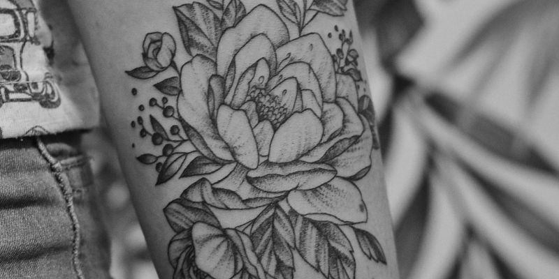
7. 3D Realistic or Hyperrealistic Piece
Realism is where ambition can outrun placement. A great hyperreal tattoo on the inner bicep looks dramatic, but a bad one looks like a muddy sticker in a year or two.
That doesn't mean avoid it. It means choose the subject carefully. Skulls, roses, big-cat faces, mechanical fragments, and strong animal eyes usually translate better than complicated multi-subject collages.
Here's a good example of the kind of detail level that suits the area:

What to Demand from the Design
A realism concept needs one dominant light source and one obvious focal plane. If everything is equally detailed, nothing stands out once the arm curves and moves.
TattoosAI can help by generating multiple realism directions before you ever talk to a studio. Try the same subject with harder shadows, softer transitions, and different crop levels. A close-up lion eye often works better than an entire lion head squeezed into the space.
Where Realism Fails
The common mistake is scale compression. People want a portrait, background texture, smoke, clockwork, and script all in one inner bicep panel. That's too much.
Use this filter when judging the concept:
- Can you identify the subject from a few feet away
- Are the darkest shadows grouped rather than scattered
- Does the piece still make sense if some fine texture softens over time
Conor McGregor's bolder animal imagery helped popularize dramatic masculine tattoos, but inner bicep realism only succeeds when the composition is edited hard. If you want an inner bicep tattoo male design that feels premium and intense, realism can do it. Just don't confuse more detail with better design.
8. Symbolic or Meaningful Text Lettering with Accent Design
If you want a tattoo you'll read more than other people will, lettering belongs near the top of your list. The inner bicep has always been a personal spot for names, short quotes, dates, prayers, and phrases that matter to the wearer first.
This placement is especially good for vertical lines of text or a centered phrase with a small accent, such as a cross, laurel, dagger, compass point, or tiny rose. It feels private without being hidden in an awkward place.
Lettering Lives or Dies by Setup
This is the category where small mistakes become permanent annoyances. A cramped script, bad spacing, weak baseline, or typo will bother you every time you catch it in the mirror.
Use TattoosAI to generate multiple font directions before the appointment. Compare clean serif text, block capitals, script, and calligraphic hybrids. Then print your favorites and physically hold them to the inner bicep to see how the phrase bends.
Readability beats decoration every time.
Smart Choices for Long-Term Wear
Accent design should support the words, not compete with them. If the message is the point, the symbol should sit beside it like punctuation.
A few rules save a lot of regret:
- Mirror-check every letter before the stencil goes on: Don't rush this.
- Choose spacing over flourish: Fancy swashes often steal room from legibility.
- Keep the phrase short: Short text ages better than long paragraphs on moving skin.
Real-world examples are everywhere. Name tributes, children's initials, memorial dates, and short discipline-driven words remain staples because they fit both the emotion and the anatomy. For many men, this is the best inner bicep tattoo male option because it combines privacy, meaning, and strong day-to-day wearability.
8-Point Inner Bicep Tattoo Style Comparison
| Design | Complexity 🔄 | Resources & Time ⚡ | Expected outcomes ⭐📊 | Ideal use cases & Tips 💡 |
|---|---|---|---|---|
| Minimalist Line Work Portrait | High precision; expert fine-line skill required 🔄🔄 | Fast (1–2 hrs); low material needs; moderate cost ⚡⚡ | Elegant, understated result; ages well but fine lines may blur over decades ⭐⭐📊 | Personal/ discreet portraits; provide high‑res reference and request high‑contrast black ink 💡 |
| Geometric Mandala / Sacred Geometry | Very high, symmetry and precision critical 🔄🔄🔄 | Long session (3–5+ hrs); stencil planning; higher cost, steady hand required ⚡ | Strong visual balance and timeless/spiritual impact; high detail retention if well executed ⭐⭐⭐📊 | Design‑conscious or spiritual pieces; supply symmetry prefs, ask for curved mockup and dotwork option 💡 |
| Blackwork / Solid Armband | Low–Medium; straightforward fills but needs experience for large blocks 🔄🔄 | Fast (1–2 hrs); large ink volume, solid healing care; moderate cost ⚡⚡ | Immediate bold statement; excellent longevity and visibility; difficult to remove ⭐⭐⭐📊 | Bold/athletic aesthetic; plan negative‑space details and strict aftercare; confirm artist blackwork experience 💡 |
| Watercolor Abstract / Splash | Medium–High; expert color blending and flow required 🔄🔄 | Longer sessions (3–4 hrs); multicolor inks and touch‑ups; higher cost, slower healing ⚡ | Highly original and artistic; vibrant but color fades faster and needs maintenance ⭐⭐📊 | Creative, expressive designs; generate palette options, ensure clear focal point and discuss touch‑up schedule 💡 |
| Japanese Irezumi / Oriental Dragon | Very high, traditional techniques and composition needed 🔄🔄🔄 | Very long (5–8+ hrs); specialist artist and premium pricing; multi‑session likely ⚡ | Deep cultural/artistic value; ages beautifully with care; ideal sleeve foundation ⭐⭐⭐📊 | Culturally meaningful, detailed narratives; research symbolism, use specialist artist and flow mockups 💡 |
| Dotwork / Stipple Portrait or Mandala | Very high, extreme precision and time investment 🔄🔄🔄 | Very long (5–8+ hrs or multiple sessions); technical and costly; meticulous process ⚡ | Distinctive pointillist depth; ages well (minimal blur); high longevity and texture ⭐⭐⭐📊 | Patient, detail‑oriented clients; request high‑density versions, verify portfolio and plan staged sessions 💡 |
| 3D Realistic / Hyperrealistic Piece | Extremely high, master‑level realism skill required 🔄🔄🔄 | Long (4–6+ hrs); very expensive hourly rate; specialist shading tools; slow ⚡ | Striking, cinematic realism if executed well; outcome highly artist‑dependent; touch‑ups may be needed ⭐⭐⭐📊 | Show‑stopping, technical pieces (portraits/animals); get multiple angle mockups and hire a realism specialist 💡 |
| Symbolic / Meaningful Text & Accents | Low–Medium; depends on font detail and spacing 🔄🔄 | Short (1–2 hrs); minimal materials; low–moderate cost ⚡⚡ | Deep personal significance; legibility can degrade over time; easy to adapt stylistically ⭐⭐📊 | Commemorations and quotes; triple‑check spelling, print mockup, choose artist skilled in lettering and suitable font size 💡 |
From Idea to Ink Your Next Steps
Choosing a style is only half the job. The hard part is turning a loose idea into something your artist can build from, especially when the inner bicep has so many practical limits around movement, friction, readability, and long-term shape.
That's where AI concepting helps. Instead of scrolling through endless recycled tattoo photos, use TattoosAI to generate focused drafts based on your subject, mood, and style. You can test a minimalist portrait against a dotwork version, compare a geometric mandala with a blackwork edit, or see whether your dragon concept looks better vertical, wrapped, or centered.
Good consultations start with better references. An artist doesn't need you to show up with the final answer, but they do need enough direction to understand your taste. If you walk in with five solid AI-generated concepts, a preferred size range, and a clear idea of whether you want softness, contrast, or symbolism, the whole appointment gets more productive.
Keep your expectations practical. The inner bicep isn't the place to cram every idea you've ever liked into one tattoo. It rewards edits, breathing room, and smart shape choices. A design that looks slightly simpler on screen often looks much stronger on actual skin.
Also think ahead. Your first choice doesn't have to be your last word on your arm. Plenty of men use the inner bicep for a stand-alone personal piece, then later connect it into a larger half sleeve or full arm story. If you're unsure, ask the artist to leave future pathways open.
And if you're correcting an old piece instead of starting fresh, it's worth understanding the benefits from laser tattoo removal before you commit to a cover-up design. Sometimes the best new tattoo starts with clearing visual noise from an older one.
The simplest next step is this. Write out your idea in one sentence. Add the mood, style, and main symbol. Generate multiple versions in TattoosAI, narrow them down, then book with an artist whose healed portfolio matches the style you picked. That process saves time, cuts down second-guessing, and gives you a much better shot at ending up with an inner bicep tattoo you'll still respect years from now.
If you want a faster path from vague idea to studio-ready concept, try TattoosAI. It lets you describe your tattoo, explore styles like minimalist, Japanese, blackwork, watercolor, geometric, dotwork, and realism, then generate custom concepts you can refine and bring to your artist.