TattoosAI
You've probably done the fun part already. You found a design you like, saved a dozen reference images, and maybe even picked a style. Then the hard question showed up: where should it go?
That decision trips up a lot of first-timers because placement isn't only about what looks cool in the mirror. It affects how much the session feels, how easy the tattoo is to hide, how the design sits on your body, and how well it holds up after years of clothing friction, movement, and sun exposure. A tattoo can be beautifully drawn and still feel off if the placement fights the shape of the design or the way your body moves.
A good tattoo placement guide should help you think past the appointment day. You're not only choosing a spot. You're choosing how that tattoo will live on your skin.
Table of Contents
- The Four Pillars of Tattoo Placement
- Matching Your Tattoo Style to Your Body Shape
- A Body Map of Tattoo Placements
- Planning for Flow and Future Tattoos
- How to Visualize Your Tattoo Before Committing
- Your Pre-Consultation Placement Checklist
- Frequently Asked Questions About Tattoo Placement
The Four Pillars of Tattoo Placement
The smartest way to choose placement is to stop treating it like a pain chart. Pain matters, but it's only one part of the decision. Most existing placement guides stay focused on pain and size, while long-term aging and friction-driven fading get much less attention. High-friction areas like fingers and feet can blur fine-line work and may need more frequent touch-ups, while lower-motion areas like the outer arm or calf tend to preserve clarity better, as noted in this tattoo placement guide on aging and upkeep.

A more useful framework has four pillars:
Pain
Some areas are easier to sit through than others. Skin that sits close to bone usually feels sharper and more intense. Fleshier areas are often easier for first-timers.Visibility
Ask yourself who you want to see it. Just you? Close friends? Everyone? A forearm tattoo lives very differently from a rib tattoo, even if the design is identical.Longevity
This is the part people often miss. Areas that rub against shoes, waistbands, bras, gloves, or frequent movement can lose crispness faster than calmer areas.Flow
A tattoo should look like it belongs on your body. The design needs to follow shape, muscle, and natural lines instead of sitting there like a sticker.
Pain matters but it is not the whole decision
A painful placement isn't automatically a bad one. A low-pain placement isn't automatically the right one either. If you choose only by comfort, you can end up with a tattoo that feels awkward in scale, too visible for your job, or harder to maintain than you expected.
Practical rule: Pick a placement you can live with after the appointment, not just one you can survive during it.
That shift in thinking helps a lot. Instead of asking, “Where does it hurt least?” ask, “Where does this design make the most sense for my life and my skin?”
The real trade-off is between visibility and upkeep
Some placements are popular because they're easy to show off. Others are popular because they age well and stay readable. Those aren't always the same spots.
A small script tattoo on the side of a finger may look perfect in a photo. In everyday life, that same area deals with washing, gripping, rubbing, and constant motion. By contrast, a similar design on the outer forearm or calf usually has a steadier canvas.
Think of your placement decision like a four-way balance:
- If you want low pain, you may choose a fleshier area.
- If you want privacy, you may lean toward torso or upper leg placements.
- If you want sharper aging, you may avoid high-friction zones.
- If you want strong visual impact, you may accept more visibility or more maintenance.
When people feel stuck, it's usually because they're trying to maximize all four pillars at once. That almost never happens. Good placement is usually about choosing which trade-offs you're most comfortable making.
Matching Your Tattoo Style to Your Body Shape
Some tattoos fail for a simple reason: the design and the body part don't match. The art might be good. The execution might be good. But the fit is wrong, so the tattoo never looks fully settled.
Experts in placement recommend matching the design's geometry to the available surface area. Thin script works well on compact, flat areas like the wrist, while larger compositions such as tribal or Japanese work need broader spaces like the back or upper arm so they don't look cramped or distorted during movement, according to Tattooing 101's placement guide.

Think in shapes before you think in body parts
A simple way to judge fit is to think like you're hanging art on a wall.
A long, narrow design usually works best on a long, narrow body area. Good examples include:
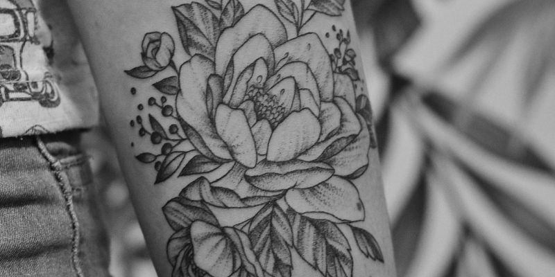
- Vertical florals on the forearm
- Script along the rib or collarbone
- A snake or branch down the calf
A rounded or compact design usually needs a body part with a stable, rounded surface. Think:
- Mandala-style pieces on the shoulder
- Small symbols on the upper arm
- Compact floral clusters near the outer shoulder or upper thigh
A broad scene or large composition needs room to breathe. That's why back, chest, and upper thigh placements feel natural for complex work with multiple elements.
A design should fill the area, not fight it.
That's where many first-time tattoos go off track. People choose the body part first because they like the idea of “a forearm tattoo” or “a rib tattoo,” then try to force the design into that space. The better order is the reverse. Start with the shape of the design, then find the body area that supports it.
Common fit mistakes first-timers make
One common mistake is wrapping a detailed design too far around a limb. A forearm can hold a beautiful vertical piece, but if the design circles too much around the arm, parts of it disappear from normal viewing angles. The image can also feel crowded when the arm twists.
Another mistake is going too small in a space that wants more presence. A tiny motif placed in the center of a large thigh or upper back can look isolated unless that emptiness is intentional.
Keep these checks in mind:
Check the natural reading angle
Will the tattoo make sense when your body is relaxed, not posed?Check the edge of the canvas
Does the design stop cleanly, or does it feel cut off?Check movement
Will bending, twisting, or turning stretch key parts of the design?Check distance
A tattoo should make visual sense both close up and from across the room.
Good placement makes a design feel custom, even before the needle starts. Poor placement makes even strong artwork look slightly off, and people often can't explain why. They just feel it.
A Body Map of Tattoo Placements
Placement gets practical. Different areas of the body carry different trade-offs in comfort, visibility, healing, and long-term wear. Anatomy is the foundation here. Industry guides consistently recommend flatter, broader areas like the back, chest, and thighs for large, detailed work, while smaller tattoos fit better on stable, compact zones like the wrist, ankle, or behind the ear. That broad placement rule is summarized in this anatomy-based tattoo placement guide.
Quick comparison chart
The chart below gives you a quick first-pass filter. The pain ratings are qualitative placeholders for comparison only, not medical facts. Your own body, artist technique, and session length all matter.
| Placement | Pain Level (1-10) | Visibility | Longevity/Fade Risk |
|---|---|---|---|
| Upper arm | 4 | Medium | Lower fade risk |
| Forearm | 5 | High | Lower fade risk |
| Wrist | 6 | High | Moderate fade risk |
| Chest | 7 | Medium | Lower fade risk |
| Back | 5 | Low | Lower fade risk |
| Ribs | 8 | Low | Lower fade risk |
| Thigh | 4 | Low | Lower fade risk |
| Calf | 5 | Medium | Lower fade risk |
| Hand | 8 | Very high | Higher fade risk |
| Foot | 8 | Medium | Higher fade risk |
| Neck | 8 | Very high | Moderate fade risk |
| Behind the ear | 6 | Low to medium | Moderate fade risk |
If you want more visual inspiration by body area, browsing a curated set of tattoo placement ideas by location can help narrow your shortlist before you speak with an artist.
Arms and hands
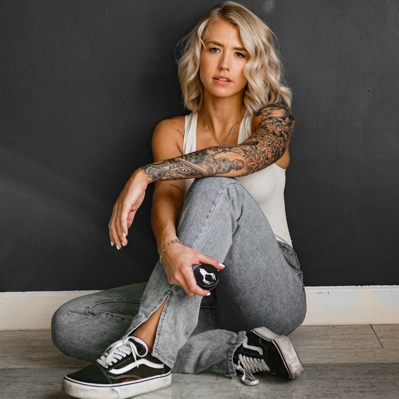
Upper arm is one of the most forgiving placements. It has enough room for medium pieces, can hide under sleeves, and usually offers a stable canvas for many styles. If you're nervous and want flexibility, this is often an easy place to start.
Forearm gives you daily visibility. That can be a plus if you want to enjoy the tattoo often, but it also means you'll notice every detail and every change over time. Long, narrow designs tend to work especially well here because the body part already gives you a clean vertical lane.
Wrist suits small, simple work. The challenge is scale. Tiny script or symbols can fit well, but highly detailed concepts can feel cramped fast. It's also an area that gets regular movement and contact.
Hands and fingers look striking, but they ask more from you. They're public, hard to ignore, and exposed to friction and movement all the time. If your dream tattoo depends on very fine detail and long-term crispness, these aren't the safest beginner placements.
If you love a hand tattoo, ask yourself whether you love the look enough to accept that it may need more maintenance than a calmer area.
Torso placements
Chest can carry bold, symmetrical work beautifully. It gives larger pieces room to breathe and can stay private under everyday clothing. The main challenge is sensitivity near bone and the fact that chest placement often works best when the design respects the center line of the body rather than ignoring it.
Back is one of the strongest canvases on the body. It gives artists broad, flat space, which is why large-scale pieces often look so balanced there. The trade-off is simple: you won't see it easily without a mirror, and aftercare can be awkward if you live alone.
Ribs attract people for good reason. Vertical script, florals, and elegant shapes can look exceptional there. But the ribs move with breathing, sit close to bone, and usually feel more intense. They're also less ideal for someone who wants a relaxed first tattoo experience.
Legs and feet
Thigh is one of the most useful placements for first-timers who want privacy and room for detail. It can take larger work without the design feeling squeezed, and it gives you options later if you want to expand into a bigger composition.
Calf is a strong middle-ground placement. It's less public than the forearm, easier to show than the thigh, and naturally suited to vertical designs. The shape of the calf helps certain motifs feel grounded instead of pasted on.
Ankle works for smaller tattoos, especially delicate or minimal designs. But it's a narrow area, close to bone, and often rubbed by socks or shoes. That doesn't make it a bad choice. It just means your design should be simple enough to survive the placement.
Feet are a commitment. They can look elegant, but they deal with constant pressure, rubbing, and motion. If your priority is longevity over novelty, there are easier places to start.
Neck and behind the ear
Neck tattoos make a statement immediately. They're hard to conceal, highly visible in work and social settings, and they place your tattoo in one of the most expressive areas of the body. That can be exactly what some people want, but it's rarely an accidental choice.
Behind the ear often appeals to first-timers because it feels small and discreet. That part is true. What people miss is that “small” doesn't always mean “simple to place.” The area is limited, slightly curved, and better suited to very compact designs than anything detailed.
Here's the practical summary:
- Want low visibility and room for detail? Thigh or back often makes sense.
- Want daily visibility without maximum exposure? Forearm or calf is usually easier to live with.
- Want a small discreet piece? Wrist, ankle, or behind the ear can work if the design stays simple.
- Want statement placement? Neck and hands deliver that, but they come with more obvious trade-offs.
The best body area is the one that matches both your design and your tolerance for maintenance. That's what a useful tattoo placement guide should help you see clearly.
Planning for Flow and Future Tattoos
A tattoo can look good on its own and still create problems later. This usually happens when someone fills the first obvious empty space without thinking about what might come next. If you even suspect you'll get more tattoos, placement should include a little future planning.

Use your body lines as a layout tool
Good flow comes from working with the body's structure. Muscles, curves, and natural directional lines help larger tattoos feel intentional. A sleeve, for example, usually looks stronger when the main elements follow the arm's length and wrap in a controlled way, instead of scattering separate images at random angles.
This matters even for a single small tattoo. The angle of a flower stem, the tilt of a dagger, or the direction of script can either support the body line or fight it. One choice feels elegant. The other feels slightly off forever.
A smart way to test future potential is to ask:
- Could this area grow into a larger project later?
- Am I placing this in the center of space I may want for something bigger?
- Will this orientation still make sense if I add surrounding work?
If you need inspiration for how artists build connected compositions, looking at examples of tattoo flow across body areas can make the concept much easier to picture.
Leave room on purpose
Not every empty space should be filled. Some of the strongest tattoo collections use negative space intentionally so each piece can breathe.
Long-view advice: A body with multiple tattoos usually looks better when each piece has a relationship to the next one.
That relationship can come from repeated shapes, similar line weight, matching subject matter, or consistent direction. A botanical tattoo on the upper arm may later connect naturally into a forearm piece if the stems and leaves already move the right way. A large thigh tattoo may leave room above or below for a future extension without boxing itself in.
If you already have tattoos, ask your artist to map the new piece in relation to the old ones, not in isolation. If you don't have tattoos yet, leave yourself options. That doesn't mean being timid. It means being deliberate.
How to Visualize Your Tattoo Before Committing
You approve a design on your phone, love it on paper, then freeze when you see it taped to your arm. That reaction is common. A tattoo is not viewed as a flat image. It wraps, bends, disappears under clothing, and ages along with the skin underneath it.

The goal is to close the gap between the version in your head and the version you will live with. That means testing more than appearance. You are also checking visibility, how the piece sits during movement, and whether the area is likely to stay crisp or need more maintenance over time.
A simple at-home placement test
Start with a version of the design you can print at a few sizes. Cut each one out and place it on the body areas you are considering. Then treat it like a fitting, not a quick mirror check.
Use this routine:
- Stand naturally and look at the placement in a mirror.
- Take photos from the front, side, and a relaxed angle.
- Live with it for a day if you can.
- Check it with real clothes such as sleeves, collars, waistbands, bras, socks, or shoes.
- Watch it in motion while you sit, bend, reach, walk, and turn.
That last part matters more than first-timers expect.
A tattoo on a forearm may look balanced when your arm is straight, then feel twisted when your hand rests at your side. A design near a waistband may seem discreet, then spend years rubbing against denim. A foot or finger tattoo can look great in a photo and still be a higher-maintenance choice because friction and constant wear often make those placements soften faster than calmer areas of the body.
If you create visual mood boards or mockups for personal projects, tools built for image planning can help you compare options before you print. Some people use resources like LunaBloom for content creators for that kind of early visual prep.
Later in the process, this video gives a useful extra perspective on testing placement and design choices before committing:
Use a body-first test, not a design-first test
A lot of placement mistakes happen because the question is too narrow. The better question is not whether you like the design by itself. Ask whether you like this design in this exact spot, at this exact size, during ordinary life.
Try checking these points while you test:
- How often will I see it?
- Will clothing, shoes, straps, shaving, or jewelry rub this area often?
- Does the design still read clearly when the body is relaxed, not posed?
- Will small details hold here, or should the design be simplified or enlarged?
- If this area fades faster, am I comfortable with touch-ups later?
That is the long-view part many pain charts leave out. A lower-pain placement is not always the easiest placement to live with, and a bold, visible placement is not always the one that ages best. The right choice is usually the one that fits your habits, your wardrobe, and how much upkeep you are realistically willing to accept.
Your Pre-Consultation Placement Checklist
A solid consultation goes better when you arrive with decisions narrowed down. You don't need every answer, but you should know your definite preferences.
Questions to answer before you book
- What matters most to me? Choose your priority: lower pain, easy concealment, long-term clarity, or strong visibility.
- What size do I want? A lot of placement problems start when someone says “small” but shows a design that needs more room.
- How often will this area rub or move? Think about shoes, waistbands, shaving, gym gear, uniforms, jewelry, and posture.
- Do I want this tattoo to stand alone or become part of a larger plan? That changes where the first piece should sit.
Questions to ask your artist
Bring two or three placement options, not ten. That gives your artist room to guide you without turning the consultation into a guessing game.
Ask questions like:
- Does this design fit this area well, or should it be reshaped?
- Will the details hold in this placement over time?
- Does the orientation follow the body correctly when I'm relaxed?
- Would you place it slightly higher, lower, larger, or simpler? Why?
- If this is a higher-friction area, what should I expect about touch-ups?
A good artist won't just approve your first idea. They'll explain what the body part will do to the design.
If you're considering a cover-up, say that immediately. Placement and design choices become much more constrained when existing ink has to disappear under new work.
Frequently Asked Questions About Tattoo Placement
Some placement questions don't fit neatly into the usual body-part breakdowns, but they matter a lot in real consultations.
Can you tattoo over scars or stretch marks
Sometimes, yes. But this always needs an in-person assessment from an experienced artist. Scar texture, age, depth, and skin condition all affect whether the area is ready and what kind of design will work there. Stretch marks can also take ink differently than surrounding skin.
The practical rule is simple: never assume a scarred or stretched area behaves like untouched skin.
Will weight changes affect placement
They can. Areas that change size or tension more noticeably may alter how a tattoo sits over time. That doesn't mean you should avoid those placements automatically. It means larger body changes are worth discussing if your design is highly symmetrical, geometric, or very detail-dependent.
If you're concerned, ask your artist whether a certain body part tends to keep the design reading clearly even if your body changes.
Can you tattoo over an existing tattoo without a full cover-up
Sometimes you can layer, rework, or expand instead of doing a complete cover-up. It depends on the old tattoo's darkness, placement, and the new design's style. Fine-line ideas usually have fewer options when old ink is underneath them.
Bring clear photos to your consultation, and be open to hearing that a bigger or darker approach may be necessary.
Is a first tattoo better in a hidden spot
Not always. Some people feel calmer when the tattoo is private. Others prefer seeing it daily because that connection helps them feel happy with the choice. The better question is whether the placement matches your lifestyle, comfort with visibility, and expectations for upkeep.
Should I choose placement before I choose style
Usually, no. Style and placement affect each other. A tiny script tattoo, a bold blackwork motif, and a large Japanese-inspired piece don't ask for the same kind of canvas. Get clear on both at the same time.
If you've got the concept but still can't picture the final result, TattoosAI can help you turn a vague idea into concrete tattoo concepts you can compare, print, and bring into your consultation. That makes placement decisions much easier because you're reacting to something visible instead of guessing from a description.