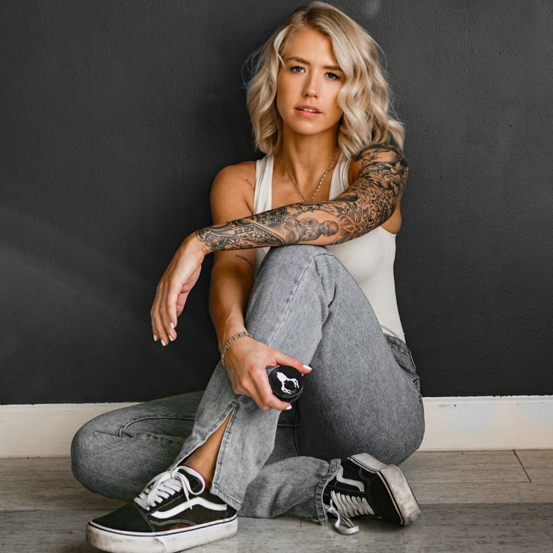
TattoosAI
Where will a small tattoo work best on your body, not just in a saved photo?
Placement decides more than people expect. It affects how often you see the tattoo, how much friction and sun it takes, how sharp the lines stay over time, and whether the design still feels right in your day-to-day life a year from now. I often see clients choose the symbol first and the body part second, then realize too late that the same design can feel refined on one area and awkward on another.
Small tattoos need strategy. A finger tattoo looks bold but fades faster. A rib tattoo feels private but can be a tougher sit. A wrist tattoo stays visible and readable, which is why many people start by browsing small wrist tattoo ideas before comparing other placements. The right choice depends on four practical factors: pain, visibility, longevity, and style.
Compact placements such as the wrist, ankle, behind the ear, collarbone, and forearm are often recommended for small work because the scale makes sense and the design has enough room to read cleanly. That principle matters more than trend cycles or social media photos.
This guide breaks down 10 placements through a useful filter: how each spot wears, who it suits, what can go wrong, and what kind of design behaves well there. You'll also get copy-and-paste TattoosAI prompts for every body part, so you can test concepts on the right canvas before you commit to ink.
Table of Contents
- 1. The Wrist A Personal & Visible Statement
- 2. Behind the Ear A Hidden Secret
- 3. The Ankle An Elegant Accent
- 4. The Finger A Bold & Trendy Detail
- 5. The Collarbone A Framed Placement
- 6. The Nape of the Neck A Peek-a-Boo Spot
- 7. The Ribcage An Intimate Canvas
- 8. The Shoulder Blade An Artistic Statement
- 9. The Inner Bicep A Discreet Power Spot
- 10. The Sternum A Centered & Personal Piece
- 10-Point Small Tattoo Placement Comparison
- From Inspiration to Ink Your Next Step
1. The Wrist A Personal & Visible Statement
Want a tattoo you can live with every day without giving up the option to hide it when needed? The wrist stays near the top of my placement list because it scores well on the four factors that matter most: visibility, moderate pain, design clarity, and easy styling with clothes or jewelry.

It is also one of the placements clients understand fast. You see it often, which helps if the tattoo is meant to feel personal and present. You can still cover it with a watch, bracelet, or sleeve for work, family events, or days when you want less attention.
Why it works
The wrist favors designs with clean structure. Short script, tiny botanicals, simple symbols, fine line stars, initials, and narrow geometric shapes usually hold up better here than anything dense or overly detailed. The space is small, slightly curved, and in constant motion, so the design needs breathing room.
Pain is manageable for many people, but the trade-off is wear. The wrist gets regular sun exposure, friction from cuffs and accessories, and frequent movement at the joint. That means ultra-fine lines and crowded micro-details can soften earlier than they would on calmer skin.
A good wrist tattoo follows the anatomy. Vertical layouts, gentle curves, and marks that sit with the line of the arm tend to look more natural than a rigid design forced straight across the joint.
Practical rule: If the design needs shading, texture, and tiny details to make sense, scale it up or choose a different placement.
For planning, I like testing two versions before anyone books: one centered on the inner wrist for a private feel, and one slightly off-center for a more editorial look. You can preview both with TattoosAI wrist tattoo ideas using a prompt like: “Minimal fine line wrist tattoo, tiny olive branch curving naturally with the wrist, delicate black ink, clean spacing, elegant first tattoo design, clear silhouette, no heavy shading.”
If you want a wrist piece that still looks sharp years from now, keep it simple, keep the spacing open, and let the placement do part of the work.
2. Behind the Ear A Hidden Secret
Want a tattoo that can disappear at work and still read as intentional when it shows? Behind the ear does that better than almost any other small placement.
The trade-off is scale. This area is narrow, curved, and usually seen from an angle, so the design has to read fast. Tiny symbols, a short script word, a fine botanical sprig, or a clean celestial mark usually perform well. Complex mini-scenes, dense shading, and stacked details usually blur into visual noise.
Hair coverage is part of the decision, too. If you wear your hair down most days, this placement stays private. If your hair is often tied back, shaved, or tucked behind the ear, the tattoo becomes much more visible than many people expect.
Best design behavior
Strong behind-the-ear tattoos rely on silhouette first. Clean spacing matters more here than clever detail because people catch this placement in passing, not in a long straight-on view.
Pain can feel sharper than the size suggests because the skin is thin and close to bone. Session time is short for most small pieces, which helps, but I still advise clients to choose a design that earns the placement. A tiny mark that fits the curve looks refined. A design that needs extra shading or micro-texture usually feels forced here.
A practical test helps. View the design from a few feet away, then from a side angle. If it still reads clearly, it has a good chance of holding up as a behind-the-ear tattoo.
- Best styles: Fine line symbols, mini florals, tiny celestial icons, short script with open spacing
- Avoid: Dense blackwork, long words, layered elements, miniature realism
- Lifestyle fit: Good for people who want control over visibility and do not need the tattoo on display all the time
For planning, test placement slightly higher and slightly lower behind the ear before you commit. A higher position can feel sharper and more fashion-forward. A lower position often feels softer and a little easier to hide. You can preview both with TattoosAI using a prompt like: “Small behind ear tattoo, minimalist black ink spark symbol, clean outline, open spacing, sized to fit naturally behind the ear, elegant and subtle, no heavy shading.”
Keep it simple enough to read in one glance. Behind the ear rewards clarity, not complexity.
3. The Ankle An Elegant Accent
The ankle has a graceful quality that a lot of small tattoo placement ideas try to imitate. It naturally suits delicate linework, small florals, orbiting shapes, and bracelet-style concepts that move with the leg instead of sitting like a sticker.

It also gives you flexibility. With shoes, pants, or socks, the tattoo can disappear. With sandals or cropped hems, it becomes part of the outfit. That's why people often choose the ankle for symbols that feel decorative but still meaningful.
What to choose carefully
The shape matters more than people expect. A tiny moon floating on the side of the ankle can look elegant. A short vine wrapping too far around can start to feel cramped if it crosses bony landmarks without enough room.
This is one of those placements where body flow helps or hurts the final result. Curved motifs, anklets, crescent shapes, snakes, or fine stems usually look more natural than rigid square designs.
A common real-world use case is someone who wants a tattoo visible only in certain clothing. The ankle handles that well. The catch is friction from socks, shoes, and movement, so the cleaner the design, the better the result tends to feel over time.
Use this TattoosAI prompt: “Small ankle tattoo, fine line crescent moon with tiny leaves, elegant curved composition that follows the ankle bone, black ink, minimalist, airy spacing, subtle feminine placement.”
4. The Finger A Bold & Trendy Detail
Finger tattoos get attention fast. Even the smallest mark feels bold because hands are always visible. That's why people gravitate toward dots, bands, tiny hearts, single letters, and miniature symbols on the side or top of a finger.
The problem is that fingers aren't forgiving. They move constantly, they rub against everything, and they're exposed to frequent washing and everyday wear. If you want something crisp and low-maintenance, there are better placements.
The real trade-off
Independent tattoo education content explicitly warns that fingers and feet are high-friction areas and that tiny tattoos tend to look best where the skin stays relatively stable, as discussed in this tattoo placement longevity video. That's the main reason finger tattoos often need a more realistic expectation going in.
This doesn't mean don't get one. It means choose the right design for the spot. A tiny band, simple rune, or minimal dotwork motif can still make sense. Fine script, intricate florals, or micro-detail usually don't.
Reality check: Finger tattoos are style-first placements. If longevity is your top priority, pick a calmer area.
A practical example is a wedding band alternative. It can look great. But if someone wants ultra-delicate lettering wrapped around the finger, that's usually where disappointment starts.
- Strong choices: Tiny bands, symbols, simple initials, minimalist hearts.
- Weak choices: Thin cursive, dense detail, tiny animals with facial features.
- Best mindset: Go simple, accept maintenance, prioritize readability over intricacy.
5. The Collarbone A Framed Placement
Want a placement that reads polished without being loud? The collarbone does that well. It gives a small tattoo a clear line to follow, so even a simple design can look intentional from across the room. If you wear lower necklines, tanks, or off-shoulder pieces, expect this tattoo to become part of how you dress.

This area works best for designs that respect the anatomy. Fine line botanicals, short script, stars, and lightly ornamental shapes usually sit well because they can track the curve of the bone instead of fighting it.
What makes this placement work
The main decision here is alignment. Place the tattoo too high, and it starts competing with the neck. Place it too low, and the collarbone stops doing the visual work that makes this spot appealing. The strongest pieces either follow the bone closely or sit just beneath it with a clear sense of balance.
Pain is moderate for many clients because the skin is thin and the area is close to bone. Visibility is high in some outfits and low in others, which makes this a flexible option if you want control. Longevity is better than fingers, but very fine details can still soften over time, especially in delicate script or ultra-thin linework.
A common mistake is choosing too much text. Long quotes often feel cramped here, while a short phrase, a small branch, or a centered symbol usually reads cleaner. I also advise clients to check the design in motion. Shoulders roll, posture changes, and a stencil that looks perfect standing still can shift once the body relaxes.
Try this TattoosAI prompt: “Small collarbone tattoo, fine line botanical sprig with subtle symmetry, black ink, airy composition following the collarbone line, modern minimalist style, clean spacing, designed for a small framed placement.”
6. The Nape of the Neck A Peek-a-Boo Spot
The nape sits in a useful middle ground. It can stay hidden under hair or become a focal point with a bun, braid, or short haircut. That makes it ideal for people who want a tattoo to feel personal without making it part of every outfit.
This area favors centered, vertical, or softly curved designs. Tiny sigils, ornamental marks, stars, lotus forms, or short script can all work if they sit cleanly between the hairline and upper back.
How to keep it balanced
The nape punishes poor spacing. Too close to the hairline and the tattoo can feel swallowed. Too low and it starts reading more like an upper-back tattoo that happens to be small.
This is also a placement where symmetry matters. If the design is supposed to sit centrally, even a slight drift off axis becomes noticeable. For that reason, simple geometry and balanced motifs tend to do better than irregular designs with no obvious orientation.
A nape tattoo should still look intentional when the head turns. Don't judge the stencil only from one straight-on mirror angle.
A practical example is a tiny sunburst. Centered well, it looks sharp with hair up. A loosely placed handwritten word can look awkward once the neck bends or the shoulders shift.
Try this TattoosAI prompt: “Small nape tattoo, centered minimal sun symbol with fine line rays, delicate black ink, symmetrical vertical composition, elegant and subtle, designed for the back of the neck.”
7. The Ribcage An Intimate Canvas
Want a placement that stays personal, gives a small design room to breathe, and still feels intentional on the body? The ribcage does that well, but only if you choose a design that respects movement, pain, and long-term readability.
This is one of the more private placements in the whole list. It suits memorial text, symbolic linework, botanical shapes, and small illustrations that carry emotional weight without asking for daily visibility. If you do not need to see your tattoo every time you wash your hands or get dressed, the ribs make sense.
The trade-off is straightforward. Rib tattoos are usually more painful than wrist, ankle, or shoulder blade work because the skin sits thinner over bone and the body moves with every breath. They also need better placement planning. A design that looks clean on a flat mockup can feel off once it wraps around the side body.
Orientation matters more here than people expect. Short script usually reads better when it follows the rib line or sits with a gentle vertical flow. Curved branches, birds in motion, crescent forms, and abstract linework often settle into this area naturally. Small boxed symbols or rigid geometric stamps can look pasted on unless the artist adjusts them to the body.
One practical test helps. Stand relaxed, breathe normally, and check whether the stencil still looks balanced from the front, side, and three-quarter angle. If it only works in one mirror pose, it is not placed well yet.
- Works well: Fine script, stems, feathers, crescent moons, flowing ornamental lines
- Less effective: Dense micro-detail, blocky icons, stiff symmetry, tiny crowded scenes
- Best for: Private tattoos, sentimental pieces, and designs that benefit from a longer shape
For design planning, it helps to preview how a small concept might flow on a curved area before you book. Browse small shoulder tattoo ideas for shape and flow reference, then adapt that logic to the side body in TattoosAI with this prompt: “Small ribcage tattoo, fine line botanical branch with gentle vertical curve, delicate black ink, elegant negative space, feminine and subtle, designed to follow the natural rib line.”
8. The Shoulder Blade An Artistic Statement
If you want a small tattoo with room to breathe, the shoulder blade is one of the easiest yeses. It gives an artist a flatter, calmer surface than many tiny placements, and it can stay private or become visible depending on tops, swimwear, or open-back clothing.
That extra breathing room is why shoulder-blade tattoos often feel more polished than the same design squeezed onto a smaller area. Small florals, abstract symbols, birds, celestial pieces, and miniature illustrative work all benefit from the cleaner canvas.
Why artists like this spot
Tattooing education sources stress that placement should follow natural curves and be judged in a relaxed standing pose so the design doesn't look twisted once the body moves, as explained in this video on body flow and tattoo orientation. The shoulder blade is a great example. It looks broad, but it still has slope, movement, and edge lines that affect orientation.
That's why a design angled with the scapula often feels more intentional than one placed perfectly straight for the sake of symmetry. A tiny swallow, branch, or ornamental star map can sit beautifully here when it respects those lines.
Placement cue: On the shoulder blade, “straight” isn't always “balanced.” Follow the body, not just the mirror.
For design testing, browse TattoosAI shoulder tattoo ideas and try: “Small shoulder blade tattoo, fine line swallow in flight with subtle stars, elegant black ink, light negative space, placement aligned with the natural shoulder curve, artistic minimalist style.”
9. The Inner Bicep A Discreet Power Spot
The inner bicep is one of the better-kept secrets for small tattoos. It feels personal because it isn't front-facing, but it's still easy for you to see when you look down or rotate the arm. That mix of privacy and access makes it a favorite for meaningful words, initials, and symbolic designs.
It also tends to feel less trend-driven than more public placements. A small tattoo here doesn't announce itself immediately. It waits to be noticed.
What works in real life
This spot handles script particularly well because the area has enough length for a short phrase without forcing the letters into a cramped shape. It also works for vertical motifs like daggers, stems, snakes, feathers, or lunar phases.
What usually fails is poor scaling. If the design is too tiny, it can look lost on the arm. If it's too wide, it starts wrapping awkwardly into the outer arm or toward the underarm.
A common real-world scenario is someone who wants a reminder tattoo they can choose to keep mostly private. The inner bicep does that better than the wrist or hand. It's also more protected from constant sun exposure than highly visible zones, which many clients appreciate when they want softer, more personal placement.
Use this TattoosAI prompt: “Small inner bicep tattoo, delicate handwritten word with a tiny star accent, fine line black ink, elegant spacing, subtle personal placement, minimalist and modern.”
10. The Sternum A Centered & Personal Piece
The sternum is one of the most intimate places to put a tattoo. Even a small design feels significant here because the placement is central, deliberate, and hard to treat casually. It suits people who want the tattoo to feel grounded in the body rather than added onto it.
For small work, the sternum usually performs best with symmetry or near-symmetry. A tiny ornamental piece, sacred-style symbol, star, or minimal floral motif can look striking because the center line of the chest does so much visual work already.
The placement rule that matters most
This is not a placement to improvise with. Body alignment matters. If the design is meant to sit centered and balanced, the stencil has to be checked while standing naturally, not just while lying down.
That's true for all tattoos, but it matters more here because the chest creates an obvious visual frame. Slight misalignment stands out quickly. Small tattoos can be unforgiving that way.
A practical example is a small ornamental crescent centered under the neckline. Done well, it looks elegant and intentional. A tiny design that sits even slightly off-center can bother the wearer every time they catch it in a mirror.
- Best design directions: Symmetrical symbols, ornamental linework, centered celestial marks.
- Proceed carefully with: Long text, asymmetrical motifs, very side-heavy illustrations.
- Ideal mindset: Treat placement as architecture, not decoration.
10-Point Small Tattoo Placement Comparison
If you are deciding between placements, compare them the way an artist would. Start with four filters: pain, visibility, longevity, and design fit. A small tattoo can look sharp in one spot and fall apart in another because the skin moves more, rubs more, or gives you less room to simplify well.
The table below is built for fast decisions. Use it to narrow your options, then test the same concept in TattoosAI on two or three placements before you book. That usually reveals sizing, balance, and mood problems early, while they are still easy to fix.
| Placement | Pain & Technical Difficulty 🔄 | Healing & Upkeep ⚡ | Visibility & Longevity ⭐📊 | Best Style Fit 💡 | Useful TattoosAI Prompt |
|---|---|---|---|---|---|
| The Wrist: A Personal & Visible Statement | Moderate pain. Curved surface, so spacing and flow matter. | Fairly easy heal, but sun and daily friction can wear fine detail faster. | High visibility. Longevity is decent if the design stays simple and bold enough. | Minimal linework, initials, tiny symbols, short script. | "Small wrist tattoo, minimal black ink, clean linework, simple symbol or short word, sized for inner wrist, realistic placement mockup" |
| Behind the Ear: A Hidden Secret | Low to moderate pain. Tiny working area, so precision matters more than detail. | Short session. Healing is manageable, but hair products and constant touching can irritate it. | Low visibility unless hair is up or short. Usually ages well because it gets less sun. | Micro symbols, dots, tiny stars, discreet marks. | "Tiny behind the ear tattoo, minimal black ink, subtle symbol, very small scale, realistic side-head placement mockup" |
| The Ankle: An Elegant Accent | Moderate pain. Bone and narrow contours affect placement. | Shoes and socks can slow healing if they rub the area. | Moderate visibility. Friction can soften crisp detail over time. | Small florals, anklet-style shapes, short vertical motifs, geometric accents. | "Small ankle tattoo, delicate black ink, botanical or geometric accent, wrapped to fit ankle contour, realistic placement mockup" |
| The Finger: A Bold & Trendy Detail | High difficulty on a tiny canvas. Skin texture and movement make clean execution harder. | Highest upkeep here. Expect fading and possible touch-ups. | Very visible. Lowest longevity in this list because hands wash, flex, and rub constantly. | Tiny icons, bands, very stripped-back marks. | "Minimal finger tattoo, tiny black symbol, very simple design, single-needle look, realistic hand placement mockup" |
| The Collarbone: A Refined Placement | Moderate to high pain. Bone, angle, and symmetry all matter. | Heals well for many clients if clothing does not rub the area too much. | Moderate to high visibility depending on clothing. Usually holds detail well if not overworked. | Fine script, balanced ornament, small branches, centered motifs. | "Small collarbone tattoo, elegant fine-line black ink, balanced composition, designed to follow collarbone shape, realistic placement mockup" |
| The Nape of the Neck: A Peek-a-Boo Spot | Low to moderate pain. Best for narrow, vertical concepts. | Easy to protect from sun, but self-aftercare is slightly awkward. | Flexible visibility. Hair can hide it, and tied-up hair can reveal it. Ages well in many cases. | Vertical symbols, runes, tiny blackwork, clean minimalist shapes. | "Small nape tattoo, vertical minimalist black design, subtle and clean, centered at back of neck, realistic placement mockup" |
| The Ribcage: An Intimate Canvas | High pain. Breathing, curvature, and tenderness make this one demanding. | Healing takes more discipline because the area moves and clothing can rub it. | Usually low visibility. Longevity is strong because it sees less sun, as long as the design suits the skin. | Personal script, fine botanical stems, celestial designs, symbolic pieces. | "Small ribcage tattoo, fine black ink, intimate minimalist design, vertical or slightly curved composition, realistic side-body placement mockup" |
| The Shoulder Blade: An Artistic Statement | Moderate pain. Stable surface gives artists more control than many smaller spots. | Generally straightforward healing. Good option if you want detail without high maintenance. | Low to moderate visibility. Strong long-term performance for small to medium-small tattoos. | Illustrative miniatures, constellations, florals, small ornamental work. | "Small shoulder blade tattoo, clean black ink or light illustrative style, balanced composition with breathing room, realistic back placement mockup" |
| The Inner Bicep: A Discreet Power Spot | Moderate pain with some tenderness. Soft skin needs a steady hand for clean lines. | Protected from sun and daily wear, which helps healing and aging. | Low visibility unless you want to show it. Usually one of the better spots for longevity. | Script, symbolic pieces, fine-line designs with a personal feel. | "Small inner bicep tattoo, subtle black ink, personal symbolic design or short script, realistic upper arm placement mockup" |
| The Sternum: A Centered & Personal Piece | High pain. Alignment is unforgiving, and symmetry errors stand out fast. | Requires careful aftercare because friction and pressure can interfere with healing. | Mostly private. Holds up well if the design is simple, centered, and placed accurately. | Symmetrical ornament, celestial marks, centered symbolic motifs. | "Small sternum tattoo, centered symmetrical black ink design, minimal ornamental or celestial motif, realistic chest placement mockup" |
A quick read on trade-offs: finger tattoos win on visibility but lose on longevity. Inner bicep and shoulder blade tend to age more gracefully. Ribcage and sternum can feel more personal, but both ask more from your pain tolerance and your artist's placement accuracy.
That is why mockups help. Testing the same symbol on the wrist, collarbone, and ankle in TattoosAI can show whether the design needs a vertical format, thicker lines, or a calmer area of skin before you commit.
From Inspiration to Ink Your Next Step
The best small tattoo placement ideas come from asking better questions than “Where will this fit?” Ask where it will age well. Ask whether you want to see it every day or only sometimes. Ask whether the design follows your body naturally or just looked good in a flat mockup. Those questions usually lead to better tattoos than chasing a trend.
If you're choosing between two or three placements, don't rely on imagination alone. Visualizing the same concept on the wrist, ankle, collarbone, or shoulder often changes your opinion fast. A design that feels poetic on the ribs may feel too exposed on the wrist. A symbol that looks sharp behind the ear may feel underwhelming on the shoulder blade. Placement changes mood.
The smartest approach is to narrow your decision using four filters: visibility, pain tolerance, longevity, and style fit. Visibility is about lifestyle. Pain tolerance is personal, but placement still matters. Longevity comes down to friction, movement, and how much detail you're trying to preserve. Style fit is the overlooked one. Some tattoos want a narrow vertical space, some need a flatter surface, and some need enough distance around them to breathe.
This is also where many first-time clients make an expensive mistake. They choose the smallest possible version of the design and the trendiest possible placement, then expect it to age like a larger tattoo on calm skin. Tiny tattoos need restraint. Simpler usually wins. Cleaner almost always wins.
Before you book, generate a few concepts and compare them side by side. Test one symbol in multiple placements. Change the orientation. Remove detail. Add negative space. If you're using TattoosAI, write prompts that include both the motif and the body part so the design concept stays grounded in placement from the start. Since TattoosAI lets you describe your idea, choose from 18+ styles, and generate multiple concepts, it's useful for exploring direction before you sit in an artist's chair.
Bring your top options to your tattooist, not just your favorite image. A good artist will refine scale, simplify where needed, and adjust orientation to your anatomy. That collaboration is where a decent small tattoo becomes a strong one.
Your tattoo doesn't need to be big to feel important. It just needs the right design in the right place.
If you want to test ideas before booking, try TattoosAI to generate small tattoo concepts for different placements, compare styles, and bring clearer references to your artist.