Family Tattoos — 4,000+ designs

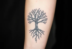
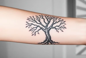
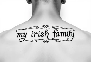
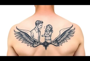
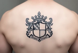
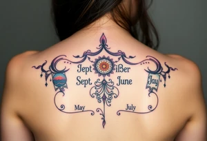
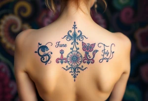
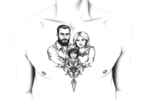
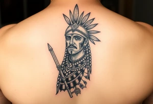
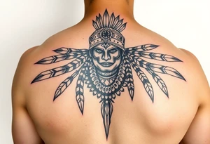
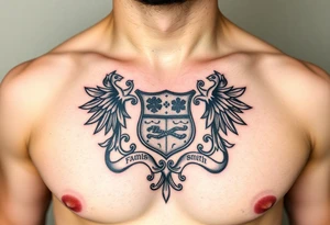
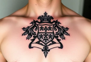
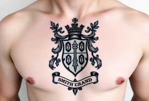
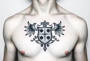
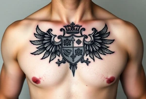
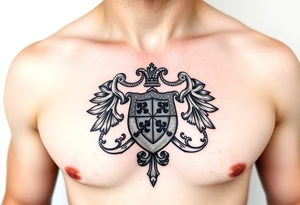
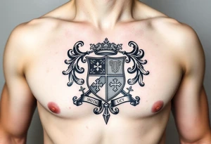
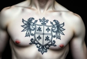
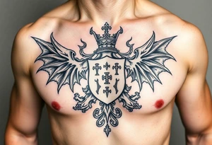
Family tattoos carry more weight than most designs, because the meaning arrives before the ink does. You already know who you're marking; the question is how to say it in a way that still feels right in twenty years. That's harder than it sounds. Names and dates are the obvious route, and they work — but they date quickly in style, and they leave nothing to interpretation. Symbols age better: a tree with a branch for each person, a pair of birds, a knot, a set of coordinates, a line drawing traced from a child's handwriting. The 4,393 designs in this gallery span both approaches, from tight minimal linework to full illustrative pieces built around portraits and heirloom objects. As you scroll, pay attention to how much space each idea needs. A four-name script needs a straight run of skin. A generational tree needs height. A tiny pair of initials can hide anywhere. Getting the shape right first makes every other decision — style, placement, artist — much simpler. Below you will find a collection of family tattoo design ideas for you to browse and get inspired by.

Join 9,635 happy customers.
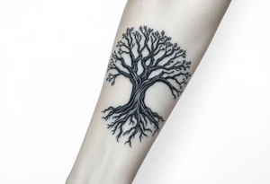
Choosing a symbol that can grow

Families change. Children arrive, partners join, people leave. Designs that lock in a fixed count — three birds, four dots, a specific number of leaves — can become awkward later. If you want room to expand, choose a structure that adds naturally: a tree gains branches, a vine gains leaves, a line of script gains a name, a constellation gains a star. Ask your artist to plan the composition with that in mind, leaving negative space where additions will sit rather than crowding the edges. If you'd rather not plan for change at all, that's a valid choice too — just make it deliberately, knowing a future addition may need its own separate piece.

Size, shape and where it sits

Match the geometry of the idea to the geometry of the body. Names and dates read best along a long straight line — inner forearm, collarbone, ribs, the outside of the calf. Anything with vertical structure, like a tree or a stacked generational design, wants height: spine, outer thigh, upper arm. Round or radial symbols suit the shoulder, chest and back of the hand. Fine script under about two inches tall is the most common regret, because thin lines soften and letters can close up over years. Go larger than feels necessary, or ask for a heavier weight of line. Portraits need real space — a coin-sized face rarely stays recognizable.
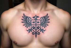
Styles that hold their meaning

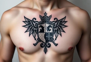
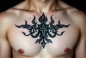
Fine-line and minimal linework dominate this theme and suit small symbolic pieces, though they benefit from being scaled up slightly. Blackwork and bold traditional hold definition longest and work well for hearts, anchors, knots and banners with names. Illustrative and neo-traditional styles handle trees, hands, birds and objects with warmth and depth. Realism belongs to portraits and to traced handwriting, where accuracy is the whole point — bring a clean scan, not a phone photo of a photo. Watercolor and script hybrids look striking fresh but rely on the artist's understanding of how soft edges settle. Whatever style you pick, view healed work from that artist before booking.
Family tattoos — common questions

Are names or symbols the safer choice?

Symbols age better aesthetically and stay private, which many people prefer. Names are unambiguous and deeply personal, but they commit you to a specific typeface and a specific set of relationships. A common compromise is a strong central symbol with initials or a date worked in small, so the meaning is legible only to you.

How do I get a family member's handwriting tattooed well?

Provide the highest-quality original you can — a scan of the actual paper, not a photograph of a screen. Ask the artist to trace rather than redraw, since the imperfections are the point. Very thin or shaky strokes may need slight thickening to survive healing; discuss that beforehand so you approve the interpretation.

Where do family tattoos hurt most?

Ribs, sternum, spine and the tops of the feet are among the more painful placements, and they're also popular for long script and vertical trees. Forearms, outer thighs and upper arms are generally gentler. If it's a long session for a large piece, factor in a break rather than pushing through in one sitting.