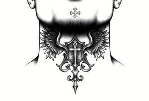
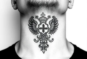
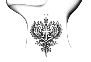
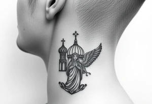
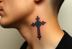
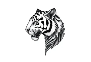
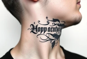
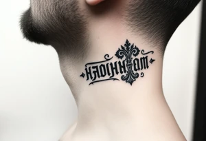
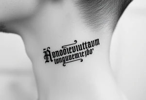
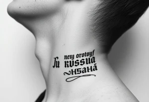
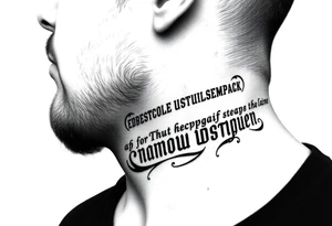
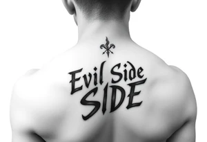
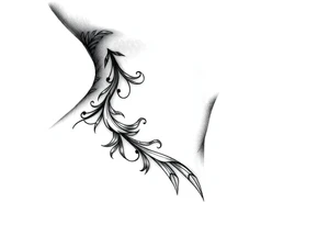
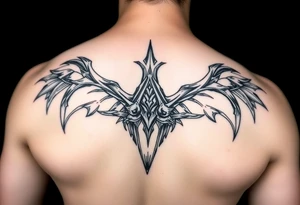
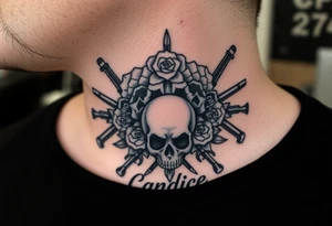
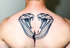
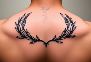
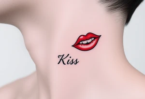
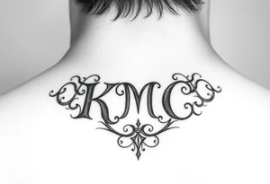
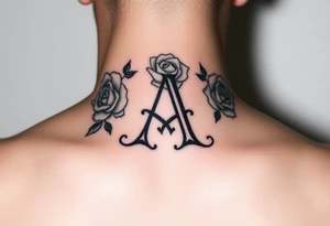
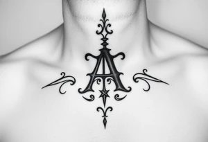
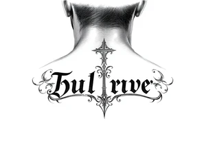
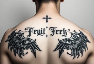
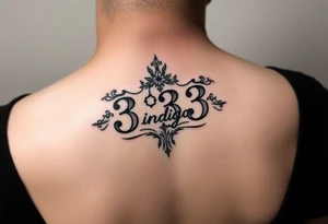
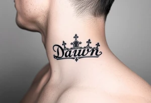
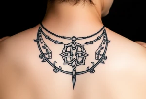
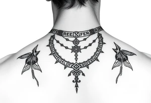
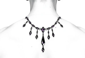
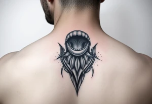
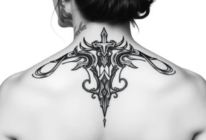
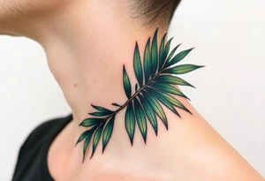
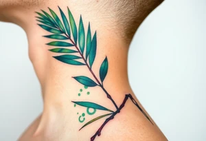
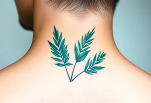
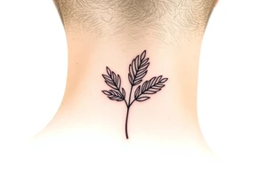
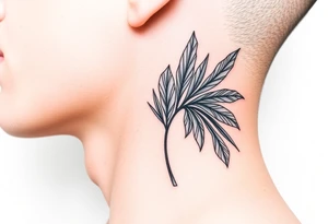
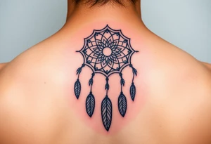
A neck tattoo sits in one of the most visible spots on the body, which is exactly why it demands more thought than most placements. This is a decision people notice — in interviews, at family gatherings, in every photo. That visibility can be the whole point, or it can be the reason you hesitate. Either way, the neck rewards designs that respect its shape: the long vertical line of the throat and sides, the curve where the neck meets the shoulders, and the flat expanse at the nape. The 992 designs in this gallery span fine-line script, bold traditional pieces, floral and botanical work, geometric patterns and small symbolic marks. Use them to test how different scales and styles read on the neck before you commit. Below you'll find guidance on what actually suits this placement, how size and orientation change the effect, and the practical realities worth weighing while a neck tattoo is still just an idea. Below you will find a collection of neck tattoo design ideas for you to browse and get inspired by.

Join 9,635 happy customers.
The neck breaks into distinct zones, and each behaves differently. The nape (back of the neck) is the most forgiving — flat, easy to cover with hair or a collar, and ideal for centered symmetrical designs like mandalas, moths or lettering. The sides follow the vertical sweep of the muscle, so long or flowing motifs sit naturally there. The throat and front are the boldest choice: highly visible, harder to hide, and best reserved for designs you're fully committed to. Small standalone symbols and short words work almost anywhere; sprawling scenes usually need the nape or a wrap that continues onto the shoulder.
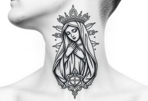
Scale matters more here than almost anywhere else because the neck has limited surface and constant movement. Fine-line and small script keep things subtle, but very delicate detail can soften over time in an area that creases and stretches, so slightly bolder lines often age more gracefully. Vertical designs suit the sides; horizontal or radial designs suit the nape. Blackwork, traditional and geometric styles read clearly at a distance, while watercolor and micro-realism ask for larger space to breathe. Think about how the design looks when your head turns and tilts, not just when you're staring straight into a mirror.
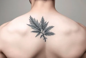
The neck is among the more sensitive and painful placements, thanks to thin skin and nearby bone. Visibility is the bigger consideration for most people: this is a tattoo that shows in most professional and social settings, and coverage depends on your hair length and clothing. It's worth being honest about your work environment and how you'd feel about it years from now. Many artists suggest starting with a placement you can conceal before moving to fully open neck work. Take a design from the gallery to a professional artist who can adapt line weight and layout to your anatomy.
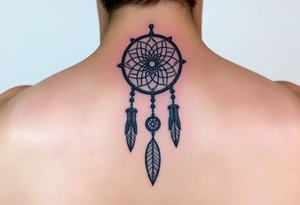
The neck is generally considered one of the more painful placements because the skin is thin and close to bone and muscle. Pain varies by person and by exact spot — the nape tends to be more tolerable than the throat or the area near the spine. Everyone experiences it differently.
It depends on location. Nape and lower-side designs can often be covered with longer hair, collars or scarves. Throat and front-of-neck tattoos are far harder to conceal in everyday and professional settings. Consider your realistic ability to cover it before choosing a highly visible spot.
Bold blackwork, traditional, geometric and clear script tend to read well and age better on a moving, creasing area. Fine-line and small symbols suit subtle looks. Match the design's orientation to the zone — vertical for the sides, symmetrical for the nape.