TattoosAI
Go smaller and finer is often the wrong advice for a finger tattoo. A whisper-thin line might look perfect in a close-up, but minimalist doesn't automatically mean low-maintenance. On a small, curved surface that bends, grips, washes and rubs against neighboring fingers, the space around the ink matters as much as the ink itself.
The strongest finger tattoo ideas balance personal meaning with readable shapes, sensible line weight and room for edges to soften. A band, constellation, moon, word, initial, botanical sprig, geometric shape or knuckle symbol can all work. The difference is whether your artist designs for your actual finger rather than shrinking artwork that belongs on a larger body part.
Think beyond the fresh photograph. Would you still recognize the design if its edges became less crisp? Would a missing dot change its meaning? Are you comfortable with visible placement, possible touch-ups and a result that won't stay digitally perfect?
Practical rule: Choose a design you'll still like when it looks like a healed tattoo, not a magnified illustration.
Commitment matters here. Resources such as the Ideal Face & Body laser removal guide belong in your background reading, not your backup plan for a rushed decision.
Table of Contents
- 1. Ring Finger Band Tattoo
- 2. Dotwork Mini Constellation
- 3. Fine-Line Minimalist Symbol
- 4. Small Script Word on Fingers
- 5. Initials and Small Monogram
- 6. Tiny Botanical Sprig
- 7. Geometric Mini Shapes
- 8. Knuckle Lettering or Symbol
- Finger Tattoo Ideas at a Glance
- From Idea to Ink Making Your Finger Tattoo Happen
1. Ring Finger Band Tattoo
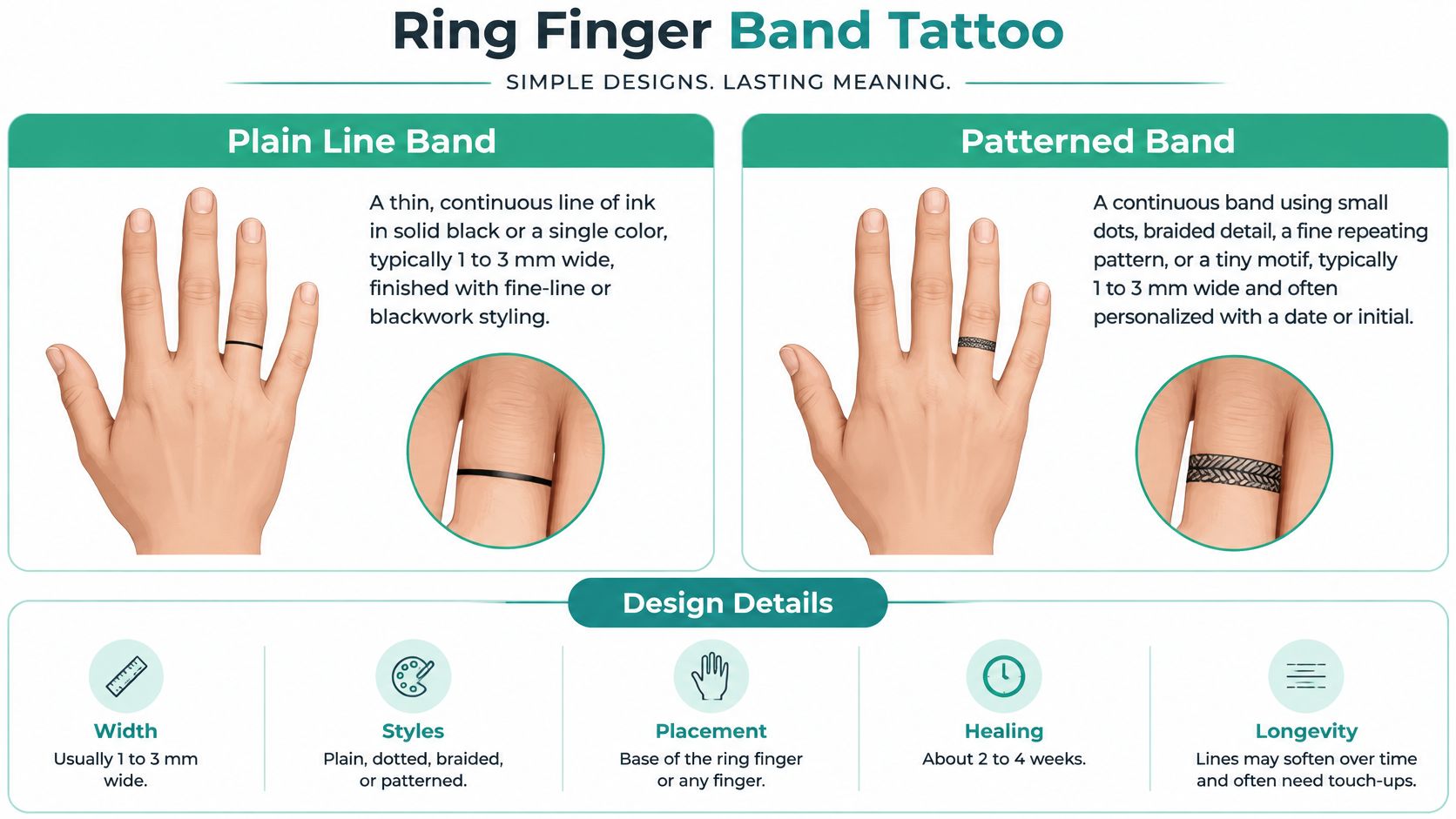
A ring band looks simple because there's nowhere for an uneven edge to hide. It can represent marriage, remembrance or a personal commitment, but its clean appearance depends on consistent width and thoughtful placement.
For a minimalist wedding symbol, start with a plain black band rather than a miniature braid. Ask your artist to draw different widths directly on your finger. A line that looks balanced from above may appear heavier at the sides, where the finger curves away.
Decide Whether It Needs to Wrap
A full wrap includes surfaces with different movement and contact patterns. An open band that stops at the sides is worth considering if you care more about a balanced top view than an uninterrupted circle.
Line weight needs restraint in both directions. A hairline leaves little visual structure if pigment becomes patchy, while a heavy band can overwhelm a narrow finger. Your artist should choose the width on your skin, not from a universal measurement.
- Plain band: The clearest option if you want a recognizable shape without decorative detail.
- Dotted band: Attractive when dots have generous separation, less forgiving if they're tightly packed.
- Braided band: Better simplified into an open rope rhythm than filled with tiny crossing lines.
For maintenance, ask how the artist handles uneven healed sections and when they assess whether another session is appropriate. Don't book a touch-up by calendar alone. More ink isn't automatically the right fix, especially before the skin has fully healed.
2. Dotwork Mini Constellation
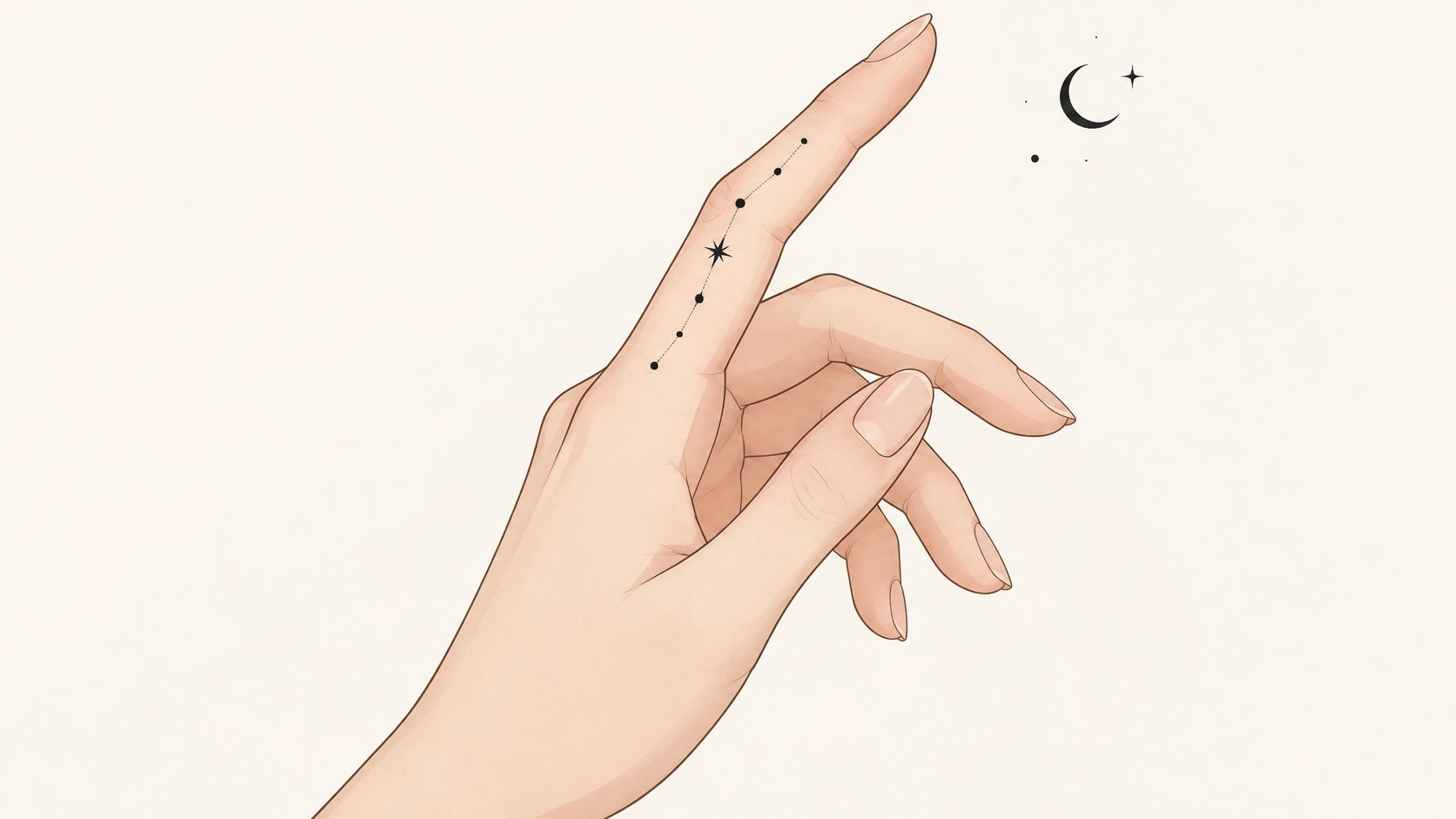
With a constellation, spacing is the design. Remove the connecting lines and the dots still need to form a deliberate pattern, not look like accidental specks.
A Big Dipper-inspired arrangement along the index finger works best when you preserve its recognizable outline rather than squeeze in surrounding stars. Bring an accurate reference if the astronomy matters to you. A decorative celestial cluster and a faithful star map aren't the same request.
Give Each Dot Its Own Space
Ask the artist to compare a sparse arrangement with a more detailed version at actual size. Dots need enough presence to remain visible, but increasing their size without increasing their separation can make the pattern crowded.
A dotted crescent offers a useful alternative when a full constellation won't fit. You can retain the celestial theme without forcing an accurate map onto a narrow surface.
- Dot size: Favor deliberate, readable marks over barely visible pinpricks.
- Negative space: Keep clear skin between neighboring dots.
- Placement: Check the arrangement with fingers relaxed and together, not only stretched apart.
- Connecting lines: Leave them out if they compete with the stars or create tiny enclosed spaces.
This concept has a particular maintenance trade-off: a missing dot can change the whole arrangement. Before booking, ask whether the pattern will still look intentional if individual points heal unevenly.
Don't mistake sparse for foolproof. A constellation contains little ink, but that makes every mark important. It suits someone who likes subtle decoration and accepts that preserving the pattern may require an artist's reassessment after healing.
3. Fine-Line Minimalist Symbol
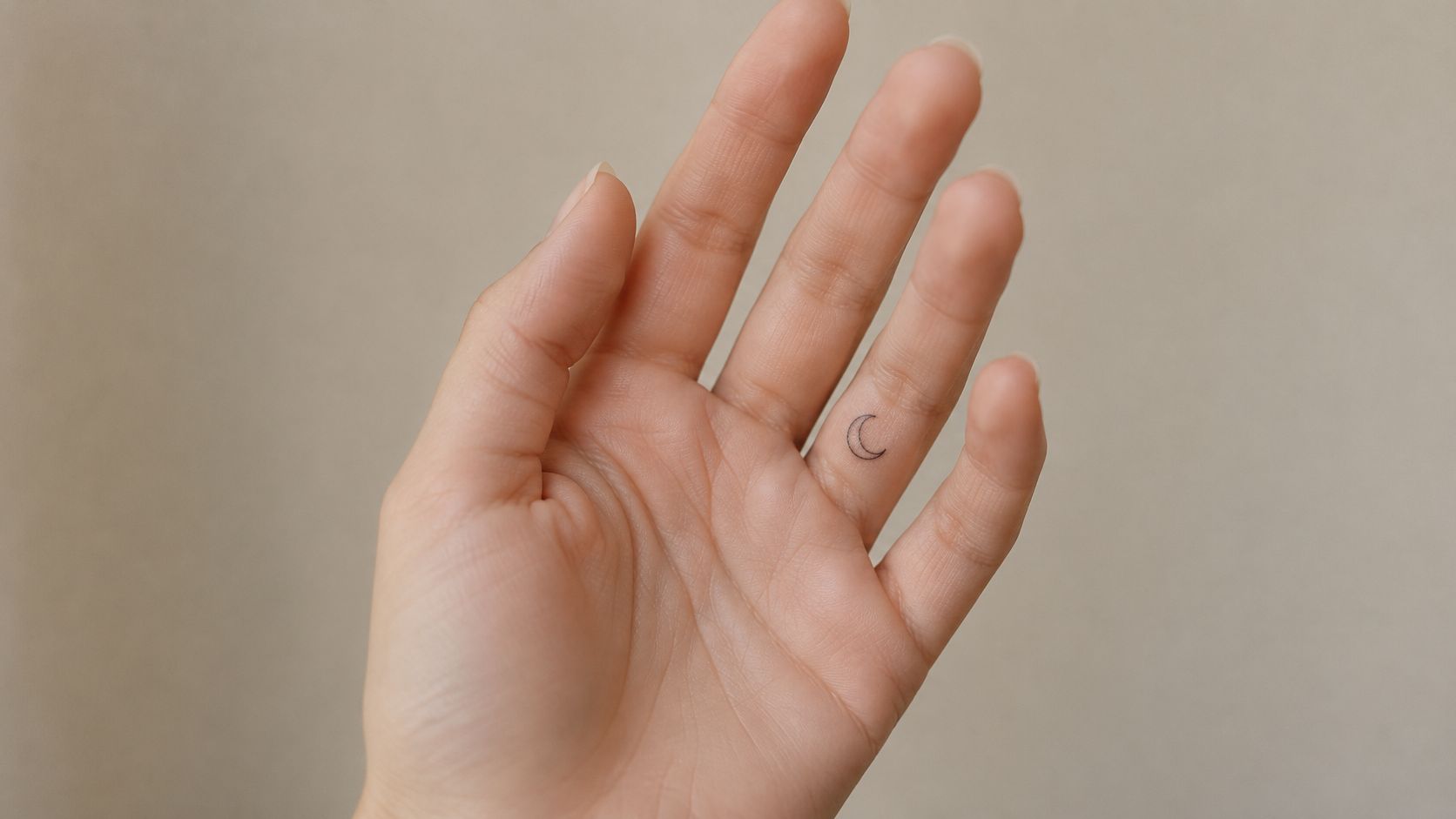
A crescent moon, heart or arrow can carry meaning without needing text. The practical challenge is keeping the symbol's defining feature open: the moon's inner curve, the heart's notch or the arrowhead's separation from its shaft.
For a crescent on the side of the ring finger, ask for a clear silhouette rather than the thinnest possible outline. The tips shouldn't depend on microscopic gaps to remain recognizable. Compare outline and filled versions before deciding which feels right.
Simplify the Symbol, Not Its Meaning
Our collection of small tattoo designs for fingers can help you compare compact motifs. Judge each by its actual-size outline rather than by how impressive it looks enlarged.
If your idea draws on tarot imagery, explore tarot card meanings before choosing the symbol. A simplified star or moon can express your interpretation without trying to reproduce an entire illustrated card.
A symbol should remain recognizable without its smallest decorative detail.
Ask your artist to remove interior hatching, miniature rays or extra orbit lines if they crowd the design. Fine-line work still needs adequate line weight, and a small tattoo doesn't need to be smaller than your finger can comfortably accommodate.
The Cleveland Clinic's tattoo aftercare guidance notes that ultraviolet exposure can accelerate fading. That makes ongoing sun protection relevant to the finished design, not just the healing period. Nobody can promise exactly how your moon will look years later, but you can avoid choosing one that only works with perfectly sharp edges.
4. Small Script Word on Fingers
Start with the word, then decide whether it belongs on a finger. Don't start with an elaborate font and force meaningful text into it.
For a word such as hope along the index finger, compare straightforward lowercase lettering with a restrained handwritten version. The important differences are open letterforms, spacing and stroke consistency, not whether the font looks delicate on a screen.
Script creates particular problems where strokes loop back over themselves. A cramped e, closed o or tight connection between letters can become difficult to distinguish as edges soften.
Make the Word Read Without Guesswork
Ask the artist to write the word at actual size and identify its tightest spaces. If those spaces already look narrow in the stencil, adding flourishes won't improve the design.
- Short word: Gives the artist room to keep letters distinct.
- Long name: May work better elsewhere rather than compressed onto a finger.
- Split wording: Needs checking with the hand relaxed, because adjacent fingers don't stay aligned.
- Handwriting reference: Usually needs adaptation rather than an exact miniature copy.
A child's name in personal handwriting can be meaningful, but the artist may need to open loops, remove an underline or separate connected strokes. Those edits preserve readability without discarding the character of the original.
Check the stencil from your normal viewing distance, not just close enough to inspect each letter. If you need to know the word in advance to read it, the lettering needs revision.
Text also makes uneven fading more noticeable. A softened symbol may still communicate its shape, while a missing letter stroke can change what someone reads. Choose the word only after you're comfortable with that trade-off.
5. Initials and Small Monogram
An initial often does what a full name can't: it leaves room for a readable letter without filling the whole finger. It's a strong option for honoring a child, partner or family member when you want the meaning to remain understated.
Consider a single capital letter on the top of the ring finger between the joints. A simple serif or open handwritten letter can feel personal without requiring an ornamental frame.
Keep the Letter's Interior Open
The empty spaces inside letters matter. An A, B or R needs enough room within its outline that the interior doesn't look cramped from the start.
Intertwined initials introduce another problem: overlapping strokes can make it unclear where one letter ends and the next begins. For a compact monogram, separation usually matters more than clever interlocking.
- Single initial: Offers the most room for a clear letterform.
- Paired initials: Work best when each letter remains independently readable.
- Monogram with a heart: Needs enough space that the heart doesn't merge into a flourish.
Test the stencil while your hand rests naturally. Decide whether the letter should face you or face someone looking at your hand, then check that orientation before the artist begins.
The broader safety decision matters more than the choice of font. Mayo Clinic's tattoo safety guidance covers risks including allergic reactions, infection and scarring, alongside the importance of safe practice and aftercare.
Don't treat a tiny initial as a tiny commitment to hygiene or healing. It still creates a wound, and it still deserves a reputable artist, appropriate equipment and clear instructions.
6. Tiny Botanical Sprig
A botanical tattoo should follow the finger's length without becoming a miniature botanical plate. A stem with clearly separated leaves usually gives the artist more room to work than a detailed flower head packed with overlapping petals.
For an olive-inspired sprig on the index finger, keep the leaves distinct from the stem and from each other. For a rose tribute, consider a simplified bloom with a short stem instead of reproducing every petal fold.
This video offers additional visual inspiration for comparing finger-tattoo approaches.
Preserve the Plant's Recognizable Features
Different plants need different simplifications. A fern depends on repeated leaflets, while an olive sprig depends more on long leaves and branching rhythm. If identifying the exact species matters, ask whether the available space can support those defining features.
A birth flower can be meaningful, but don't force a complex bloom into an unsuitable size. Moving the flower elsewhere and keeping a leaf or stem on the finger may produce a better result.
Design check: Cover the interior detail in your reference. If the outline no longer reads as the plant you want, it may need more space.
Avoid dense shading between small leaves. Those gaps help separate the botanical elements, and filling them can make a graceful sprig look heavy before it has even healed.
A wrapping stem also needs checking from several angles. Ask the artist to inspect it with your hand open and curled so the composition doesn't depend on a single photograph-friendly pose.
For maintenance, discuss which sections are easiest to reassess if pigment heals unevenly. A simpler sprig gives the artist fewer crowded intersections to evaluate than a tightly detailed floral wrap.
7. Geometric Mini Shapes
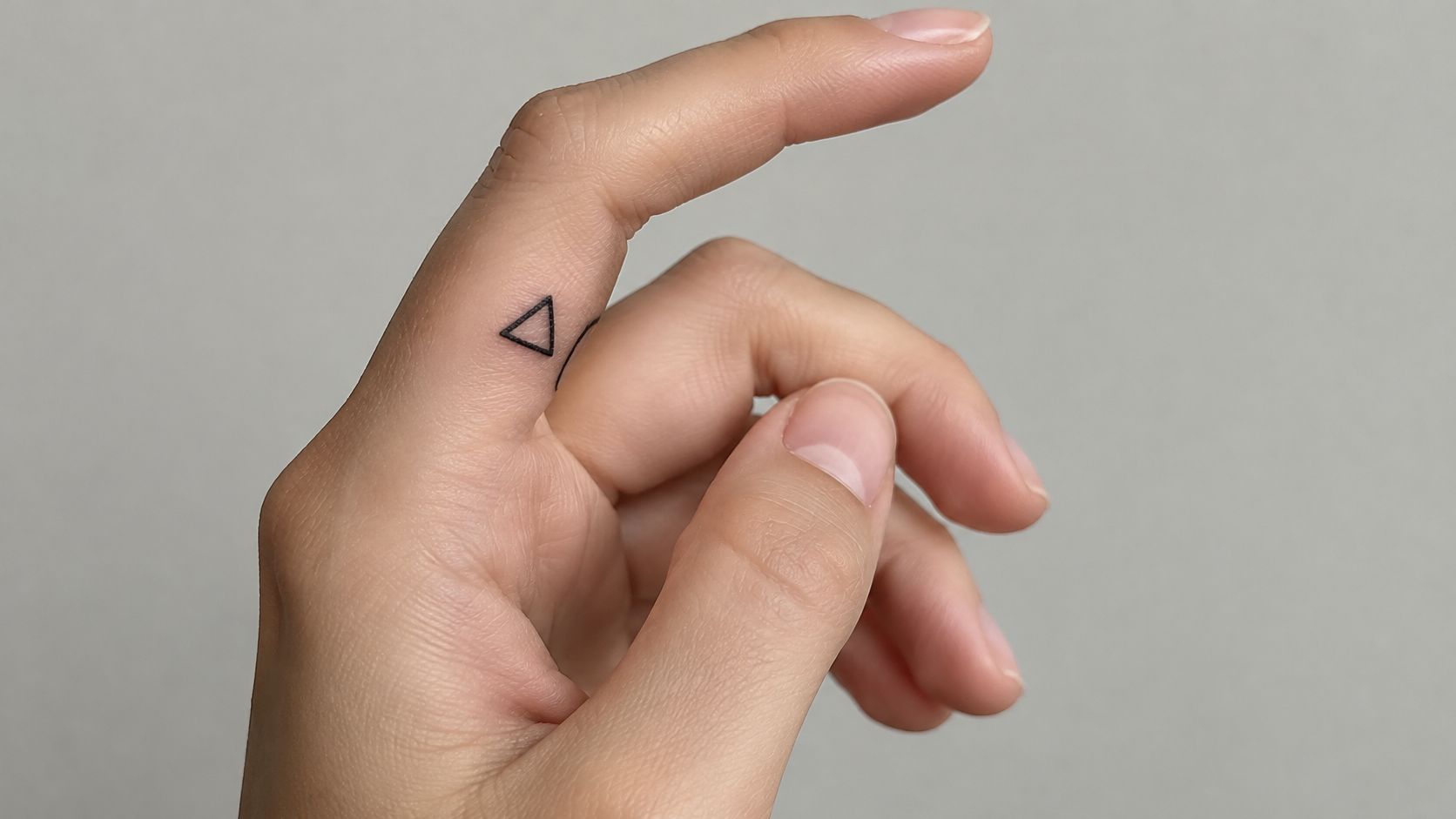
A triangle is straightforward to recognize, but surprisingly unforgiving to draw on a curved finger. A slight difference in an edge or corner can look more obvious in geometry than in an organic leaf.
For a minimal index-finger tattoo, compare an open triangle with a filled silhouette. The outline needs room inside it; the filled version needs enough separation from nearby marks that it doesn't look crowded.
Check Symmetry on the Hand
Don't approve geometry from a flat drawing alone. Ask the artist to position the stencil on your finger and assess it from above, from the side and with the hand relaxed.
A circle with a central dot needs visible space around that dot. A chain of hexagons needs gaps large enough that neighboring outlines don't create a dense mesh. When the available surface is narrow, reducing the number of elements is usually better than shrinking every element.
- Single triangle: Keeps the focus on a clear silhouette.
- Open circle: Needs an interior that doesn't already feel tight.
- Repeated shapes: Require consistent spacing across the finger's curve.
- Intersecting lines: Need simplification where several strokes meet.
Don't ask for extra-heavy outlines as insurance against every aging concern. Excessive weight can reduce the very negative space you need to preserve.
Geometry suits someone who enjoys precision but accepts that skin isn't graph paper. The aim is a balanced shape on a moving hand, not mathematical perfection from every viewing angle.
Before approving the stencil, remove unnecessary accents. A triangle doesn't become more meaningful because it has a miniature constellation inside it.
8. Knuckle Lettering or Symbol
Knuckle tattoos are a visibility decision before they're a lettering decision. You'll see them while typing, holding a cup and shaking hands, and so will other people.
A short word distributed across the fingers can work well when each letter has a clear shape. A star or anchor can offer similar impact without requiring someone to read across a moving hand.
Choose Structure Over Flourish
Our guide to words for knuckle tattoos can help narrow the wording. Once you've chosen it, ask the artist to adjust individual letters for the available skin rather than treating every finger as an identical square.
Bold, open lettering is generally a more practical starting point than narrow cursive. Keep decorative shadows and interior stripes out unless there's enough room for them.
- Word layout: Check letter order with both hands in their intended position.
- Symbol layout: Keep the important outline clear of unnecessary interior detail.
- Joint placement: Have the artist assess where bending changes the design.
- Pain expectations: Discuss the specific placement and your tolerance before booking.
Finger tattooing can be painful, and small doesn't mean painless. Ask how the artist handles breaks, movement and a client who needs to stop.
Your healing schedule also needs to suit your life. A clinical review of tattoo complications discusses infection, allergic reactions, scarring and delayed inflammatory responses as general tattoo risks, not finger-specific predictions.
Tell the artist about frequent handwashing, chemical exposure, skin disease or a history of raised scars. Sometimes the sensible recommendation is a different placement or postponement, not a tougher attitude toward healing.
Finger Tattoo Ideas at a Glance
| Placement | Healing Time | Longevity | Best For |
|---|---|---|---|
| Ring Finger Band Tattoo, Base of the ring finger or any finger | About 2 to 4 weeks | Lines may soften and often need touch-ups | A subtle commitment symbol or minimalist jewelry alternative |
| Dotwork Mini Constellation, Sides of fingers, knuckles, or between the knuckles | About 2 to 4 weeks | Dots can soften or spread; occasional touch-ups help | Celestial designs and meaningful star patterns |
| Fine-Line Minimalist Symbol, Top, side, or inner side of any finger | About 2 to 3 weeks | Fine lines may need refreshing after a few years | A small, personal symbol with a simple look |
| Small Script Word on Fingers, Side or top of fingers, or across two adjacent fingers | About 2 to 4 weeks | Letters can soften and may need touch-ups over time | A short, meaningful word or name |
| Initials and Small Monogram, Side or inner part of any finger | About 2 to 3 weeks | Small letters may need refreshing after several years | A compact, discreet tribute to someone |
| Tiny Botanical Sprig, Side or top of fingers, or wrapped around a finger | About 2 to 4 weeks | Fine details may soften; bold outlines last longer | Nature-inspired designs with personal meaning |
| Geometric Mini Shapes, Knuckles or sides of any finger | About 2 to 4 weeks | Tight spacing may blur; open spacing ages better | Clean, modern patterns and symmetrical designs |
| Knuckle Lettering or Symbol, Knuckles and inner finger joints | About 3 to 4 weeks | Bold letters hold up better; expect periodic touch-ups | A bold, visible statement or short message |
From Idea to Ink Making Your Finger Tattoo Happen
A finger tattoo that looks sharp in a photo can blur once the skin heals and moves. Pick a design whose main shape still reads after lines soften. A band needs consistent width. Lettering needs open interiors and clear spacing. A botanical sprig or constellation needs a recognizable arrangement, not hairline stems or dots packed too tightly to stay separate.
Apply the same test to the artist. Ask to see healed finger work, not only fresh close-ups, and talk through what happened to comparable designs after healing. An honest consultation may end with a larger motif, fewer details, a different surface of the finger, or a recommendation to use another placement.
Before You Book
- Size test: Approve a stencil on your actual finger and inspect it with your hand relaxed and bent.
- Touch-up plan: Ask when the artist assesses healed results, what their policy covers and what might make further work unsuitable.
- Spelling check: Verify every letter, initial, numeral and orientation before tattooing.
- Daily routine: Explain work gloves, jewelry, frequent washing and exposure to cleaning products.
- Health discussion: Raise skin conditions, allergies, scar history and any concerns that may need medical advice.
- Aftercare instructions: Leave knowing how to clean the area, avoid irritation and recognize a problem.
Don't accept vague aftercare. A peer-reviewed analysis of U.S. tattoo aftercare instructions found that only 19.4% explained when to seek medical care. Ask specifically about worsening redness, spreading swelling, pus, fever or severe pain, and seek medical advice rather than assuming those signs are routine healing.
The TattoosAI generator offers 19 styles and has generated more than a million designs. Explore finger tattoo ideas, generate variations with different line weights and spacing, then take your preferred reference to a trusted tattooist. The result is a reference, not a stencil, and your artist must adapt it to your finger, your skin and how the design may age.
Crisp lines years later are never guaranteed on finger skin. Readable artwork, a realistic touch-up plan and an artist who explains those limits before the needle starts are the parts you can control.
Describe your finger tattoo idea, choose a style and color, and compare custom concepts at TattoosAI. Ask for a simplified version with clear spacing and a strong silhouette, then take your favorite reference to your tattooist for a placement and aging assessment.