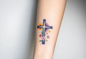
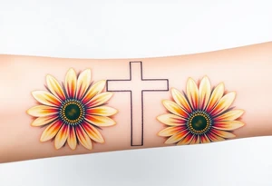
Inner versus outer, and which way it faces
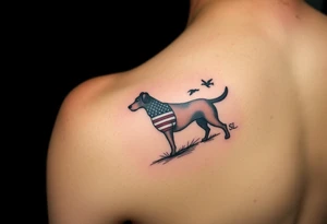
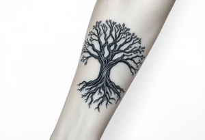
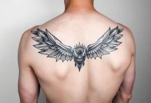
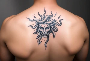
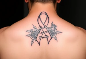
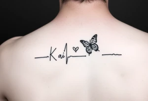
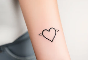
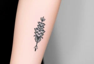
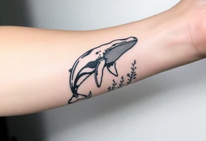
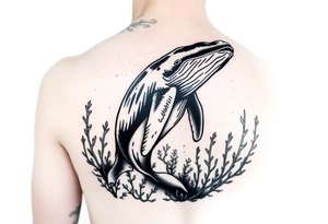
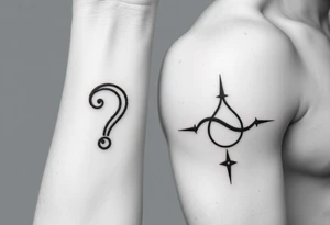
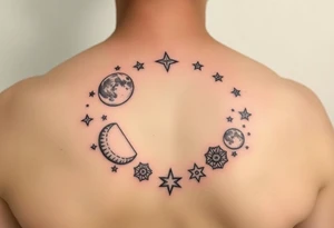
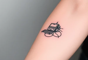
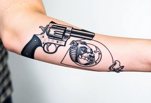
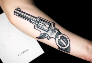
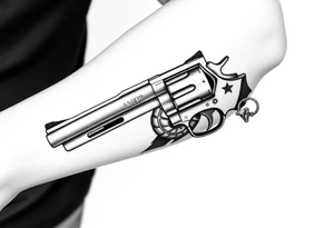
Inner forearm skin is softer and slightly more sensitive, and the area gets less sun, so ink there often holds its crispness longer. It suits script, small symbolic pieces and anything you want to read yourself. Outer forearm is tougher, broader and more visible to other people — better for bold graphic work, animals, portraits and pieces meant to be seen at a glance. Decide orientation early: does the design read upright to you when you look down, or upright to someone facing you? Lettering makes this decision unavoidable, and it's the single most common regret people describe after the fact. Sketch it on with a marker and live with it for a day.