TattoosAI
You've scrolled through hundreds of abstract tattoo photos. You love the smoky color washes, the sharp geometry, and the loose black strokes. Then you look at your own arm and still can't say which design would belong there.
That's the difficulty with abstract tattoos. There's no recognizable subject to judge, so you're choosing the relationship between shape, movement, empty skin, and placement. A composition that looks balanced in a square photograph may feel cramped on a wrist or disappear around the side of a shoulder.
Searching for tattoo abstract designs gives you plenty of inspiration, but a good reference needs more than an appealing surface. You need to know what should stay readable as the tattoo softens, where the design can bend, and which details your tattooist should simplify.
Start with placement: Choose a part of your body you genuinely want tattooed, then judge designs against that space. Don't squeeze a large composition into a small placement just because the reference looks beautiful.
These styles offer different ways to approach that decision. Some suit broad areas and generous spacing. Others work as restrained, intimate pieces. None is automatically maintenance-free, and fresh photographs won't tell you everything about the healed result.
Table of Contents
- 1. Watercolor Abstract Wash
- 2. Ink Splatter and Brush Stroke Abstract
- 3. Geometric Abstract
- 4. Continuous Line Abstract
- 5. Dotwork Mandala Abstract
- 6. Blackwork Negative Space Abstract
- 7. Abstract Botanical Fragments
- 8. Cubist-Inspired Fragmented Abstract
- Abstract tattoo styles at a glance
- Turning Your Favorite Abstract Idea Into a Tattoo
1. Watercolor Abstract Wash
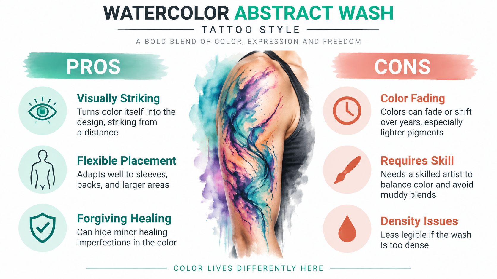
A blue-and-violet wash across the upper back can feel atmospheric rather than illustrative. On a forearm, a smaller wash behind a clean line motif gives the color something definite to surround. The strongest versions have a focal area, not an even cloud of pigment everywhere.
This comparison shows the visual appeal and the compromises to discuss before choosing the style.
Give soft color a clear structure
Upper arms, thighs, and backs provide room for transitions without compressing every change of color. A forearm works well for a lengthwise wash, provided the artist considers how it looks when your arm rotates.
The trade-off is softness. If the design depends entirely on pale edges, it may become harder to distinguish as its appearance changes. Ask for healed examples in a similar palette and on a similar skin tone, rather than judging only freshly saturated photographs.
- Control the palette: Choose related hues with a deliberate accent instead of combining every color you like.
- Keep an anchor: A darker pool, defined contour, or clear skin opening can preserve the composition.
- Discuss pigments: Ask which inks the artist plans to use and what fading or touch-up expectations they have for that palette.
Our guide to how watercolor tattoos work explains the approach behind the painted effect.
Use the video as another visual reference, then compare what you like with your artist's healed portfolio.
Ask your tattooist: Which part of this wash will remain the focal point if the lightest areas become less distinct?
2. Ink Splatter and Brush Stroke Abstract
Choose this style for movement, not randomness. A sweeping stroke across a shoulder blade can follow the shoulder's angle. A rib composition can curve around the torso, with smaller splashes supporting the main direction rather than scattering equally across the skin.
Look at the difference between the dominant stroke and its supporting droplets in this reference.
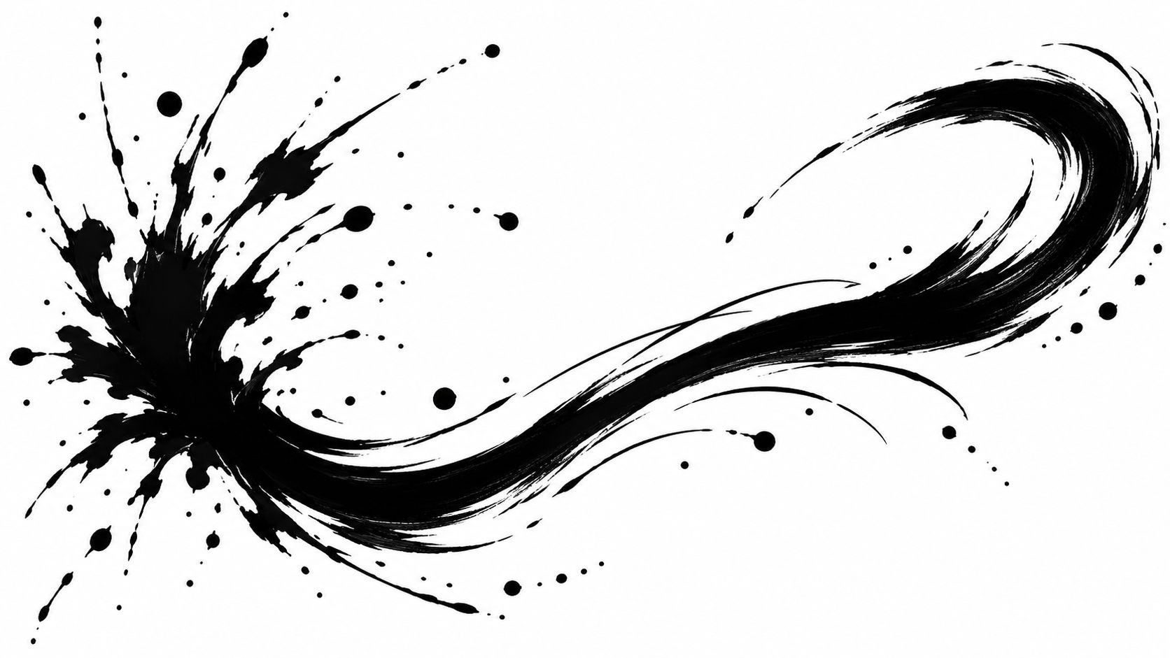
Contemporary abstract tattooing draws from several visual traditions rather than a single inventor, including gestural painting and geometric abstraction, as described by the Tattoo History Atlas. For your appointment, the useful distinction is whether you prefer a loaded, solid brushstroke or a dry, broken mark.
Keep the gesture, edit the spray
Bring brushwork references, not just tattoo photographs. Show the artist whether you like blunt starts, tapering ends, rough edges, or diluted ink effects. Those details communicate more than asking for something energetic.
For a first piece, an outer upper arm offers a practical canvas for a broad stroke with room around it. Ribs can suit longer gestures, but discuss your comfort, clothing friction, and the working position before committing.
Tiny droplets are optional, not essential. If they're too small or tightly grouped, their intended separation may become less clear. Enlarging selected splashes usually preserves the gesture better than reproducing every speck.
A convincing brushstroke tattoo is carefully composed to look spontaneous. Ask the artist to show you the main direction before adding texture.
Ask your tattooist: Which droplets would you remove or enlarge so this still reads as brushwork after it heals and ages?
3. Geometric Abstract
Triangles, circles, and intersecting lines suit people who like order without needing a literal image. A triangular forearm arrangement can feel compact and architectural. Interlocking circles across the upper back can create a broader, more open composition.
This reference shows how easily layered geometry can become dense.
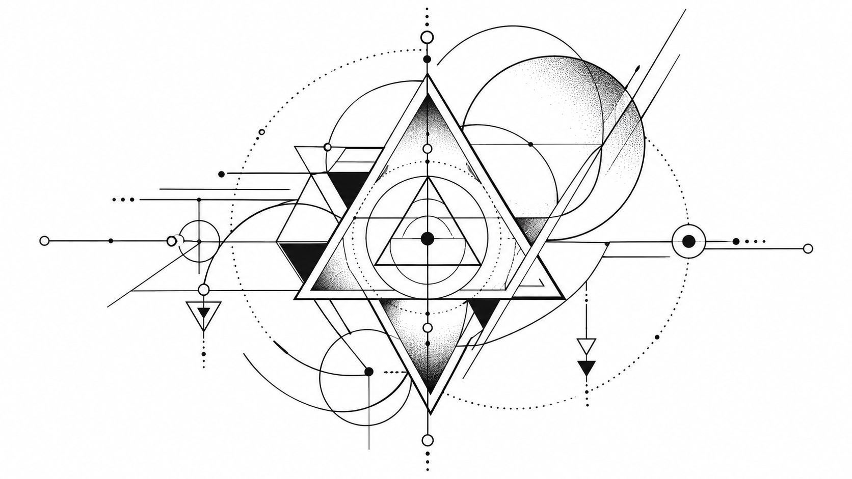
Geometry needs a hierarchy, not just accurate shapes. A composition guide from AI for Tattoo recommends defining body-flow direction, recurring motifs, and deliberate negative space so a nonrepresentational piece stays readable. That's especially useful when overlapping shapes could otherwise compete equally.
Test the geometry while you move
A circle on paper won't appear circular from every viewing angle once it wraps around an arm. That isn't necessarily a mistake. The important decision is which view matters most to you.
- Forearm grids: Check them with your arm relaxed, palm turned, and elbow bent.
- Chest compositions: Assess balance while standing naturally, not only with shoulders pulled back.
- Back arrangements: Decide whether the spine is a centerline or whether deliberate asymmetry suits you better.
Ask for a stencil test before approving the layout. Consistent line weight can create a calm result, while deliberate heavier accents can separate the main shapes from supporting construction lines.
For aging, watch the small enclosed spaces. Closely nested triangles and near-touching circles leave little room for visual softening. Enlarging the whole design or removing an internal shape is often better than insisting on finer lines.
Ask your tattooist: Which gaps need to be wider, and where should this composition look most balanced when my body is relaxed?
4. Continuous Line Abstract
A continuous line can suggest a face, a folded ribbon, or a looping path without fully describing any of them. Its appeal is restraint. Because there's so little else to look at, every bend and crossing matters.
For a discreet first tattoo, a loose loop above the ankle can work better than a tightly knotted miniature. A longer forearm line gives the artist more room to separate crossings and build an expressive curve.
Minimal doesn't have to mean microscopic
Wrist and ankle placements can suit short, open compositions, but don't choose them solely to make the tattoo tiny. Ask your artist to compare the smallest workable version with a larger version at actual size.
A practical abstract-design guide from AI for Tattoo on meaningful abstract designs suggests keeping the smallest marks approximately 2–3 mm wide. That's a planning reference, not a universal rule for every line tattoo; your artist must judge the line weight and spacing for your design and skin.
Ask to see healed fine-line work, especially where lines cross or turn closely together. A fresh photograph can't show how those intersections will read later.
- Open loops: Preserve clear areas of skin between returning lines.
- Controlled crossings: Avoid piling several intersections into the focal point.
- Touch-up expectations: Ask when the artist assesses healed work and what their policy covers.
If you want a knot-like form, distinguish a personal looping design from an established cultural symbol. Reading about endless knot symbolism explained can help you decide whether that association is intentional.
Ask your tattooist: What line weight gives me this light appearance without making the design depend on fragile-looking detail?
5. Dotwork Mandala Abstract
Start with the placement's center. A radial dotwork composition can sit naturally over a shoulder cap, while a broader chest piece can spread outward from a central pattern. The alignment matters as much as the individual dots.
For example, a shoulder design might use an open central rosette, denser surrounding bands, and a sparse dotted edge. That variation creates depth without filling the entire area equally.
Our guide to the dotwork tattoo style offers a closer look at how stippling creates texture and shading. For an abstract piece, decide whether you prefer crisp radial organization or a looser pattern that only hints at a mandala.
Judge the pattern from a distance
The aging question isn't whether every dot stays individually noticeable. It's whether the larger pattern remains clear when viewed normally, rather than in a close-up photograph.
Ask the artist to show where the darkest areas stop and the open skin begins. If the whole composition uses similar density, the result can feel flat despite the amount of work involved.
Distance test: Step back from the design. You should still be able to identify its center, main bands, and open edges without inspecting the dots.
A shoulder cap accommodates rounded patterns well, but check how the outer border travels toward the chest and back. On the sternum or chest, discuss breathing, posture, and whether exact symmetry is realistic for your anatomy.
Dotwork can require patient, repetitive work. Ask about session planning and how the artist estimates the cost before you approve an elaborate composition. Don't assume that routine touch-ups will be necessary on a fixed schedule.
Ask your tattooist: How will you separate the density bands so the pattern stays readable as the dots soften?
6. Blackwork Negative Space Abstract
Here, the untouched skin is part of the design. Broad black shapes frame open channels, cutouts, or islands of skin. The effect can be bold without requiring a recognizable subject.
This reference demonstrates the relationship between solid shapes and the spaces around them.
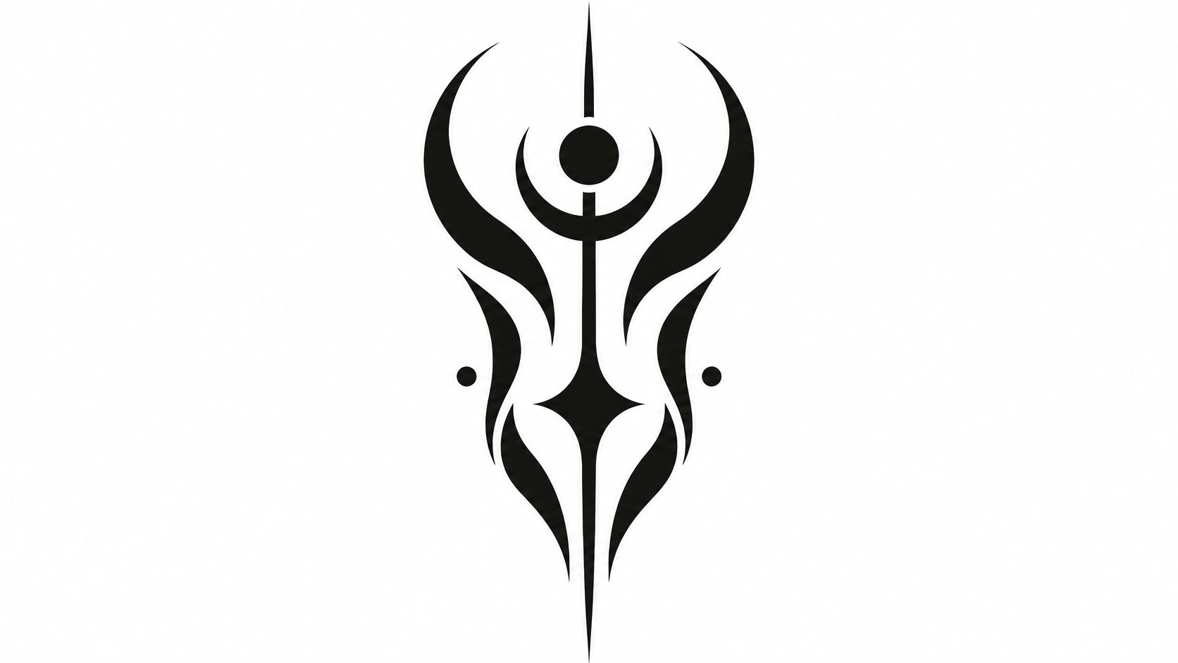
An upper-arm composition might use a heavy black sweep with an open curved channel through it. A back piece can support broader, separated masses. For a sleeve, map the open areas around the whole limb before approving isolated sections.
Design the empty areas first
A placement-first approach is particularly useful here. Coverage of abstract and unconventional placement trends at Sky Rye Design highlights the aesthetic interest, but your consultation still needs to resolve how the specific composition wraps and moves.
- Preserve openings: Narrow skin slivers may not provide the lasting separation you expect.
- Check the silhouette: View a mock-up from across the room, not just at phone-screen distance.
- Plan extensions: Decide where future work could connect without filling every remaining gap.
Solid black offers strong contrast, but it's also a substantial commitment. Revising a large dark area can mean changing the surrounding design rather than making a small local adjustment.
Ask how the artist checks healed saturation and handles uneven areas if they occur. Follow their aftercare instructions, and don't pick at healing skin to make the fill look smoother.
Ask your tattooist: Which negative-space channels need more width, and what options would remain if I wanted to extend or revise this piece later?
7. Abstract Botanical Fragments
You might want a connection to nature without wearing a complete flower or a detailed branch. Botanical abstraction keeps selected features, such as a leaf's curve, a petal edge, or a seedpod silhouette, and leaves the rest unresolved.
For a forearm piece, use a lengthwise arrangement of partial leaves with open skin between them. On the back, broader fragments can change scale and direction without looking like a scattered collection of unrelated plant parts.
Keep a recognizable visual thread
Bring photographs of plants that matter to you. Then explain which characteristics you want to keep. A narrow leaf shape, branching rhythm, or irregular petal edge gives the artist a useful starting point without asking them to copy a botanical illustration.
Choose a repeated visual feature to connect the fragments. That might be a curved stem line, a shared angle, or consistent black silhouettes. If every fragment uses a different technique, the composition can feel accidental.
Color needs a separate conversation from style. The WHO/IARC tattoo FAQ states that allergic reactions can appear months or years after tattooing and that no pre-tattoo allergy test is currently available. Don't treat a small preliminary tattoo as proof that a larger color piece will be risk-free.
For aging, simplify veins, tiny gaps, and overlapping outlines before removing the main leaf shapes. The botanical character should come from the larger forms, not depend entirely on fine internal detail.
Discuss relevant medical history with your tattooist and seek clinical advice about allergy concerns. Ask to document the inks used, and don't assume future removal will be straightforward.
Ask your tattooist: Which botanical features should stay distinct, and how will you connect the fragments without adding unnecessary detail?
8. Cubist-Inspired Fragmented Abstract
A fragmented face across the shoulder can be more interesting than a conventional portrait if you like ambiguity. Overlapping planes suggest features without locking them into a single viewpoint. On a forearm, a narrower arrangement of angular facets can create the same effect without requiring a large face.
The main risk is overcomplication. When every plane has an outline, a texture, and its own shading, you can lose the original structure beneath the detail.
Choose a dominant set of planes
Bring a Cubist artwork as a reference for its visual language, not as a request for a direct reproduction. Explain whether you like flattened features, intersecting angles, muted color blocks, or the tension between recognizable and abstract forms.
A shoulder suits a composition that can bend around a rounded surface. A thigh or upper back gives the artist more room for broad planes and clear separations. A forearm version should usually become narrower and simpler, rather than merely shrinking the larger design.
- Prioritize the focal area: Keep the strongest contrast around the feature or intersection you want noticed first.
- Separate the layers: Decide which planes use outlines, solid fill, or shading.
- Remove weak fragments: Delete small facets that don't contribute to the overall shape.
Aging favors a design that remains understandable when subtle tonal differences become less obvious. Ask the artist to show the composition as a simplified value sketch before approving decorative textures.
Keep the planes that establish the composition. Remove the ones that only make the reference look more intricate on a screen.
For a first piece, an isolated fragmented form also leaves more room for future additions than an edge-to-edge field of competing facets.
Ask your tattooist: If we remove the smallest planes and simplify the shading, will this still have the fragmented character I want?
Abstract tattoo styles at a glance
| Item | Main Look | Placement Fit | Main Trade-off |
|---|---|---|---|
| Watercolor Abstract Wash | Translucent, blended color with soft, irregular edges | Suits sleeves, backs, and other larger areas | Color may fade or shift; skilled blending is important |
| Ink Splatter and Brush Stroke Abstract | Bold, energetic strokes and irregular ink splatters | Adapts to ribs, shoulders, and calves | Needs careful composition to avoid looking messy |
| Geometric Abstract | Precise shapes and lines, often symmetrical or monochrome | Scales across placements; works alone or in sleeves | Small alignment errors are noticeable |
| Continuous Line Abstract | Minimal, flowing design made from one unbroken line | Suits wrists, ankles, and collarbones | Fine lines may blur, and mistakes are difficult to correct |
| Dotwork Mandala Abstract | Textured patterns and gradients formed from stippled dots | Works especially well on shoulders and kneecaps | Time-consuming and requires precise execution |
| Blackwork Negative Space Abstract | Bold black forms contrasted with open skin | Striking on arms, legs, and backs | Dense designs can obscure negative space |
| Abstract Botanical Fragments | Fragmented plant forms in organic lines or muted colors | Flexible for small or large placements | Needs a clear concept to avoid looking generic |
| Cubist-Inspired Fragmented Abstract | Angular planes and overlapping viewpoints | Adapts to portraits, objects, or abstract compositions | Complex designs can become hard to read |
Turning Your Favorite Abstract Idea Into a Tattoo
Narrow your shortlist to one style and one placement before collecting more inspiration. You don't need a finished design. You need a clear direction: a brushstroke on the upper arm, an open geometric composition on the forearm, or botanical fragments across the shoulder.
Bring a small selection of references to a tattooist you trust. Tell them what each reference contributes, such as the spacing in one, the movement in another, and the color treatment in a third. Make it equally clear what you don't want.
Ask for a body-specific version
Have the artist assess the available space with you standing naturally. Check the proposed layout from different angles and in ordinary movement. A forearm tattoo should make sense with your arm relaxed, not only in the pose used for the stencil photograph.
Ask how the artist expects the design to heal and age on your skin. Their answer should address line weight, spacing, contrast, and detail density. Be open to enlarging a focal shape or removing a texture if that makes the composition more durable.
- Review actual size: Print or display the concept at its intended dimensions instead of judging a zoomed-in image.
- Check healed work: Look for examples that resemble your chosen technique, not just the artist's most dramatic fresh pieces.
- Discuss maintenance: Clarify aftercare, healed assessments, and touch-up policies without assuming a fixed maintenance schedule.
Don't make a small placement responsible for a large design's complexity. If the composition only works when you zoom in, either simplify it or give it more space.
Use generated concepts as references
TattoosAI can help you explore and refine abstract concepts before your studio visit. Describe the placement, direction of movement, palette, and amount of open skin you want, rather than requesting an abstract tattoo with no further constraints.
Our generated result is a reference for a tattoo artist, not a stencil. Your tattooist must adapt it to your body, skin, and how the design will age. We're an independent product, not a studio or booking service, so you take the concept to a tattooist you trust.
Make your next step concrete: choose your style and placement, save a few references, and arrange a consultation. Ask the artist what they would change before discussing what they would preserve. That conversation is more valuable than finding another perfect-looking image.
TattoosAI lets you describe an idea, choose a style and color, and generate tattoo concepts to discuss with your tattooist. Visit TattoosAI to explore your preferred abstract style, then bring your favorite reference to an artist who can adapt it for your body.