TattoosAI
Choosing among different types of flower tattoo gets confusing when galleries mix up two separate decisions. One decision is the flower itself. The other is how that flower is drawn, how big it is, and where it lives on your skin. Separate those choices, and most of the guesswork disappears. You'll also avoid the common trap: picking the most delicate looking design, then learning it's the one that needs the most correction later.
Table of Contents
- Flower Tattoo Types Right Now
- Flower Species at a Glance
- Styles That Hold Up Over Time
- Personal Meaning Beyond Stock Lists
- Placement by Size and Wear
- How to Brief a Flower Design
- Questions to Ask Before You Book
Flower Tattoo Types Right Now
In a 2023 Pew Research Center survey of 8,480 U.S. adults, 32% had at least one tattoo, while 22% had more than one, and 69% of tattooed adults said honoring or remembering someone or something was a reason for getting one. That helps explain why flowers keep returning as first pieces, additions, and memorials. They're personal without needing a long explanation, and they can connect older tattoos into a bouquet or sleeve.
The main flower tattoo types are rose, peony, lotus, cherry blossom, sunflower, chrysanthemum, lily, lavender, wildflower bouquets, and birth-month flowers. Each can be drawn in realism, fine line, blackwork, watercolor, Japanese, traditional, or geometric styles. Flower tattoos are a motif family, not a single style. You choose the species and the treatment separately.
The flower is the noun, the style is the tone of voice.
How to Picture the Difference
Say two people both want a peony for a parent. One chooses a Japanese peony with firm contours and blocks of color across a shoulder. The other chooses a fine-line peony the size of a coin on a wrist. They share a subject, but they don't share the same tattoo problem. The first has room for layered petals. The second has to fit those layers into a small, high movement area, so the artist must remove detail or the inner petals will blur together.
Demand backs up that breadth. Google Trends data covering July 2024 through July 2025 identified flowers as Iowa's most-searched tattoo design and roses as Illinois's most-searched design, according to B100 Quad Cities reporting on National Tattoo Day trends. A separate state map summary found flowers ranked first in tattoo-design searches in 16 U.S. states and roses ranked first in 7 states in 2025, according to iHeart's report on Google's state-level trend map.
Where to Start Looking
If you're still at the arrangement stage, a florist's take on floral tattoos from Fiore is useful because it thinks in bouquets and stem groupings, not just single blooms. Use that kind of reference for composition, then use the chart below for tattoo decisions. Real flowers show you petal shape. Tattoo references show you what survives on skin.
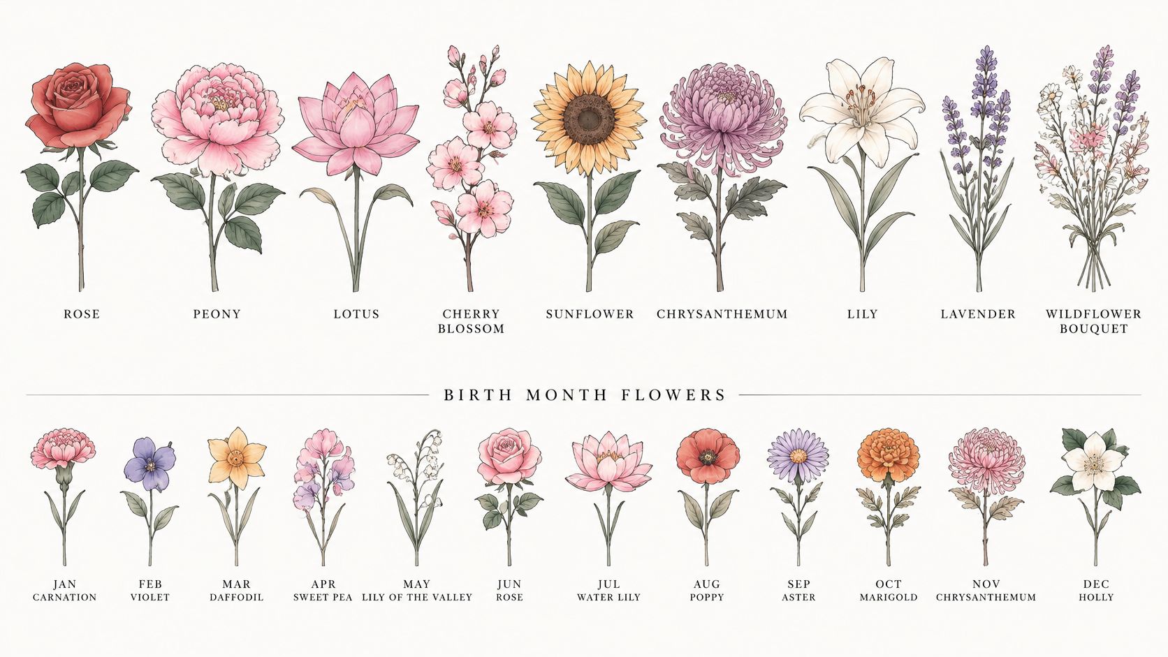
Flowers suit almost any placement and scale, which is why they work as standalone pieces or as filler between existing ink. Work in this order: pick the species, match a durable style, test the personal meaning, fit it to a placement, write a brief, then run the booking checks.
Flower Species at a Glance
| Flower | Often read as | Scale that holds detail | Treatment that ages cleanly | Easy mistake |
|---|---|---|---|---|
| Rose | Love, remembrance, or a named person | Small stem to medium bloom | Bold traditional or blackwork silhouette | Too many overlapping petals in a tiny outline |
| Peony | Prosperity, romance, or fullness | Medium to large | Japanese color blocking or strong contour | Cramming a full bloom onto a wrist |
| Lotus | Renewal, resilience, or a personal turning point | Medium | Fine line with open negative space or blackwork | Losing the center so it reads as a generic bloom |
| Cherry blossom | Impermanence, spring, or a season of change | Medium cluster or sleeve scatter | Japanese or limited-color branch | Micro blossoms that merge into dots |
| Sunflower | Warmth, loyalty, or a bright personality | Medium, with room for the disk | Realistic or traditional with a dark center | A flat circle with no seed texture |
| Chrysanthemum | Longevity, grief, or autumn, varying by culture | Medium to large | Japanese or bold line | Thin petals packed so tightly they heal as a blob |
| Lily | Remembrance, purity, or a specific person | Medium stem | Black and grey or traditional | Pointed petals that look like generic leaves at small size |
| Lavender | Calm, memory, or a place | Narrow vertical medium piece | Fine line spike or dotwork | A finger-size sprig with no separable florets |
| Wildflower bouquet | A relationship, family, or mixed identity | Medium to large arrangement | One hero flower plus simpler fillers | Equal detail on every stem |
| Birth-month flower | A birthday, child, or relationship | Set by that month's bloom | Whatever keeps the species recognizable | Simplifying until the month cannot be told |
Reading the Rows Like a Designer
Start with shape, not symbolism. A rose reads through overlapping petals. If you include a stem, thorns and leaves need enough separation to stay distinct. A peony is dense by nature, so it wants width. Shrinking it doesn't make it minimalist. It makes the center crowded.
A lotus needs a clear center and layered petals arranged around it. Lose that structure and viewers see a pretty, generic flower. Cherry blossom works as a cluster, which means the empty skin between blooms matters as much as the blooms. Without that breathing room, a branch becomes a pink smudge.
A sunflower depends on contrast between bright petals and its dark disk. Give the disk room for seed texture, even if that texture is simplified into dots or short marks. A chrysanthemum stacks many thin petals, so it's the opposite problem. You need fewer, clearer petals than a photo shows, or a larger canvas.
The Smaller, Trickier Blooms
A lily uses long pointed petals. At a good size, that shape is elegant and unmistakable. Too small, the petals look like leaves and the flower loses its identity. Lavender is a spike made of tiny florets. It's a strong vertical design on a forearm, calf, or rib, but it collapses on a finger because each floret needs its own gap.
- Wildflower bouquet: Pick one dominant bloom. Let the other stems be simpler shapes behind it, or every flower competes and the whole piece turns into visual noise.
- Birth-month flower: Judge it by recognizability. If you reduce a carnation, daffodil, or chrysanthemum to a generic outline, the month connection exists only in your explanation, not in the image.
- Single stem: Keep one clear identifier, such as the trumpet on a daffodil or the disk on a sunflower, and cut secondary detail first.
Scale rule: If you can't name the flower from across a room at the printed size, enlarge it or simplify the species, don't just thin the lines.
Choose your species from this chart first. Style comes next, because the same bloom can be durable or fragile depending on how it's drawn.
Styles That Hold Up Over Time
A minimal flower can be higher maintenance than a bold one. That's the counterintuitive part. A tiny stem made of hairline marks and micro veins looks low effort on a screen, but skin isn't paper. Pigment sits in the dermis and disperses slightly over time. Narrow, closely spaced lines can soften into each other, and pale shading can lose contrast faster than solid black structure.
The illustration below compares the main visual families before the detailed table breaks down how each one tends to age.
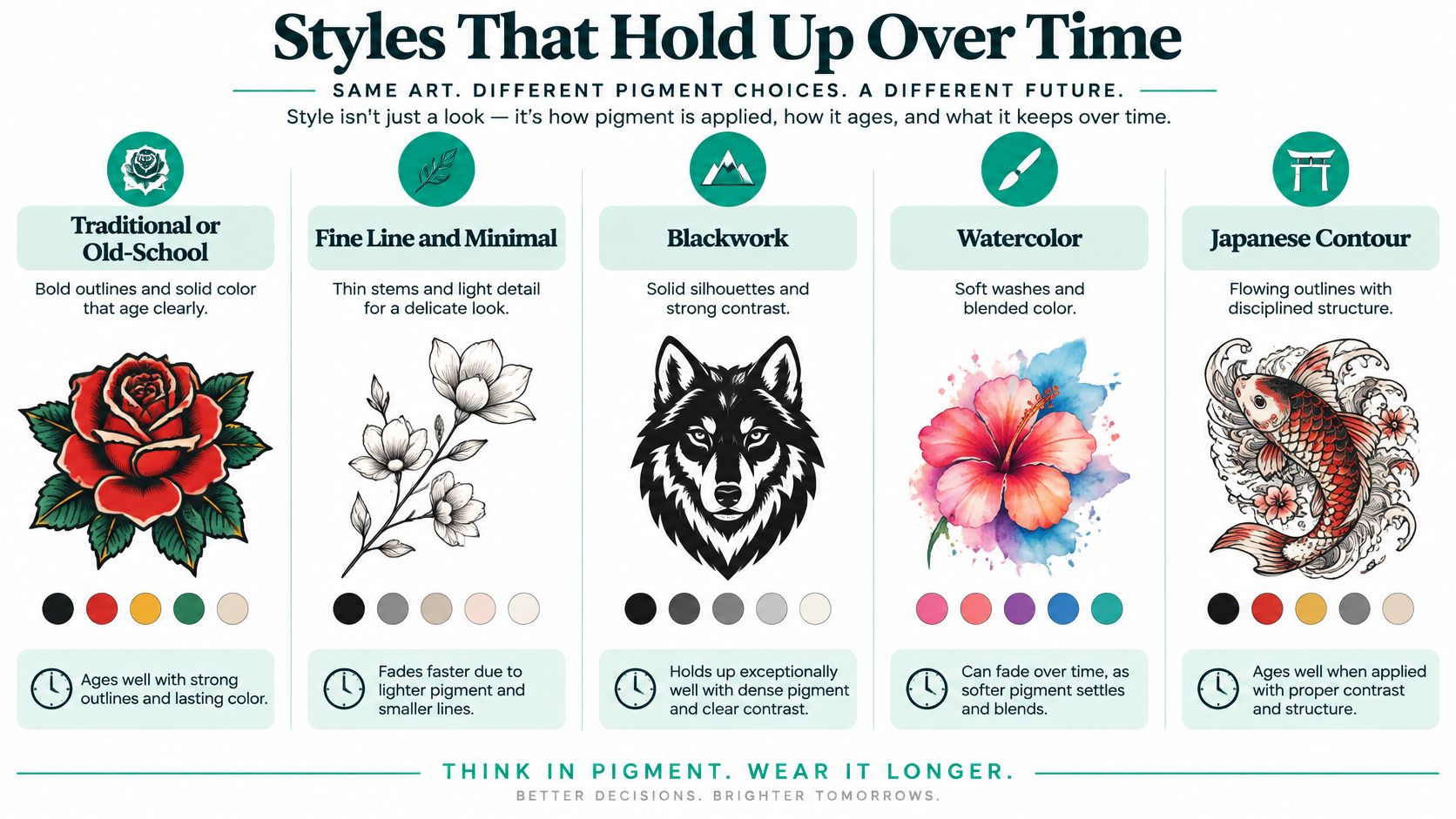
| Style | Line and color | Aging tendency | Best floral job |
|---|---|---|---|
| Traditional or old school | Heavy black outline, limited saturated color | Outline keeps the bloom readable | Single rose, peony, or banner flower |
| Fine line | Narrow black or single-color lines | Micro detail can soften and merge | One identifiable stem with open space |
| Blackwork | Solid black shapes and high contrast | Strong silhouette, less reliance on pale shade | Botanical silhouette or dense floral panel |
| Watercolor | Soft multi-hue washes, light structure | Pale areas can lose contrast sooner | Accent petals behind a darker stem |
| Japanese | Large scale, firm contour, color blocks | Holds at a distance when given room | Peony, chrysanthemum, lotus, or blossom branch |
| Geometric | Straight frames or repeating facets around the bloom | Framework lasts if lines are not hairline | Flower inside a shape or mandala |
| Dotwork | Tone from spaced dots, little gray wash | Dots can blob if packed too tightly | Gradual shading on a medium bloom |
| Realistic | Fine texture, many values, often color | Needs size and an artist used to soft edges | Portrait-like sunflower, peony, or lily |
Line Weight Does the Heavy Lifting
Blackwork, bold outlines, and high-contrast silhouettes generally provide stronger long-term readability than densely packed pale shading, as the FDA tattoo and permanent makeup fact sheet context on pigment behavior helps frame. The same FDA page notes that lighter colors such as yellow, green, and red are more difficult to remove than dark blue and black, and that no tattoo pigments are approved by the FDA specifically for injection into skin. Removal difficulty isn't a reason to avoid color. It's a reason to choose color deliberately.
Fine line still has a place. It works best when the design has one clear stem, generous gaps between petals, and no dependence on tiny interior veins. If your reference only reads when you zoom in, it won't read on an arm in normal light.
Color Load Is a Maintenance Choice
Watercolor copies translucent petals with soft transitions. That beauty depends on accurate pigment choices and careful healing. Muted edges may need refreshing sooner than a black outline. Japanese work solves the same problem differently, with larger scale, firm contour, and deliberate color blocks. Dotwork builds tone from separated points, so spacing is the whole technique. Crowd the dots and you lose the gradient.
For a deeper side by side of these families, our guide to tattoo styles and how they differ lays out the visual language before you commit to a floral version. In your own brief, name the species, the viewing distance, your minimum line weight, and whether the piece stays standalone or grows into a sleeve. A generator can show variants, but your tattooist still converts the chosen concept into a stencil with realistic spacing for petals, veins, and negative space.
Personal Meaning Beyond Stock Lists
Stock lists assign fixed meanings, such as rose for love, lotus for rebirth, peony for prosperity, or cherry blossom for impermanence, as noted in this overview of flower tattoo meanings, styles, and inspiration. Those labels can start a conversation. They can't finish it. Meanings shift by region, religion, family history, and what you pair with the flower.
The map below replaces a dictionary approach with questions you answer before you generate or book anything.
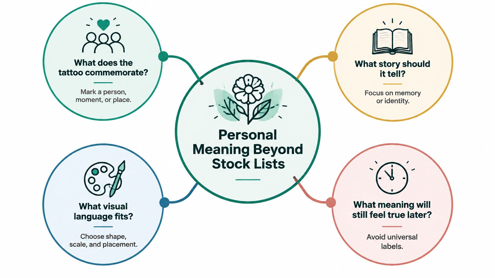
Four Questions That Beat a Meaning Chart
- What does it commemorate: Name the person, moment, place, or turning point in one sentence. "My grandmother's garden after she died" gives an artist more to work with than "love."
- Which tradition informs it: A lotus inside a specific religious tradition isn't a generic wellness icon. A chrysanthemum can signal grief in some places and longevity in others. Know the source you're borrowing from.
- Should strangers read it: Some people want a memorial anyone can recognize. Others want a private reference. That choice affects species clarity, names, and dates.
- Which details change the message: Season, color, number of blooms, orientation, and companions all shift the reading. A fresh red rose and a dried rose don't tell the same story.
Watch combinations, too. Pairing a memorial lily with a celebratory banner can blur whether the piece is grief, gratitude, or both. That mixture may be exactly right for you. Just make it intentional, not accidental.
This short video is a useful pause point if you're weighing a symbolic bloom against a literal botanical study, because seeing healed line work changes what people ask for.
Three Directions Instead of One Emblem
Generate or sketch three versions. Try a literal botanical study that shows the petal structure. Try a symbolic arrangement that combines the flower with a date, second bloom, or object. Then try an abstract interpretation that keeps the story through shape and movement without spelling it out.
Two ambiguities deserve honesty. A birth flower can matter to you and still be unrecognizable after simplification. A culturally specific motif copied from a trend board can lose the context that made it respectful. Neither problem means "don't do it." Both mean you should decide with your eyes open.
A flower tattoo doesn't need a standardized meaning to be valid.
Treat the "Often read as" column in the species chart as a starting label. Your story is the verdict.
Placement by Size and Wear
| Placement | Canvas | Friction | Flower fit |
|---|---|---|---|
| Forearm | Medium vertical or wrap | Moderate | Single stem, small bouquet, or readable rose |
| Upper arm or sleeve | Large continuous | Moderate | Branch, blossom scatter, or connecting florals |
| Shoulder | Medium cap | Low to moderate | Round bloom such as peony, lotus, or sunflower |
| Chest | Medium to large | Low, under clothing | Statement flower or symmetrical pair |
| Back | Large | Low | Full bouquet, Japanese panel, or spine stem |
| Thigh | Large | Moderate under clothes | Realistic bloom or wildflower arrangement |
| Rib | Narrow vertical | Flex and clothing | Single stem or stacked small blooms |
| Wrist | Small band | High | Simple silhouette, not a dense peony |
| Ankle | Small | High, shoes and socks | Compact flower with a short stem |
| Finger | Very small | Very high | One bold icon, expect softer detail over time |
| Neck | Small and visible | Moderate | Tiny bloom only if the shape stays obvious |
| Hip | Small to medium | Clothing rub | Vertical floral accent rather than micro veins |
Big Canvas, Honest Detail
Forearm, thigh, shoulder, chest, and back give medium or large blooms room for the gaps that keep petals separate. A shoulder cap suits round flowers because the body's curve supports the bloom's shape. A thigh can carry a realistic peony or a wildflower arrangement without squeezing every stem into the same width.
A sleeve changes the job. There, flowers often work as connectors: a blossom branch wrapping between older pieces, scattered cherry blossoms filling gaps, or a bouquet that flows from shoulder to elbow. Tell your artist if future pieces are planned. A flower that looks complete alone may block the best path for later work.
Small Canvas, Simpler Flower
Wrist, ankle, finger, and neck placements are small, visible, and exposed to frequent friction or movement. That's where people get disappointed. A sunflower disk that looks sharp in a phone photo can turn muddy on a finger because there's no room for seed texture. A lavender spike loses its florets. A peony becomes a round knot of lines.
- Wrist: Choose a bold silhouette with one readable bloom, not a bouquet.
- Ankle: Keep the stem short so socks and shoe edges don't cross the most detailed area during healing.
- Finger: Expect softer detail over time and discuss touch-ups before you commit.
- Rib and hip: Vertical stems fit the shape, but skin flexes and clothing rubs. Avoid micro veins there.
Lower-friction areas generally suit fine detail better than spots that scuff daily, though no site is maintenance free. Our tattoo placement guide for canvas and visibility can help you compare zones before you test a design.
Print the flower at life size and tape it to your body. Bend, sit, and look in a mirror from a normal distance. A flat concept is not a body preview, and we do not currently offer a way to preview a tattoo on your body. Your artist still checks curvature, muscle movement, and how the stem follows the limb. Finish this step with one placement that matches the scale your species needs.
How to Brief a Flower Design
A good brief fits on one page. It doesn't need art terms. It needs the species, the story, the size, the style constraint, and what must stay readable.
The six steps below turn a saved gallery of maybes into one reference your artist can redraw.
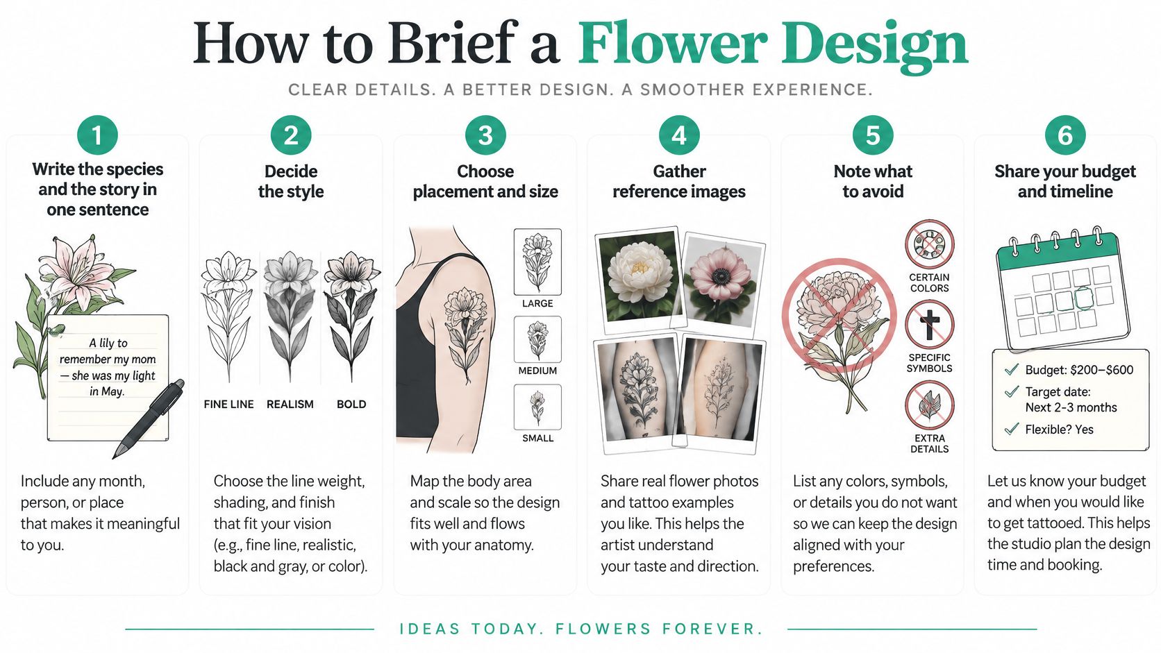
Steps 1 to 3 Lock the Decisions
- Write the species and story in one sentence: Include any month, person, or place. For example, "A November chrysanthemum for my brother, no name." Skip stock slogans unless they're yours.
- Lock placement and approximate size: Use plain language, such as a forearm stem about as long as your hand, or a shoulder-cap peony. If you use a measurement in a mockup, treat it as a test size with your artist, not a promise.
- Choose one primary style and one constraint: Minimum line weight, black only, or a short color list. If pale yellow, green, or red carries the design, say how you'll handle future fading or touch-ups.
Don't add objects to fix a weak flower. If the bloom doesn't read, iterate on species clarity and line weight first. Extra ribbons, bees, and lettering only hide the problem for a week.
Steps 4 to 6 Generate and Filter
- Generate concepts in TattoosAI: The generator works in 3 steps: enter your idea, select style and color, then get your tattoo design. Each output is a fresh concept for that request.
- Create three directions: Make the literal, symbolic, and abstract versions. Keep the one whose petals, center, and negative space still read at your intended size on paper.
- Save one favorite as a reference: You're free to use what you generate, including getting it tattooed. Bring the image to your artist as a starting point.
A useful prompt sounds like this: "Blackwork peony with open petal gaps for an upper arm, no micro veins, readable from across a room." Notice what's in it. Species, style, placement, a negative constraint, and a readability test. Notice what's not in it. No pile of extra symbols.
Before you send it: Shrink the image to the size you want on skin. If you have to zoom to tell a lily from a leaf, the design isn't ready.
Say this plainly to yourself and your artist: the result is a reference for a tattoo artist, not a stencil, and the artist must adapt it to your body, skin and how the design will age. A good artist may widen gaps, drop two petals, or thicken a stem. That isn't them ignoring your idea. That's them translating a flat image into skin.
Bring two backup variants, one slightly bolder and one slightly larger. If the artist says the delicate version will merge, you already have an option you like. You won't have to redesign from scratch in the chair.
Questions to Ask Before You Book
Book only after the concept survives a practical check with a real tattooist. If you want the tattoo done, you take the design to a tattooist you trust. We're a small independent product, not a marketplace and not a studio, so the booking judgment stays between you and that artist.
Our generator offers 19 tattoo styles, including Sketch, Realistic, Minimalist, Black and White, Surreal, Geometric, Blackwork, Japanese, Old School, Cartoon, Watercolor, Dotwork, Tribal, Abstract, Negative Space, Lettering, Biomechanical, Portrait, and 3D. That means your reference can already speak a style language your artist recognizes. They still redraw it for skin, scale, and placement.
Safety Questions to Ask Out Loud
- Needles and setup: Are needles single-use, and what gets opened in front of you?
- Ink traceability: Can the studio identify ink lots if a reaction happens later?
- Dilution practice: How are pigments diluted, and is sterile water used?
- Aftercare: Will you leave with written aftercare, not just verbal instructions?
- Color history: For red, yellow, or green heavy florals, discuss allergy history and future color maintenance.
Those questions matter because the FDA guide to thinking before you ink reports that contaminated tattoo inks can cause infections even when containers are sealed, and that nonsterile water used to dilute pigments is a common contamination route. The same guidance warns that adverse reactions can occur immediately or years after tattooing. A sealed bottle isn't the whole safety story.
For reaction and medical context, the American Academy of Dermatology page on tattoo skin reactions is the right kind of source to discuss with a clinician if you have sensitive skin or a history of reactions. Red ink is more often linked with allergic reactions than many other colors. Tattoos can also rarely produce burning or swelling during MRI scans, so tell medical staff about tattoos before imaging.
Separate Medical Facts From Taste
No flower or style is universally safest. A blackwork rose isn't medically "better" than a watercolor peony. They carry different pigment loads, different healing demands, and different aging patterns. Watercolor and highly saturated petals depend more on accurate pigment selection, controlled saturation, and disciplined aftercare. Japanese color blocking and carefully spaced dotwork solve readability differently. Your artist should explain the trade-off for your skin, not sell you a category.
Ask about expected touch-ups, line longevity on your chosen placement, and whether tiny details should be enlarged. If the delicate version relies on marks that will blur, choose the bolder variant you already generated. Leave the consultation with one approved drawing, one placement, and a healing plan. If you can't name all three, you're not ready to book yet.
Ready to test your flower at a size and line weight that will still read on skin? Generate literal, symbolic, and abstract versions of your rose, peony, lotus, or birth flower with TattoosAI, save the clearest reference, and take it to a tattooist you trust for the final stencil.