TattoosAI
Black isn't the compromise colour. Black and grey ink took 60.5% of the global tattoo-inks market in 2026, according to Globe Market Research, and part of the reason is mechanical. Black pigment is the most stable thing in the cabinet, so a black line that softens is still a black line. An ornamental blackwork tattoo, all symmetry, solid fill and fine line, is the most forgiving thing you can put on a body and still recognise twenty years later.
Forgiving isn't foolproof. The same density that keeps a piece legible at fifty is what makes a badly spaced one close up at five, and placement decides which of those happens. Seven motif and placement combinations follow, each judged on the two things most galleries skip: where the design belongs, and how it behaves as skin changes.
Table of Contents
- 1. Ornamental Mandala Blackwork
- 2. Blackwork Geometric Sacred Geometry
- 3. Ornamental Blackwork Botanical Florals
- 4. Blackwork Celtic and Knotwork Ornament
- 5. Ornamental Blackwork Filigree and Lace Patterns
- 6. Blackwork Dotwork Ornamental Gradients
- 7. Ornamental Blackwork Frames and Cartouches
- Ornamental Blackwork Styles at a Glance
- From Concept to Commitment: Your Next Step
1. Ornamental Mandala Blackwork
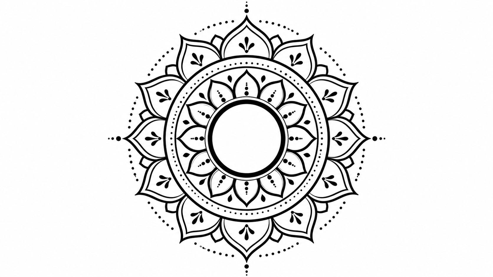
A mandala is a radial structure: a solid black core, one or two line rings, and a dotted or stippled outer ring, repeated with symmetry in every direction. It's the most requested shape in ornamental work and the one that punishes lazy spacing hardest, because every element repeats and every flaw repeats with it. Ornamental blackwork grew out of a decorative branch of the blackwork tradition built on repeating geometry, mandala-like structures, fine dots and negative space, as the history of blackwork tattooing documents.
The version that holds at chest scale has a solid core and dotted outer rings:
Centre placements carry it best. A sternum piece uses the flat of the breastbone for the core and lets the outer rings ride the pectorals. A full back panel scales the rings out to the shoulder blades. A shoulder cap wants a half mandala that stops at the deltoid seam rather than a full circle squeezed onto a curve.
The outer dot ring is the part that fails first. Dots merge into a grey smear years before solid fill shows any change, and tight ring spacing speeds that up.
Ask for this before the stencil: the gap between the outer dot ring and the line ring, shown at full stencil size rather than on a tablet.
A sternum mandala at eight inches holds fine dots. The same drawing squeezed into five inches doesn't, and the client finds out two summers later.
2. Blackwork Geometric Sacred Geometry
Sacred geometry needs room to stay legible. Overlapping circles, triangles, hexagons, the Flower of Life and Metatron's Cube all rely on clean alignment. A small shift can make a repeating pattern look uneven, so choose a design scaled to the body rather than transferred onto it. Browse sacred geometry tattoo ideas for patterns to discuss with your artist.
Match the pattern to the placement. Forearms and collarbones suit a single strong figure. Shoulders and upper backs can carry nested compositions across a broader area. Ribs are harder: breathing moves the skin, and lines that cross the rib margin can look curved from most viewing angles.
Keep the line weights consistent. Fine liners suit filigree and micro-detail; heavier liners define the main outlines. Flat or magnum shaders spread pigment across a wider area for solid coverage, helping preserve clean negative space around the geometry.
What to confirm before the stencil
- Measuring workflow: for repeating shapes, ask how the artist will check spacing and alignment, using a stencil, dividers or a printed grid where appropriate.
- Symmetry or deliberate offset: choose one. An accidental-looking mismatch can distract from the pattern.
- Ring count at final size: check which elements remain distinct at the intended width. Remove details that would have to be crowded together.
A pattern that reads clearly on a screen can close up on skin. Confirm the stencil at its actual size and placement before the tattoo begins.
3. Ornamental Blackwork Botanical Florals
Say you want a rose on your thigh and you don't want it reading as a sticker from across a room. Blackwork fixes that by treating the flower as pattern: petals packed solid black, highlights left as bare skin, stippling for the soft edges, leaves flattened into graphic shapes instead of shaded like a photograph. The flower becomes ornament, and ornament sits on a body better than a picture does.
Single-colour work has the numbers behind it. The epidemiological review published by ISPRA reported that 63% of surveyed tattoos were single-colour and that black was the typical colour in 59% of cases. A black-dominant floral isn't a fallback decision for many clients. It's the default.
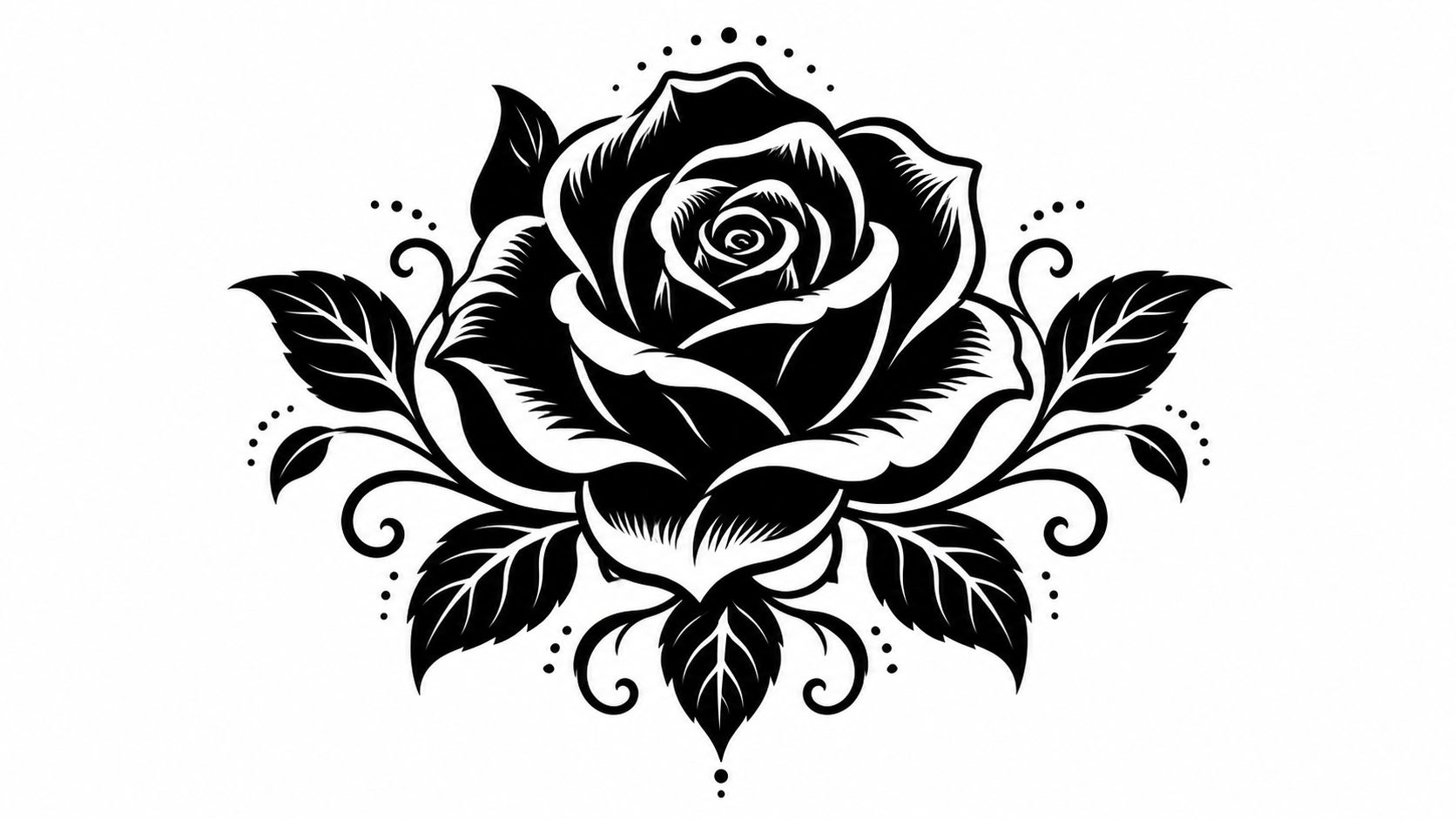
Placement. Sleeves and thigh panels take the large compositions. Calves and forearms take wrapping vines that follow the muscle rather than sitting in a rectangle on top of it. Ankles and hands are where botanicals go to die: friction, sun and thin skin erase fine detail inside a decade.
Leave the gaps open
The failure mode for botanical blackwork is leaves that touch. Solid black leaf, solid black leaf, no skin between them, and at year eight you have one black mass with a stem. Keep a clear bare-skin channel between every element, and let stippling do the transitions instead of packing more black.
4. Blackwork Celtic and Knotwork Ornament
Interlaced knots, spirals and braided bands, drawn with a precise over-under weave. The trade-off is honest: knotwork looks best dense, and density is exactly what makes it hard to fill evenly. An armband is a closed loop, so the join where the band meets itself shows every wobble in saturation.
Fill is the whole job. The Tattlab professional needle guide notes that #12 needles at roughly 0.35 mm are a common bold-saturation standard, while finer #8 and #10 options near 0.25 mm and 0.30 mm restrict ink flow and suit delicate detail or gradual buildup. It lists 15M1–23M1 configurations for faster coverage on large solid motifs, with consistent depth around 1–2 mm to reduce blowouts and pigment fallout.
A short walk through the weave, useful before you commit to a band width:
Band width and the join. A narrow band on a forearm reads as a bracelet and loses the over-under structure below about a centimetre of interlace. Wider bands on the upper arm and calf keep the weave visible. Ask the artist to draw the join at full size before anything is stencilled, because that seam is where a copied Book of Kells panel stops being a manuscript page and starts being a tattoo.
Read the meaning first. The triquetra, the Dara knot and the various eternity weaves carry different associations, and some of what gets sold as Celtic in a Western studio is loosely borrowed from living traditions. Pick a knot you can explain in one sentence, and let the artist rebuild it for your arm rather than tracing a photograph.
5. Ornamental Blackwork Filigree and Lace Patterns
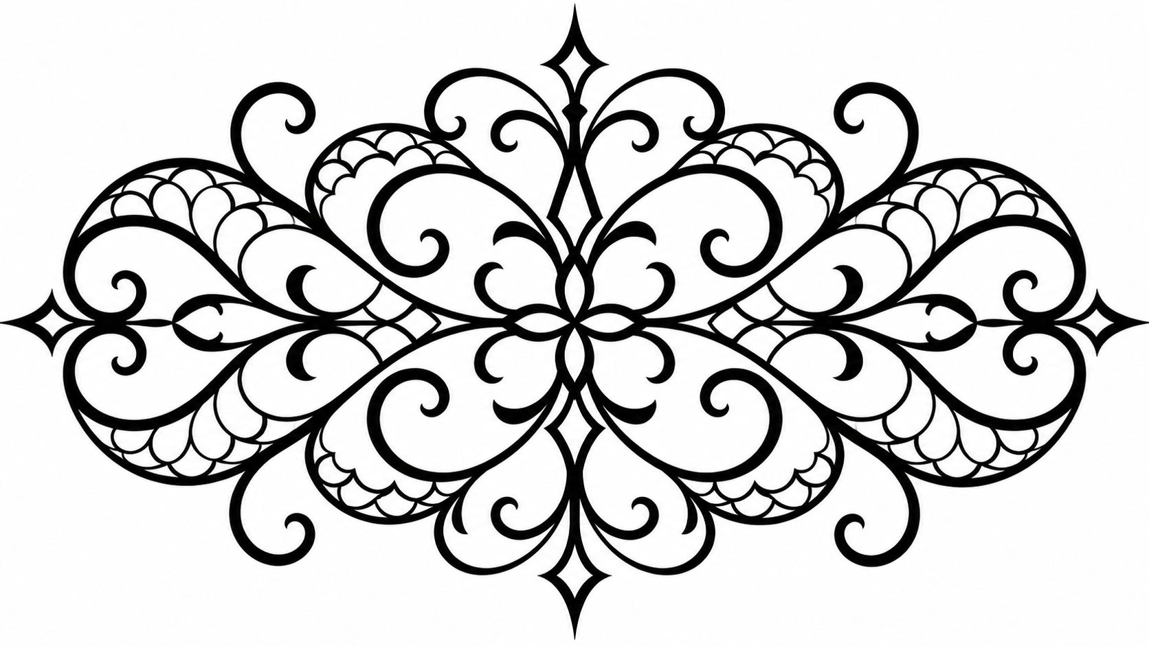
Filigree is the most beautiful category on this list and the least forgiving. Hairlines, scrolls and perforated shapes that mimic lace or wrought metal depend on spacing measured in fractions of a millimetre, and skin does not respect fractions of a millimetre forever.
The rule: if a line has to be thinner than the fill beside it to look right, the piece is either too small or in the wrong place.
Placement. Shoulder-to-elbow panels, upper back panels framing a central motif, and the outer forearm all give you room. Fingers, the inside of the wrist and anywhere across a joint are the wrong answer, because the pattern is a repeating grid and anything that flexes breaks a grid visibly.
The aging conversation is the important one. Narrow gaps close as ink spreads, delicate details merge, and small asymmetries become obvious in a large central piece. Print the design at its intended size, tape it on, and look at it from two metres and from thirty centimetres. Then ask to see healed filigree, not fresh work, and ask directly how a cover-up or removal would work later. Removal of extensive black coverage can take multiple sessions and may not restore unmarked skin, which makes "will this still work in fifteen years" a different question from "do I like it today".
Demand isn't the constraint here. One industry forecast values the tattoo market at USD 2.43 billion in 2025 and projects USD 5.99 billion by 2034, per Fortune Business Insights, and plenty of artists will say yes to a lace sleeve. Fewer can hold a hairline for a decade.
6. Blackwork Dotwork Ornamental Gradients
Stippling instead of fill. A gradient built from thousands of individual dots gives you grey without grey ink, plus a hand-made texture that solid fill can't produce. It's also the slowest technique on this list, and the price reflects that.
Peachy Tattoos puts a 6-inch ornamental hip tattoo at 5–8 hours and USD 900–1,800 at a mid-tier studio. Dotwork sits at the top of that range, because a gradient is drawn dot by dot at a consistent depth and the skin stops cooperating long before the design is finished.
Placement. Forearm gradients that fade toward the wrist work because the limb tapers and the eye reads the fade as natural. Chest pieces that pair a solid mandala core with stippled outer rings work for the opposite reason: the solid black anchors the composition when the dots soften. Calves hold bigger dots than the inner arm, which holds them better than the ribs.
Where dotwork actually blurs
Dotwork doesn't fail by going patchy. It fails by going flat. Dots expand, the gaps between them shrink, and the contrast between a light stipple field and a dark one disappears, so a soft gradient slowly becomes an even grey wash. If you want depth that lasts, keep one or two bold solid elements in the design and treat the dots as shading around them. Look at healed dotwork in the artist's portfolio before you book, and look at it in daylight rather than under studio lighting.
More on the technique itself sits in this guide to the dotwork tattoo style.
7. Ornamental Blackwork Frames and Cartouches
A cartouche is the rare ornamental design where the frame does the work and the lettering stays small. Scrolled borders, ornamental corners, a banner or a shield, wrapped around a name, a date, a short phrase. It's the most practical item here for a memorial piece, and the easiest to get wrong at the lettering stage.
Letter height decides everything. Text is the first thing to close up. Keep the phrase short, confirm the letter height at full stencil size, and give the inner border a clear gap so the scrolls never collide with the letters. A three-word phrase inside an eight-centimetre frame survives; a full sentence inside the same frame turns into a smudge.
Shape follows the body. Oval frames suit forearms and biceps, rectangles suit the ribs and sternum, and a vertical cartouche works down the spine in a way a wide one never does.
Ornamental artists in major US and European cities commonly charge USD 180–350 per hour, according to Peachy Tattoos' ornamental style guide, and a frame is mostly drawing and layout time rather than fill time. Budget for the design conversation, not just the needle.
Design the outer edge so a second panel can join it later. Frames are what people add to.
Settle one thing with your artist before the stencil: whether the frame is a standalone object with a hard border, or a module that can grow into a half sleeve. The first looks deliberate today and awkward later. The second costs nothing now and saves a rework.
Ornamental Blackwork Styles at a Glance
| Item | Signature Look | Best Placements | Aging / Durability Notes |
|---|---|---|---|
| Ornamental Mandala Blackwork | Radial symmetry, concentric rings, solid black shapes, and dotted details | Chest, back, shoulder cap, thigh | Bold areas hold their shape; fine dotwork may blur, especially in high-friction areas |
| Blackwork Geometric Sacred Geometry | Precise circles, triangles, and interlocking patterns with black fills and fine lines | Forearm, collarbone, upper arm, shoulder | Tight spacing can blur or close up; hairline details may need touch-ups |
| Ornamental Blackwork Botanical Florals | Stylized flowers, leaves, and vines with bold silhouettes and negative-space details | Full sleeve, thigh, calf, back of shoulder | Solid shapes stay legible; thin vines may fade and dense areas can become muddy |
| Blackwork Celtic and Knotwork Ornament | Interlaced knots, spirals, and braided bands in bold black and negative space | Upper arm, forearm, calf, ankle | Bold bands and knots tend to age well; small intricate interlacing may lose clarity |
| Ornamental Blackwork Filigree and Lace Patterns | Fine scrolls and lace-like openwork arranged in decorative panels | Full sleeve, upper back, thigh, forearm | Fine details are prone to blurring; careful spacing supports long-term readability |
| Blackwork Dotwork Ornamental Gradients | Stippled gradients and ornamental motifs, often paired with solid black accents | Forearm, chest, upper arm, back | Dots may soften or spread over time; bold accents help preserve definition |
| Ornamental Blackwork Frames and Cartouches | Decorative scrollwork borders framing text, dates, or small motifs | Forearm, ribs, calf, upper arm | Strong frames help maintain legibility; fine scrolls may need touch-ups and small text can crowd |
From Concept to Commitment: Your Next Step
Whichever direction you choose, the winning move is the same. Lock the composition before you book, then pressure-test it against your placement rather than against a screen.
Print the design at its intended size and tape it to the skin. Look at it from two metres away, then from thirty centimetres, then in a mirror, which is how everyone else will see it. If the detail only reads when you're squinting up close, it's already too fine. If the symmetry only works at one angle, the placement is wrong, not the drawing.
Then take three questions to the artist. Show me healed blackwork at this scale, not fresh work. How much gap are you leaving between these elements once the stencil is on skin. And if I want to extend this in two years, where does the outer edge go. An artist who answers all three without flinching is the one you want packing solid black into your skin.
If you want a starting point rather than a blank page, TattoosAI's generator takes a written brief, offers a Blackwork style among 19 options, and returns several concepts in seconds. The Blackwork style page alone holds 40+ design ideas, and every image is created for your request rather than pulled from another artist's portfolio. The output is a reference for the studio, not a stencil: no tool knows your skin, and there's no way to preview a design on your body yet, so the artist still owns the resizing, the spacing and the session plan.
Do that groundwork now, and the piece will still hold its shape decades from today.
TattoosAI turns a paragraph of description into concrete blackwork concepts you can hold a real conversation about, with ornamental layouts, mandala structures and negative-space ideas generated from your own brief instead of a gallery you have to reverse-engineer. Take two or three of those references to your artist and you'll spend the consultation on spacing and placement rather than on explaining what you meant. Head to TattoosAI and describe the piece you've been circling for months.