TattoosAI
You've picked the date. You've checked the conversion twice. Now comes the question almost nobody asks before booking: how much actual width sits between the base of your hand and the point where your forearm starts to widen, and how many characters can that space hold at a size that will still read in ten years?
Most numeral advice stops at meaning and font choice. It skips the mechanics that decide whether the piece stays crisp: character count against wrist width, stroke weight against ink spread, and orientation against the way skin folds when you type, drive, and lift. A four-character year and an eight-character date need different layouts even in the same typeface. The wrist doesn't forgive either one if the spacing is wrong.
This list covers seven approaches to a Roman numeral tattoo on wrist, and treats each as an engineering problem rather than an aesthetic one. Placement, curvature, minimum stroke scale, and how the thing behaves at year five all get addressed per design. You'll get what works, what fails without warning, and how to brief an artist so the stencil matches the idea in your head.
Table of Contents
- 1. Date or Birth Year in Roman Numerals
- 2. Single Numeral as a Symbol
- 3. Milestone Countdown or Tally with Numerals
- 4. Clock-Face or Watch-Band Numerals
- 5. Ornamental Serif Numerals with Small Accents
- 6. Dotwork or Geometric Roman Numerals
- 7. Stacked or Paired Numerals for Two Dates or Names
- 7 Roman Numeral Wrist Tattoo Ideas at a Glance
- From Date to Design: Making Your Numeral Wrist Tattoo Real
1. Date or Birth Year in Roman Numerals
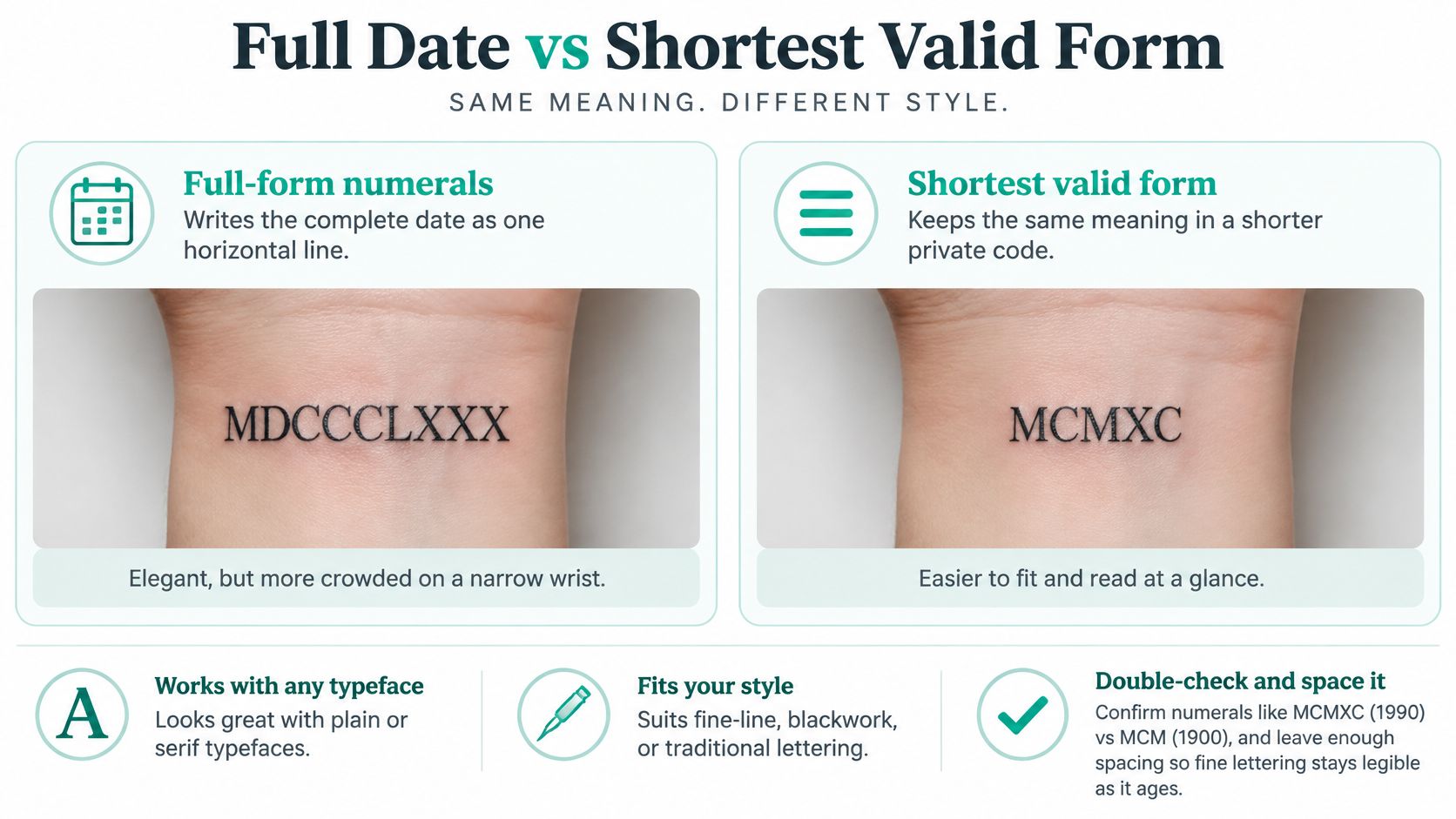
A year is the compact version of this idea: a birth year, an anniversary, the date someone died. On the inner wrist it still has to earn every millimetre of width. MCMXC for 1990 and MMXXIV for 2024 sit in the few-character range that can read cleanly on one line; once you add a day and month, the count climbs and the letters either wrap, shrink, or lose the air between strokes that keeps them separate after healing.
The characters carry ceremony because they are old. The system reaches back roughly 2,000 years to ancient Rome, and the forms were not fixed all at once: Britannica's history of the Roman numeral notes that L and D appeared in the Late Roman Republic while M settled into 1,000 during the Middle Ages. Subtractive pairs such as IV and IX were used unevenly in ancient practice and standardized later, which is why a modern date can be wrong even when it looks convincing.
Where date tattoos go wrong
Two failures dominate, and neither starts with the machine.
- The arithmetic. MCMXC and MCM differ by only the two characters XC yet mean 1990 and 1900, so a dropped pair is an easy error. Check the conversion twice, then have the artist read the finished stencil back in Arabic numbers before lining starts.
- The width. A full date at a readable height usually wants the inner forearm just below the wrist crease, or a two-line stack; a single tight run around the curve is where spacing fails. Wrist skin flexes every time the hand bends, and crowded uprights and closed bowls blur first.
- The height. Lock character height before choosing the typeface. If the size that fits your wrist cannot hold serifs, counters, and spacing, the font is wrong for this placement.
Practical rule: if the stencil is not legible at arm's length under normal room light, the characters are too tight for the space.
2. Single Numeral as a Symbol
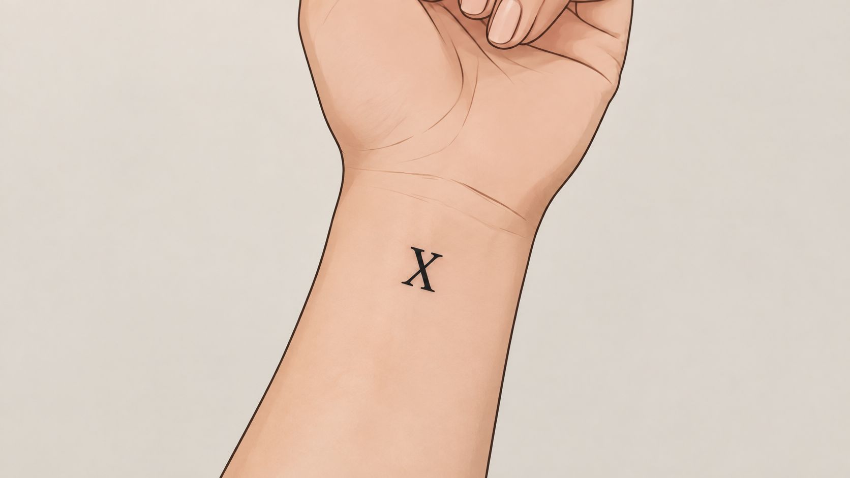
A solitary I, V, X, or L is the most forgiving thing you can put on a wrist. One character means no tracking decisions, no wrapping, no shrinking to fit. It also keeps its meaning private, which is the point when the number is a sobriety count, a jersey, or a decade marker.
Wrist and hand tattoos are common enough that any working artist has watched a lot of them heal. That experience is worth using. Ask what they've seen blur, fade, or fold badly on this exact patch of skin, because the inner wrist is thin, mobile, and sits next to a crease that never stops bending.
What a single character can and can't do
The main risk with one stroke is that it reads as a scar or a smudge rather than a numeral. A bare I with no serifs and no weight looks like a mark; a serif I looks like a numeral. Decide which you want before the stencil.
- Give the stroke some mass. A single needle line at hairline weight on the inner wrist can soften into an indistinct dash as pigment settles. A slightly heavier line holds its shape through that spread.
- Watch the angle on the outer wrist. A V or X placed on the outer side sits at a different angle when your arm hangs at rest than when you hold it out flat for the artist. Check both positions, because the wrist's curve exaggerates any tilt.
- Test placement with a marker first. Draw the character, live with it for a day, and photograph it in the mirror. Your own viewing angle matters more than the mirror shot.
Say you're marking ten years off alcohol with an X. Put it on the inner wrist where you'll see it while working, size it so the two strokes stay distinct at that distance, and keep it clear of the crease so nothing folds through the middle of the letterform. One clean character, placed well, ages better on the wrist than almost any other concept in this list.
3. Milestone Countdown or Tally with Numerals
Numerals plus tally marks record something still moving: years clean, races finished, months survived. The numeral anchors the unit and the tallies count them. It's a strong idea with a built-in weakness, because tallies are short, thin, closely spaced strokes in exactly the configuration that ages worst.
Artists have been saying this out loud. A 2025 local news report quoting tattoo artists notes that tiny fine-line tattoos often lose their crisp, small appearance as they heal and age, even though fine lines stay popular, per The Daily Record. Tally marks are the purest example of the problem.
Design rules for strokes that repeat
Four decisions control whether a tally block survives.
- Fix the final count before design. A row of five and a row of twenty need different footprints, and retrofitting later crowds the wrist.
- Keep every mark the same length and the same gap. Uneven spacing looks like an accident within a year.
- Leave a deliberate margin. If the count may grow, reserve clear skin beside the last mark rather than jamming the block against the wrist bone.
- Go heavier than feels necessary. Thicker individual marks blur into each other more slowly than hairlines, which sounds backwards until you see both healed.
Tally marks fail in the same place every time: the gap between strokes. Widen it while the design is still on paper.
A worked version: five years sober becomes a V followed by three wider-spaced tallies in a single row, sized so the whole block spans the wrist without touching the crease. Ask the artist to draw the block at the finished scale on your skin, not on the desk.
4. Clock-Face or Watch-Band Numerals
A watch dial gives you four fixed positions, and that geometry maps onto the wrist better than almost anything else. The usual build is a partial arc of numerals across the inner wrist, or a thin band running the circumference like a bracelet. Both read as a timepiece reference without drawing an actual clock.
Band designs cross the wrist crease, and that's where placement discipline matters. An expert quoted by Allure advises positioning a wrist tattoo a couple of inches below the crease, because movement and healing conditions in high-flex areas affect how the piece holds up, as summarized in AARP's roundup of tattoo survey findings. The same reference notes that Ipsos polling found roughly 12% of tattooed respondents reported regret, against 88% reporting happiness. A full band is a larger commitment than one small numeral, so give it more thought, not less.
IIII, not IV, if you want the traditional look
Clock faces have used IIII for four for centuries, and the asymmetry looks deliberate once you notice it. If you want the vintage dial reference, ask for IIII. If you want strict numeral accuracy, ask for IV. Pick one and stay consistent across the whole arc.
The bend test
Have the artist stencil the arc, then look at it with your wrist bent, straight, and turned over. The numerals will shift relative to each other as the skin moves, and a gap that looks even at rest can bunch when you flex.
For more on anchoring dates and times to a dial layout, the guide to birth clock tattoos covers how the numerals get arranged around a face.
5. Ornamental Serif Numerals with Small Accents
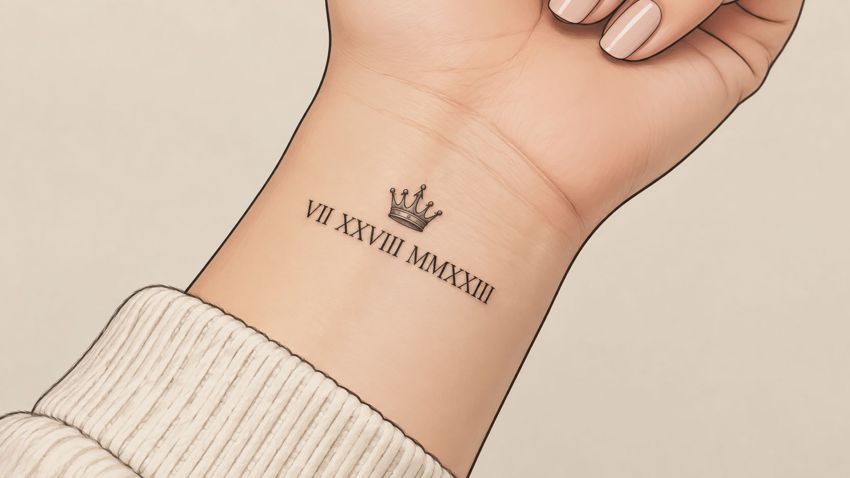
This is the engraved, coin-lettering look: bracketed serifs, fine cross strokes, sometimes a crown, star, compass, or rose tucked above or below the numerals. It photographs beautifully on the day and is the design most likely to lose detail in healing.
The constraints are specific. Specialist design guidance for numeral tattoos recommends prototyping the complete date at approximately 5 mm capital height or larger, then validating the stencil at true wrist scale rather than on a screen, per Romanize's numeral font and legibility notes. The same guidance flags compressed spacing as the reason I and X sequences visually merge.
The serif problem
Hairline serifs are the first detail to go. They're small, they sit at the edge of the letterform, and pigment spreading across a few millimetres erases them faster than the main stroke softens. A numeral that depended on delicate serifs to look engraved ends up looking like a plain bold number with slightly ragged edges.
Fine serifs and tight tracking are the two most common reasons a numeral date reads as a smudge by year three.
Keep serifs thick enough to survive, and choose one accent motif. A crown plus a rose plus a banner crowds a two-centimetre wrist panel into noise. Place the accent where it won't be crushed by the hand's movement, which usually means above the numerals rather than below.
Before booking, ask to see the artist's blackwork and engraved lettering work at healed stage if they have it. Fresh photos hide everything.
6. Dotwork or Geometric Roman Numerals
Dotwork builds the numeral from stippled points or straight geometric segments, which gives an old notation a contemporary edge. On a wrist it's a texture play: the shape of the numeral has to read from dots alone, and dot density does more visual work than line weight.
The failure mode is the same one that hits every dotted piece. Individual dots spread slightly as the skin heals, and a dense field becomes a solid grey block while a sparse field holds its grain. Ask for wider dot spacing than the reference image shows, especially in the strokes of a numeral where two dotted lines sit close together. A single-needle hand builds dots tighter than a small liner group, so the artist's tool choice changes the finished density.
Frames and borders
Geometric work responds well to a container. A thin rectangle, a partial circle, or a triangle around the numerals gives the eye edges to read against and stops the dots from looking like a birthmark at a distance.
- Choose one construction method. Dots forming the strokes, or solid straight bars forming the strokes with dots as filler. Mixing both muddles the read.
- Keep the frame line weight above the dot weight. Otherwise the border disappears into the fill.
- Test densities on paper. Print three versions at wrist scale before committing.
Reading first-timer guidance on how dotwork tattoos are built helps you ask better questions about needle groups and spacing. For the wider style picture, this dotwork tattoo style guide covers how shading, texture, and healing interact in dotted pieces.
7. Stacked or Paired Numerals for Two Dates or Names
Two dates on one wrist is a layout problem before it's an emotional one. Two birth years, a wedding and a birth, two people's anniversaries. Stacked vertically along the arm axis, they read as a column. Side by side horizontally, they eat width fast and force smaller characters.
Stack when the strings are long. A vertical stack on the inner wrist follows the forearm's natural line and gives each date its own row with full letter spacing. Horizontal pairing works when both strings are short, like two single numerals or two four-character years, separated by a thin rule, a dot, or a small symbol.
Plan for the possibility that one date stops being meaningful
This is the part that rarely gets discussed. A dated tattoo is a permanent bet on how you'll feel about a year, and the wrist is one of the harder places to undo a bet.
A 2025 prospective model cited in a study on laser tattoo removal found hand and finger tattoos required the highest average number of laser sessions among the locations evaluated, at about 7.8 sessions, with ink density as the strongest predictor of treatment burden. A separate case report in the same source found wrist tattoos faded more slowly than tattoos on several other body areas and needed additional sessions. Small and black does not mean easy.
Three practical moves follow. Choose dates whose meaning doesn't depend on another person's continued presence. Consider a symbol that stands for the year rather than the four characters. And if you're tattooing a shared date, talk to the other person first, then decide whether a paired design or a single one serves you better if circumstances change.
7 Roman Numeral Wrist Tattoo Ideas at a Glance
| Design | Complexity | Best Placement Area | Best For |
|---|---|---|---|
| Date or birth year in a single line of Roman numerals | Simple | Inner wrist | First-time tattoo seekers wanting a meaningful, low-commitment design |
| Single Roman numeral as a personal symbol | Very simple | Inner wrist, outer wrist, or thumb-side edge | Tattoo enthusiasts wanting a small, meaningful first piece |
| Roman numeral paired with tally marks or a countdown | Moderate | Wrist | People marking personal progress or achievements |
| Clock-face or watch-band numerals in a curved or wrapping layout | Detailed; requires precise alignment | Around the wrist or inner wrist | Design-savvy creatives who like classic or vintage aesthetics |
| Ornamental serif numerals with a small accent motif | Detailed | Wrist, especially the inner wrist | Tattoo enthusiasts wanting a detailed, heritage-inspired piece |
| Dotwork or geometric Roman numerals | Detailed; requires precise spacing | Wrist | Design-savvy creatives wanting a modern, textured look |
| Two Roman numeral dates or names, stacked or paired | Moderate | Wrist | People planning a meaningful tattoo for two people or two important dates |
From Date to Design: Making Your Numeral Wrist Tattoo Real
Seven approaches, one decision framework. Start with width: measure the horizontal run available, then count characters. Four characters fit comfortably on most wrists in a single line; eight usually need the inner forearm, a diagonal, or a stack. Then weigh detail tolerance. Ornamental serifs and dotwork ask your skin to hold fine information for decades, and the wrist is thin-skinned and constantly flexed. If you love detail, place it where the skin is flatter and the piece has room.
Next, ask how the design ages rather than how it photographs. Heavier strokes and open tracking look slightly less delicate on day one and considerably better at year five. A minimalist layout that depends on hairline gaps is the least timeless option on this list, whatever it looks like fresh.
Finally, match the design to the event, not to a trend. A single numeral carries a private meaning with almost no layout risk. A tally block records something still in progress. A clock arc references time itself. A paired stack should survive the possibility that one half of it changes meaning.
Generate before you commit. TattoosAI, with more than a million tattoos generated on the site, offers a free Roman numerals tool and a concept generator across 19 styles. Treat the outputs as references: the artist you trust still adjusts line weight, spacing, and scale for thin, flexing wrist skin. Do that step in the right order and the piece on your skin matches the one in your head.
Your date deserves better than a guess at font size. Describe your idea, pick a style and color, and compare an open serif against a heavier blackwork treatment before anyone touches a needle. Bring the version you like to your artist as a starting point, and let them adapt the scale and spacing to your anatomy. Start with your date at TattoosAI.