TattoosAI
You've got a favorite photo open on your phone. You want that face tattooed, but the artist asks about size, placement, and style, and suddenly the decision isn't simple. The photo looks right on a screen. Will the expression still read when it's wrapped around your arm?
A portrait needs more planning than most designs because small changes can change who it looks like. Eyelid shape, the distance between the nose and mouth, and the angle of a smile all matter. The artist also has to leave enough space between those features for the tattoo to remain readable as your skin and the ink change.
When you're collecting tattoo ideas, portraits deserve more scrutiny than a striking fresh photograph. Compare how much likeness each style can hold, what details it sacrifices, and whether you're comfortable with its likely maintenance.
Start with the face, not the frame. Flowers, lettering, and backgrounds should fit around a readable portrait, not force it into a smaller space.
At TattoosAI, we're a small independent tool, not a studio, and nothing on our site is a booking. Your tattooist remains the person who adapts any concept to your body, skin, and long-term wear.
Table of Contents
- 1. Photorealistic Black and Grey Portrait
- 2. Memorial Portrait Tattoo
- 3. Traditional and Neo-Traditional Portrait
- 4. Watercolor Portrait Tattoo
- 5. Dotwork and Stipple Portrait
- 6. Single-Line Minimalist Portrait
- 7. Pet Portrait Tattoo
- 8. Silhouette and Profile Portrait
- How the Eight Portrait Tattoo Styles Compare
- Turning Your Portrait Idea Into a Brief Your Artist Can Use
1. Photorealistic Black and Grey Portrait
Black and grey realism suits someone who wants the face itself to be the main subject. The artist builds facial structure with dark anchors, midtones, and reserved highlights rather than relying on a heavy outline. A grandparent's portrait on the outer upper arm is a practical example, especially when the original photograph shows a clear expression and directional light.
Reference quality matters more than the photograph's sentimental value. InkStory's realism guide recommends sharp, high-resolution references with visible eyes, useful shadow detail, and lighting that reveals facial structure. Send the original file if you have it, not a screenshot cropped from a family group chat.
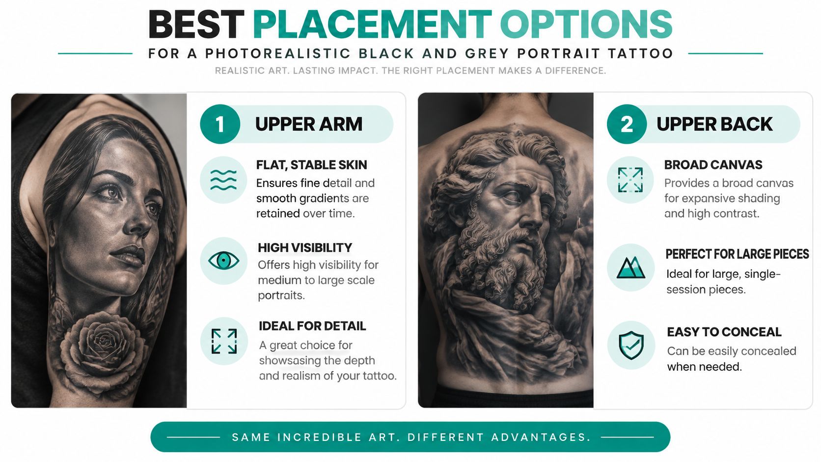
Choose Contrast Before Microdetail
The aging trade-off is straightforward. Broad shadows can preserve the shape of a cheek or eye socket, while tiny pores and closely packed hair strokes have less room to soften without becoming indistinct. Black and grey isn't automatically durable just because it lacks color.
Bring these to the consultation:
- Original reference: A face with clear eyes and no beauty filter.
- Placement preference: An upper arm, calf, thigh, or suitably sized forearm area.
- Healed-work questions: Ask to see portraits after healing, particularly the eyes, teeth, and lighter shading.
Our portrait tattoo style guide can help you distinguish realistic shading from more illustrative approaches. Choose the artist by their healed likenesses, not just their ability to make a fresh tattoo look photographic.
2. Memorial Portrait Tattoo
A memorial portrait needs to resemble the person you remember, not merely reproduce an available photograph. A formally posed image might be technically clear but miss the expression you associate with them. Bring that photograph alongside candid references that show their usual smile, posture, or hairstyle.
The emotional motivation is well established. In its survey of U.S. adults, Pew Research Center found that 69% of tattooed adults said honoring or remembering someone or something was at least a minor reason for getting a tattoo. That doesn't mean a memorial needs elaborate symbolism to carry meaning.
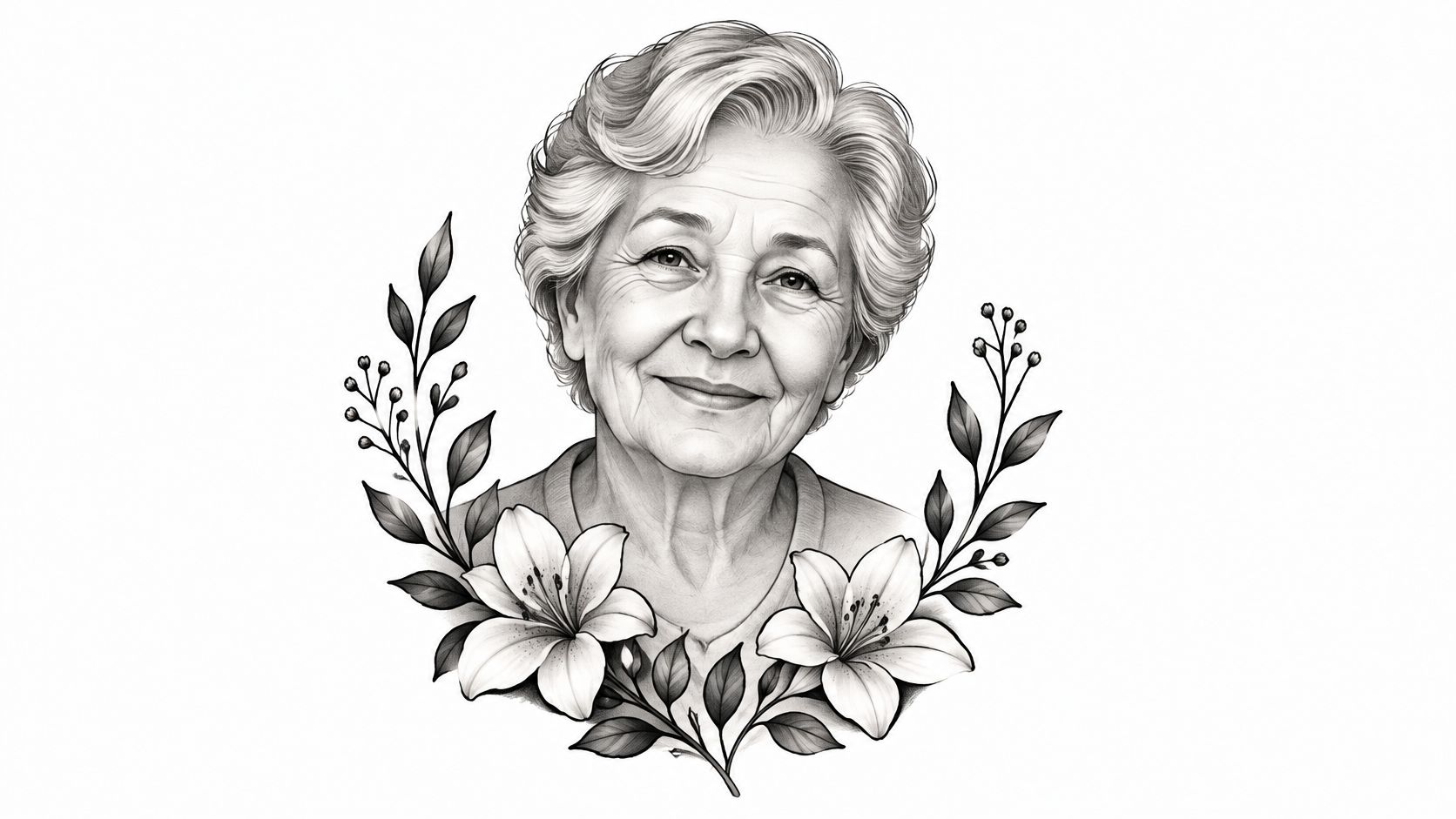
Give the Face Priority
Say you want your mother's portrait on your chest with lilies and her handwriting beneath it. Ask the artist to establish the face size first, then fit the flowers and lettering around it. Shrinking the portrait to accommodate a large wreath is usually the wrong compromise if likeness is your priority.
Text needs its own breathing room. Don't tuck a date into a narrow gap beside the jaw or use lettering so delicate that its readability depends on every tiny opening remaining unchanged.
You don't have to book while the loss still feels urgent. Taking time to approve the expression is part of making the memorial personal.
Bring a primary photograph, supporting angles, and an exact copy of any handwriting or text. Ask for healed memorial portraits with similar shading, and discuss whether you want the tattoo somewhere you'll see daily or somewhere more private. That placement choice can matter as much emotionally as visually.
3. Traditional and Neo-Traditional Portrait
Choose traditional portraiture when you're happy to trade photographic accuracy for a bold interpretation. Strong outlines, simplified facial shapes, and deliberate blocks of shading give the artist a different way to describe a person. Neo-traditional work allows more modeling and decorative detail while retaining an outlined structure.
A historical figure surrounded by flowers works well in a neo-traditional composition. A sailor portrait with a banner can suit a more traditional treatment. For a partner or family member, however, approve the face drawing before getting attached to the surrounding design.
Decide What Must Stay Recognizable
The useful question isn't whether the drawing copies every feature. It's whether the artist has retained the features you use to recognize that person.
- Keep distinctive contours: A particular nose, eyebrow angle, chin, or hairstyle can carry the likeness.
- Simplify secondary detail: Skin texture and subtle wrinkles may become broader graphic marks.
- Approve the expression: A stylized smile can change the mood more than an altered hair texture.
Bold structure can remain readable when fine transitions soften, but a readable face isn't necessarily an accurate likeness. If you need a near-photographic resemblance, this may be the wrong style even when you love its appearance.
Bring the photograph and examples of traditional or neo-traditional faces you like. Ask the artist for healed examples showing their outlines, color separation, and facial expressions. Choose the upper arm or thigh when a decorative frame needs room, and don't assume a banner improves healing. It's a composition device, not a technical safeguard.
Color should support the structure rather than rescue a weak drawing. The portrait should still make visual sense when you look at its broad light and dark shapes.
4. Watercolor Portrait Tattoo
A watercolor portrait can suggest the feeling of a painted keepsake rather than a literal photograph. For example, a loved one's face on the outer upper arm might use restrained facial shading with loose blue and pink washes outside the head. Keeping the expressive color around the face is often a better compromise than dissolving the facial landmarks themselves.
The key trade-off is between softness and definition. If the likeness depends on pale edges and delicate transitions alone, there's less visual structure left when those transitions become less distinct. Ask the artist which features will remain readable independently of the surrounding splashes.
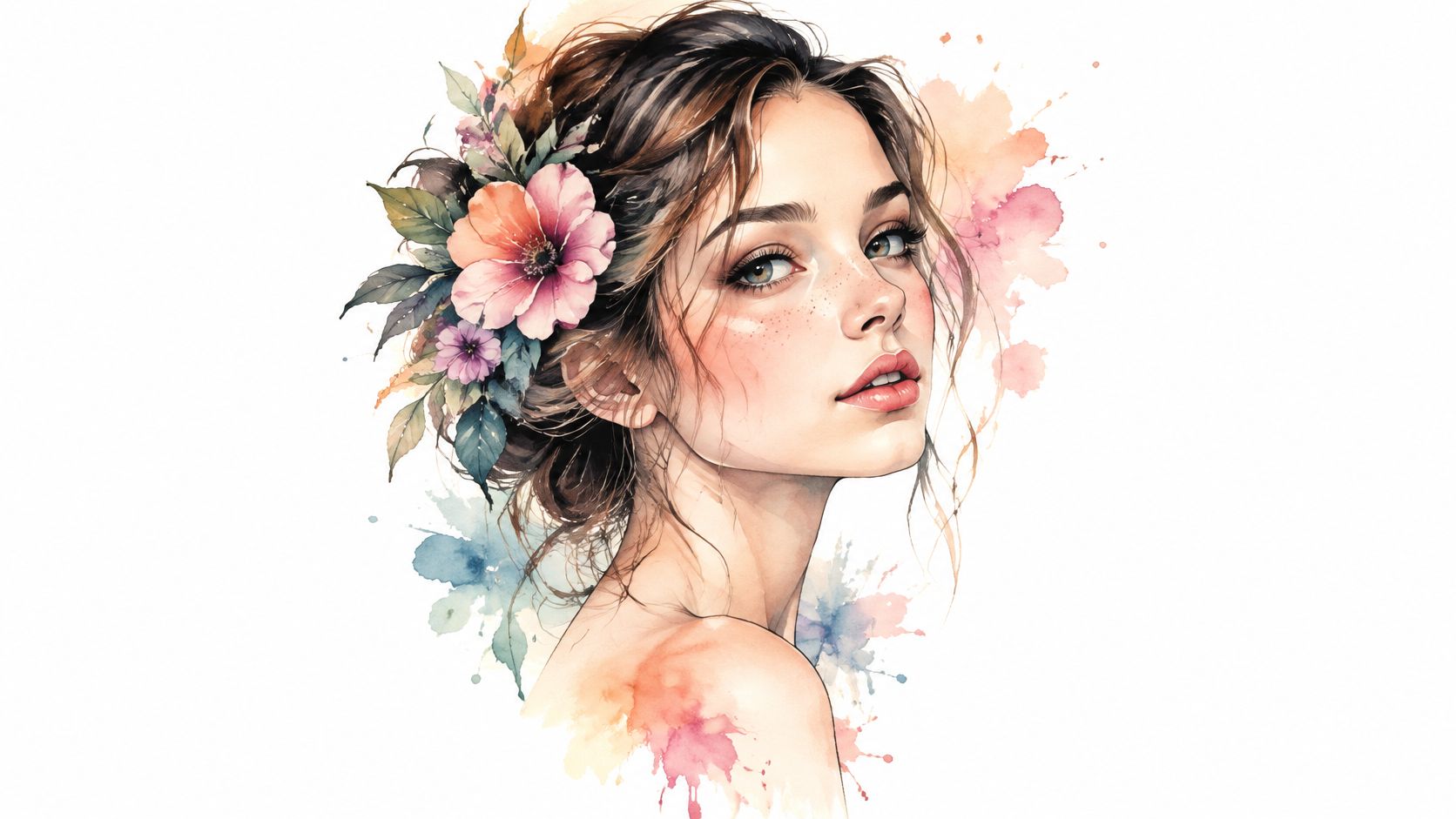
Check More Than the Palette
Bring a clear reference photo and healed watercolor examples from the artist's own portfolio. Compare the facial structure, not just whether the colors still look attractive. Ask what a touch-up could restore and what would require a more substantial redesign.
Ink safety belongs in that conversation too. The FDA's tattoo safety guidance explains that inks can be contaminated even in sealed containers and that allergic reactions can appear immediately or years later. Black and grey isn't automatically risk-free either.
- Before booking: Discuss allergy history, ink traceability, and any patch-testing questions with the appropriate professional.
- Before tattooing: Understand the studio's sanitation procedures and written aftercare instructions.
- If problems develop: Seek medical advice for concerning redness, lesions, fever, or persistent itching.
Choose watercolor because you want a painterly interpretation and accept its compromises, not because a digital image makes pale shading look effortless.
5. Dotwork and Stipple Portrait
Step back from a stippled portrait and the dots become shadows. Up close, you see the texture of the technique. Dotwork works best when both views make sense, rather than when the face only becomes recognizable at a particular viewing distance.
A portrait inside a circular frame on the upper arm can suit this approach. Keep the frame quiet enough that it doesn't compete with the eye sockets, nose, and mouth. A busy mandala behind an already textured face can make the important shapes harder to find.
This video can serve as a visual reference while you discuss the technique with an artist.
Judge the Shadows, Not the Dot Count
Portrait realism depends on value separation, not the amount of detail. Tattoora's realism guidance recommends roughly 10 cm or more for a recognizable face, with additional room generally needed for color. Treat that as a discussion point, not a guaranteed minimum that fits every face or placement.
Bring a reference with clear light and shadow. A flat, evenly illuminated face gives the artist fewer obvious shapes to translate into dot density.
Practical rule: If you can't recognize the face when you squint at the drawing, adding more tiny dots probably isn't the answer.
Ask for healed stipple portraits, not only geometric dotwork. Look at whether the artist preserves open highlights and separates adjacent shadows after healing. Discuss session planning, too, because building controlled density across a face can be labor-intensive.
The aging compromise is texture versus clarity. Fine dots may soften together, so the portrait needs an underlying structure that remains readable without every individual mark.
6. Single-Line Minimalist Portrait
A single-line portrait records a contour, not a complete facial likeness. That's its appeal and its limitation. A partner's profile on the inner forearm can feel unmistakably personal to you while remaining an abstract face to everyone else.
Choose a photograph with a clear profile or uncluttered facial angle. The artist needs to identify the forehead, nose, lips, and chin without guessing which edge belongs to which feature. A front-facing photograph with flat lighting often gives a continuous-line drawing less useful structure.
Keep the Important Gaps Open
Minimalist doesn't have to mean extremely small or barely visible. The artist should choose a line weight and spacing that suit the design, rather than reproducing a delicate digital drawing at any cost.
- Preserve the signature shape: Keep the subject's distinctive nose or chin instead of smoothing it into a generic face.
- Remove unnecessary crossings: Closely overlapping lines around the mouth can become confusing.
- Separate added text: Give a date or name its own space instead of squeezing it into the contour.
For a rib placement, ask the artist to show how the line sits when you stand naturally. For the wrist, consider whether the available width allows the profile to remain open and readable. Neither placement should be approved from a flat drawing alone.
Bring the original photograph, the simplified concept, and examples of healed linework at a comparable scale. Don't expect a touch-up to recreate negative space that was too narrow from the start. If exact resemblance matters more than restraint, an illustrative portrait with selective shading may serve you better than a continuous line.
7. Pet Portrait Tattoo
Your dog's crooked ear may matter more than every strand of fur. Your cat's uneven facial marking may carry more identity than a perfectly rendered eye reflection. Choose the features that make the portrait your animal, not a convincing example of the breed.
A black and grey dog portrait on the upper arm gives the artist room to establish muzzle shape, eyes, and coat markings. A watercolor cat portrait on the calf can work as a looser interpretation, provided the face remains distinct from the decorative color.
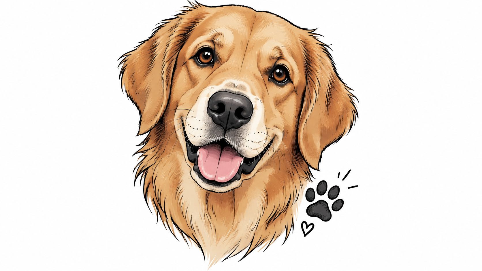
Bring Evidence of Their Particular Features
Use a close-up taken near the animal's eye level, with visible eyes and enough light to show dark fur. Add supporting photographs if an ear folds differently from the other or a marking disappears in the main reference.
Ask the artist to explain how they'll group fur into readable shapes. Copying every hair can create a convincing drawing while producing a crowded tattoo. Healed examples should show clear separation around the eyes, nose, and muzzle, not just impressive fresh texture.
Our pet memory tattoo ideas guide can help you consider supporting elements without making the face secondary. If you add a name, establish its size and position before approving the overall footprint.
You can also turn dog photos into blanket keepsakes when you want to preserve the full photograph outside the tattoo. That gives you permission to simplify the skin version. A tattoo doesn't have to contain every visual detail to hold the same personal meaning.
8. Silhouette and Profile Portrait
A silhouette is the strongest option when the outer shape tells the story. It gives up interior facial information in exchange for a clear graphic form. A partner's profile on the upper arm can work beautifully if their forehead, nose, lips, and chin create a distinctive contour.
The limitation is easy to miss. If the subject's identity depends mainly on their eyes or smile, a solid silhouette removes the very features you care about. In that case, choose a profile drawing with selective interior detail instead.
Test Recognition Before Adding Decoration
Bring a true side-profile photograph with the full head visible. Ask the artist to trace and refine the actual contour rather than replacing it with an idealized profile. Check the hairline and posture as carefully as the face.
- Solid silhouette: Prioritizes the outer edge and a bold overall shape.
- Outline profile: Keeps the design lighter but depends on clean, well-spaced linework.
- Negative-space version: Adds interior openings that need enough room to remain distinct.
A larger back composition might incorporate floral negative space inside the head. Keep those openings broad and deliberate rather than filling the silhouette with tiny decorative cuts.
This style can be more forgiving than a face built from closely packed shading, but it isn't maintenance-free. The outline still needs to remain recognizable, and narrow interior spaces still require planning. Ask for healed blackwork or profile tattoos from the artist, then inspect the stencil while standing naturally.
Judge it without the name underneath. If the profile only feels personal after you read the lettering, decide whether that level of resemblance is enough before booking.
How the Eight Portrait Tattoo Styles Compare
| Item | Best For | Detail Level | Aging Outlook | Common Placements |
|---|---|---|---|---|
| Photorealistic Black and Grey Portrait | Lifelike portraits with precise expression and shading | High | Broad shading can hold well, while fine details and soft transitions may blur | Upper arm, thigh, back, chest |
| Memorial Portrait Tattoo | Personal tributes to loved ones or pets | Medium to high | Fine detail can soften over time, so touch-ups may be needed | Chest, inner forearm, calf |
| Traditional and Neo-Traditional Portrait | Bold, stylized portraits with graphic character | Medium | Bold outlines tend to stay readable; colors may need touch-ups | Upper arm, thigh, shoulder |
| Watercolor Portrait Tattoo | Expressive, painterly portraits with soft color | Medium | Color may fade or blur; touch-ups are often needed | Outer upper arm, shoulder, forearm |
| Dotwork and Stipple Portrait | Textured portraits with an engraved or geometric look | High | Dots may blur or spread over time | Upper arm, back |
| Single-Line Minimalist Portrait | Discreet, modern portraits with minimal detail | Low | Fine lines may fade or blur | Inner wrist, inner forearm, ribcage |
| Pet Portrait Tattoo | Meaningful portraits of dogs, cats, horses, or other pets | Medium to high | Fur details may soften over time | Forearm, calf, back, upper arm |
| Silhouette and Profile Portrait | Bold, graphic portraits emphasizing shape and profile | Low | Solid fill generally reads well, though touch-ups may be needed | Shoulder, upper arm, back |
Turning Your Portrait Idea Into a Brief Your Artist Can Use
Choose the style that matches your expectations, not the most impressive screen image. If exact likeness comes first, give realism enough space and choose a specialist. If you want a discreet tattoo, accept the simplification that a contour, silhouette, or graphic interpretation requires.
Permanence makes this a design decision, not just an image choice. The FDA's tattoos and permanent makeup guidance explains that tattoos aren't easily removed and that removal can cause problems of its own. Don't approve a questionable expression on the assumption that you can easily change it later.
A Portrait Brief You Can Copy
Bring a sharp primary photograph and write a short brief using these fields:
- Subject and meaning: Who the portrait represents and what you want it to communicate.
- Essential likeness: The expression, facial contour, marking, or feature that must stay recognizable.
- Style and color: Black and grey realism, neo-traditional, stipple, watercolor, or another clear direction.
- Size and placement: Your preferred area, available space, and willingness to enlarge the design.
- Supporting elements: Exact text, flowers, symbols, and anything you're happy to remove.
- Aging priorities: Whether you'd rather preserve broad readability or accept more delicate detail and possible maintenance.
- Consultation requests: Healed examples, a placement assessment, and an explanation of necessary simplification.
Keep the original photo separate from any edited concept. Services offering professional AI headshots may be useful for a different purpose, but a polished generated face shouldn't replace evidence of someone's real features in a likeness-focused tattoo brief.
Our generator can help you explore and refine portrait concepts before taking them to a tattooist. You're free to use what you generate, including getting it tattooed, but the result is a reference, not a stencil. Compare every concept against the original photograph, especially the eyes, mouth, and facial proportions.
We don't currently offer a way to preview a tattoo on your body. Your artist's consultation is the best test of placement, scale, contrast, and what can realistically survive the translation to skin.
Take the brief, the original image, and your preferred concept to a tattooist you trust. Ask what they would enlarge, simplify, or remove, and make sure you understand why before approving the stencil.
Explore portrait compositions, styles, and color directions with TattoosAI before your studio consultation. Generate alternatives around the features that matter most, then bring your preferred concept and original photograph to your tattooist for a skin-ready redesign.