TattoosAI
The most common advice about a 4 elements tattoo is also the easiest to misunderstand: earth means stability, water means emotion, air means freedom, and fire means transformation. Those can be useful personal associations, but they aren't a universal symbolic code. The four-element framework has a particular history, and a thoughtful design starts by understanding that context, then deciding what the imagery means to you.
A strong tattoo also has to work as a composition on skin, not just as an idea on a screen. The way its shapes, spacing, color, and placement come together can determine whether all four elements remain clear as the tattoo heals and ages.
Table of Contents
- Rethinking Universal Elemental Symbolism
- The Ancient Greek Roots of the Four Elements
- Engineering a Balanced Radial Composition
- Choosing Styles and Placements for Longevity
- Generating Unique Concepts with TattoosAI
- Navigating Ink Safety and Healing Realities
Rethinking Universal Elemental Symbolism
Earth, water, air, and fire don't carry one fixed meaning across every culture. The familiar four-part grouping belongs to an ancient Greek and later Western framework, so treating its associations as universal can blur important differences between cultural traditions. An overview of the four-element framework's cultural context raises the same concern: elemental imagery appears in different cosmologies, but those systems aren't interchangeable.
That distinction matters when a tattoo combines elemental shapes with symbols from another tradition. A mandala, religious image, or alchemical mark may have a history and meaning beyond a general idea of balance. Adding one because it looks visually compatible can suggest a connection you didn't intend, or borrow from a tradition without understanding its context.
Start with your meaning
Before choosing icons, ask what the design should express in your life. It might represent recovery, family, a connection to the natural world, or a period of change. Those answers can guide the imagery more effectively than copying a chart that assigns one meaning to each element.
For instance, someone marking personal change might use a river that bends around a solid stone, with a small flame reflected in the water and open space above. The four forces are present, but the design doesn't need to claim that water always means emotion or earth always means stability. Its meaning comes from the wearer's experience and the artist's interpretation.
Design principle: Choose the story first, then decide whether literal symbols, natural forms, or abstract textures tell it best.
When abstraction says more
A tattoo can communicate the idea of balance without using four labeled symbols or sacred imagery. Different textures, shifting scenes, or directional lines can suggest contrast and coexistence while leaving room for personal interpretation. That may be a more authentic choice if you're drawn to the four-part structure but don't identify with specific spiritual symbols.
Cultural awareness doesn't require avoiding all elemental imagery. It means recognizing where a model comes from, learning about symbols you plan to include, and being honest about what they mean to you. That process can produce a design that feels personal rather than like a borrowed template.
The Ancient Greek Roots of the Four Elements
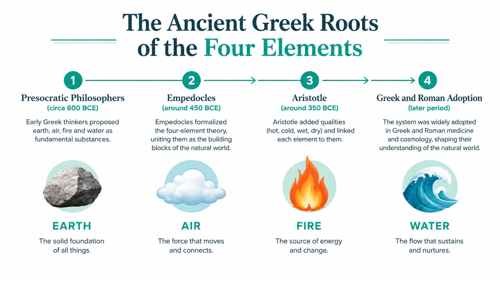
The classical elements are best understood as an early philosophical model of nature, not as chemical elements in the modern scientific sense. The Greek philosopher Empedocles, active in the fifth century BCE, presented earth, water, air, and fire as the fundamental “roots” of the natural world. Aristotle later developed the framework by pairing each element with qualities: fire was hot and dry, air hot and wet, water cold and wet, and earth cold and dry. The model influenced Western philosophy, medicine, and natural science for roughly 2,000 years, before modern chemistry replaced it. The history of the classical elements provides context for this long-running system.
From ancient qualities to visual language
For a tattoo, the old model offers a coherent way to organize four distinct forces. The traditional qualities can inspire modern visual choices, but they don't dictate a single correct interpretation. Fire's heat might become a motif of energy or transformation. Water's movement could suggest adaptability or emotion. Air can evoke freedom or intellect, while earth can suggest grounding and steadiness.
Think of these as starting points for a conversation with your artist, not definitions that every wearer must accept. If water represents home to you, or fire recalls a difficult period you survived, those personal associations can lead the design in a different direction while keeping the four-part structure recognizable.
The classical model also shouldn't be collapsed into other cultural or religious systems that happen to use elements. If you're exploring a separate spiritual tradition, learn about its concepts on their own terms. For readers looking for a primer on Hindu traditions in an art context, Hinduism essentials for art collectors offers a starting point for understanding that tradition rather than treating it as a variation of the Greek model.
The value of historical context is practical as well as symbolic. It gives you a clear visual framework to work with while reminding you that you're making a personal interpretation of an old idea. Your design can honor that history without presenting its meanings as universal or timeless.
Engineering a Balanced Radial Composition
Four motifs need enough separation to read clearly and enough connection to feel like one tattoo. A balanced radial composition can help: divide the design into four equal sectors, then use a central circle or shared geometric frame to unite them. That structure gives each element room without letting one dominate the whole piece.
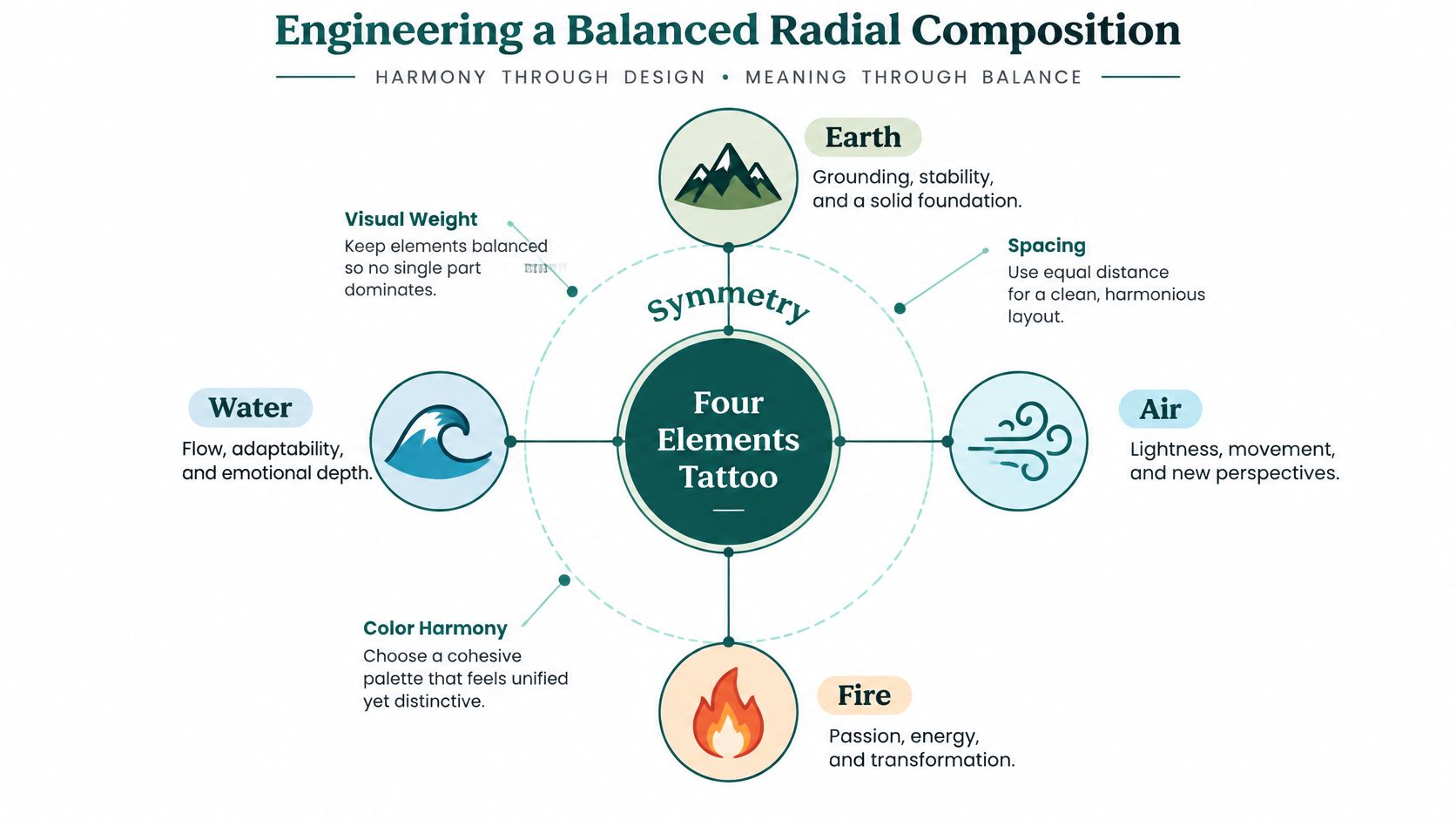
The key is to give each quarter a different shape language. Earth can use heavy, angular masses; water can rely on flowing S-curves and open negative space. Fire reads well through sharp, high-contrast or radiating forms, while air can take shape as thin, open wisps or directional lines. Those differences help prevent neighboring motifs from blending into one visual texture.
Build the composition in stages
Start by deciding what holds the design together. A circle, a shared border, or a central point can provide structure. Then set the directional flow: upward movement can suggest release, downward movement can feel grounding, and a circular arrangement can suggest equilibrium.
Next, make a quick thumbnail using simple silhouettes, not tiny detail. If the four areas are hard to distinguish at this stage, more texture won't fix the problem. Adjust each element's visual weight and leave clear gaps between key forms before you add shading or color.
A useful design brief should name the dominant element, if there is one, and explain whether the composition should feel symmetrical or intentionally uneven. It should also set limits on color and clarify where shapes may overlap. A guide to sacred geometry tattoo ideas can offer inspiration for shared frames and repeating forms, though your artist should adapt any geometry to the tattoo's specific design and placement.
Practical rule: Ask to see the main shapes clearly before approving the fine details.
If you're using an AI image generator for early exploration, describe how the design should be organized rather than listing the motifs. Specify a radial layout, four clearly separated sectors, a distinct line-weight hierarchy, controlled negative space, and a defined focal point. These instructions give you a more useful concept to discuss with an artist than a prompt that only says “earth, water, air, and fire.”
The following video offers another visual reference for thinking about how the elements can work together:
Choosing Styles and Placements for Longevity
A design that looks intricate on paper may not stay legible if its details are packed too tightly for the chosen size and body site. Tattoo pigment is deposited in the dermis, while the epidermis continually renews. That's why clear spacing, contrast, and simplified shapes matter more than adding detail for its own sake. The German Federal Institute for Risk Assessment's information on tattoo inks describes the skin layers involved in tattooing.
Compare the design choices
Fine-line work can make airy shapes feel light and delicate, but an overcrowded arrangement may leave too little separation between the four elements. Heavier blackwork can create strong contrast and bold silhouettes, but large solid areas may overwhelm subtler motifs if they aren't balanced. Black-and-grey shading can bring the elements together without relying on four saturated colors, while a color design can distinguish them through separate palettes.
Neither style is automatically more durable for every person or placement. Dense textures and very close linework can become harder to distinguish as ink settles, especially in areas exposed to repeated friction or strong sunlight. Discuss the intended scale and body site with your artist before committing to tiny details or tightly packed patterns.
For practical placement decisions, consider how much room the composition needs and whether its central shape can follow the contours of that body area. A design with four distinct sections may need more space than a simple single-symbol tattoo. A tattoo placement guide can help you think through the relationship between size, position, and the shape of the body.
Give your artist a useful handoff
Bring a clear reference, but let the tattooist adapt it. The handoff should identify the intended final size, placement, dominant element, preferred black-and-grey or color approach, and the minimum gaps that keep the elements visually separate. Include examples of the kinds of textures you want, but don't insist that every small mark from a screen image must transfer to skin.
Earth might read through solid value blocks, water through flowing contours, fire through sharp contrast, and air through lighter open marks. Keeping those visual roles distinct helps the design communicate without labels. A licensed tattooist can advise on the final linework and spacing for your skin and the selected site. An image generator can provide a reference, but it can't replace that professional judgment.
Generating Unique Concepts with TattoosAI
AI can help you explore the structure of a tattoo before you have a finished drawing, especially if you know what you want the design to do but aren't sure how it should look. The important shift is to prompt for composition and readability, not just subject matter. “Four elements tattoo” names an idea; a useful prompt describes the shapes, spacing, focal point, and style that make the idea work.
Write a prompt that guides the design
A practical prompt might ask for a circular composition divided into four readable areas, with angular earth forms, flowing water, radiating fire, and sparse wind lines. Add instructions for a clear line-weight hierarchy, open negative space, limited overlap, and one focal point. If you want a restrained look, specify black-and-grey; if color matters, ask for distinct areas that don't merge visually.
Compare the results as sketches rather than choosing the most polished-looking image. Look for whether all four motifs read at a glance, whether one element overwhelms the others, and whether the design still makes sense when imagined at its intended size. If the generator adds extra ornament that obscures the structure, revise the prompt to request fewer details and simpler silhouettes.
TattoosAI lets users describe a concept, choose from styles including minimalist, dotwork, Japanese, watercolor, geometric, 3D, and blackwork, then generate visual concepts to refine. You can use the variations to compare how one composition changes across styles, or adjust the prompt to explore a different palette or balance. The results are brainstorming references, not finished stencils: take the chosen direction to a tattooist, who can redraw it for the body site and adapt it to the practical requirements of tattooing.
For a separate kind of visual exploration, AI animation tools can help turn a static design idea into a moving presentation. That may be useful for considering directional flow, but motion doesn't show how a design will heal or fit a particular body area. Keep the final decision grounded in a tattoo artist's assessment, not just a compelling screen image.
Navigating Ink Safety and Healing Realities
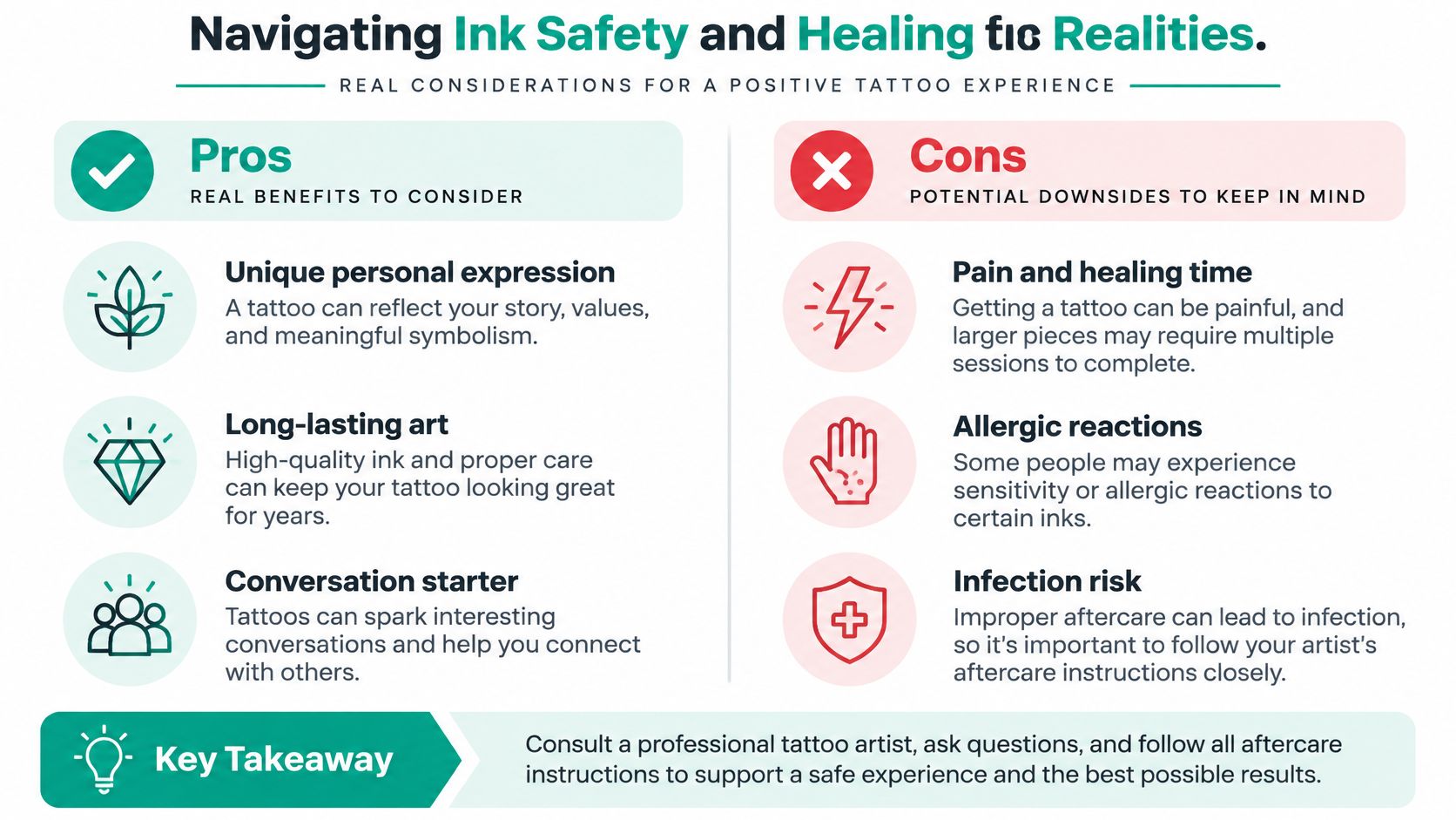
A visually rich design isn't worth sacrificing clarity or skin health. Tattooing breaks the skin, and complications can include allergic reactions and bacterial infections. One clinical study cited in an overview of tattoo safety reported that allergic reactions made up about 37% of complications and bacterial infections about 11%; these figures describe the complications in that study, not the overall likelihood that any individual tattoo will cause a problem. The tattoo safety overview discussing those findings provides further context.
Keep the design readable without relying on color
A four-element tattoo doesn't need four saturated colors to make its point. Black-and-grey textures, clear silhouettes, and deliberate negative space can distinguish earth, water, fire, and air while reducing dependence on a complex palette. That choice can also help preserve the design's visual hierarchy, particularly if the planned tattoo is small or has many fine details.
If you're considering color, talk with your tattooist about the pigments and how they'll be used. The safety source notes that delayed reactions may involve red pigments, but online design guidance can't predict how your own skin will respond. Share relevant allergies, medical conditions, and past reactions with a licensed professional before the appointment.
A simple, well-spaced design can communicate more clearly than a crowded one that asks every pigment and texture to do too much.
Follow the artist's aftercare instructions and contact an appropriate health professional if you have concerns about healing or a possible reaction. Tattoo practices, ink regulations, and professional standards vary by location, so choose a qualified artist who can explain their process and answer questions about ink ingredients and hygiene. Treat an AI-generated concept as a visual aid, never as medical advice or a substitute for the artist's assessment.
Use TattoosAI to explore different styles and generate several four-element concepts from a detailed prompt. Bring the version that best expresses your meaning to a licensed tattooist, then work together to adapt its shapes, spacing, and placement for your skin.