TattoosAI
You've got the date chosen. Maybe it's a wedding anniversary, maybe it's the morning a parent died, maybe it's the day your daughter arrived. What you can't settle is whether to set it in plain digits or push it through the Roman system and turn it into something that looks carved rather than typed.
The case for going Roman is practical as much as romantic. Six digits compress into a short run of characters, the block stays readable at arm's length, and the letterforms give a tattooist real material to work with. Spacing, weight, framing, all of it.
Be clear on one thing before you scroll. The image you carry into the studio is a reference, not a stencil. Your artist redraws it for your skin, your body shape and how lettering behaves as the ink settles. These seven approaches are judged the way a studio judges them, on how the numerals read on a real body part years later.
Table of Contents
- 1. Classic Serif Roman Numeral Date
- 2. Fine-Line Minimalist Roman Numeral Date
- 3. Roman Numeral Date Within a Laurel Wreath
- 4. Blackletter Roman Numeral Date
- 5. Roman Numeral Date Styled as a Clock Face
- 6. Roman Numeral Date with Birth or Coordinate Details
- 7. Stacked Roman Numeral Date in Geometric Layout
- How the 7 Roman Numeral Date Tattoo Styles Compare
- Turning Your Chosen Date Into Ink You Will Still Love
1. Classic Serif Roman Numeral Date
The most requested version is also the one that ages best. A single line of Roman numerals set in a traditional serif, evenly spaced, with thick-to-thin stroke contrast and small bracketed feet. Nothing else in the design competes.
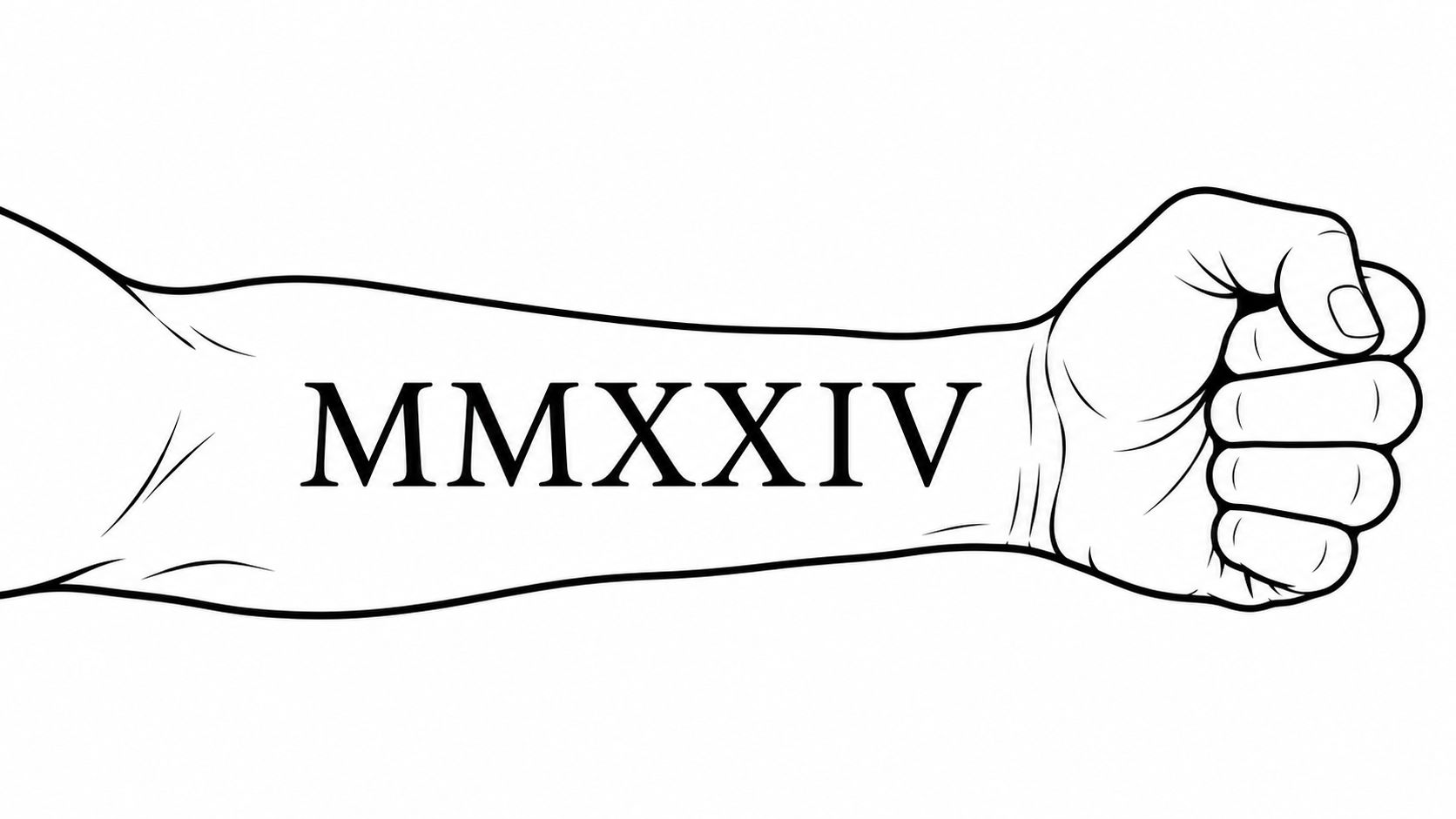
The formality isn't an accident. Roman numerals ran Western European record keeping for roughly 2,000 years across seven symbols, I, V, X, L, C, D and M for 1, 5, 10, 50, 100, 500 and 1,000, as Britannica's history of the Roman numeral explains. A date like 14 February 1990 becomes XIV·II·MCMXC, and that middle dot earns its place: it separates the fields so the eye parses day, month and year instead of one long string.
Sizing that survives a decade
Set cap height at 2 to 3 cm on an inner forearm. On a collarbone inscription, hold 2 cm minimum even when the space looks narrow, because serifs are the first detail to soften as ink spreads. Check your conversion twice. 1994 is MCMXCIV and 2008 is MMVIII. Wrong numerals are permanent.
Practical rule: Count the characters before you commit to one line. A full day-month-year usually reads better broken into two or three groups than squeezed into a strip.
A worked example: a memorial date on the inner forearm, numerals in a 2.5 cm serif, a small sprig below it, and a dot separator between month and year. The date stays the focal point and the whole piece fits inside a palm's width.
2. Fine-Line Minimalist Roman Numeral Date
You sit for a fine-line date because the script looks quiet on a wrist. A year later the same piece can read as a grey bar. Thin needle, light single pass, delicate weight: that is still the request people bring in, and the 2025 trend coverage from Allure's tattoo trend report confirms fine script and small symbols remain the dominant ask. Roman numerals fight that smallest scale. The system is built from repeated vertical strokes, and those strokes are the first detail ink spread erases.
The smallest safe size for a date
Keep the lettering tall enough, and the gaps wide enough, that each character stays distinct once the edges soften. Pack a day, month and four-digit year into a hairline strip and the III in a date merges into one block of grey. I would rather lose a little delicacy than watch a minimalist date turn into a smudge. Extra height buys years of clarity. Nothing else in this style does.
Wrist and finger pieces need more weight than an inner bicep. Both sit in high-friction, high-wash skin, so a line that holds on a protected arm blurs faster there. Ask for healed photos, not fresh ones. A shot from the day of the appointment hides every spread pattern. Plan one touch-up after the first year. A single refresh puts back the crispness the first heal takes away.
A wrist band is the classic home for this style. Our Roman numeral wrist tattoo guide covers how that strip of skin behaves over time.
Worked example: a paired anniversary, one short date on each inner wrist, fields split by a single dot. Give the strokes room to breathe and they stay readable after the ink settles. Crowd them and the verticals fuse. Tell the artist you want separation you can still see once the piece is healed, not only on the stencil.
3. Roman Numeral Date Within a Laurel Wreath
A wreath does one job better than any other framing device: it tells the eye where the date begins and ends. Two curved branches, tied at the base, with the numerals sitting in the negative space at the centre. The composition reads as an emblem rather than a line of text.
The symbolism leans toward achievement and honour, which makes it a natural fit for graduation years, promotions, citizenship dates and personal milestones that took effort rather than luck. It also suits memorial pieces, where the wreath reads as tribute instead of celebration.

Getting the wreath to sit right on a curved body
Decide symmetry before the drawing starts. A symmetrical wreath wants the flat centre of an upper back or sternum. An asymmetrical wreath, with one branch heavier than the other, follows the curve of a shoulder or outer arm without looking broken.
A wreath drawn flat on paper will look lopsided the moment it wraps a bicep. Ask to see the stencil on the arm, not on the table.
Keep the leaves smaller than the numerals. If a single leaf measures close to the height of an M, the date stops being the subject and the foliage takes over. On a sternum or upper arm piece, that usually means leaves at 40 to 60 percent of numeral height. Space the branches so a gap of at least 3 mm separates leaf tips, otherwise the two sides fuse into a dark mass after healing.
A worked example is a graduation piece: MMXXIV inside a wreath on the outer upper arm, numerals at 2 cm, leaves at roughly 1 cm. It reads clearly from across a room without shouting.
4. Blackletter Roman Numeral Date
Blackletter takes the numerals somewhere else entirely. Heavy verticals, diamond feet and tight counters give a date a gothic, manuscript feel that suits dark traditional and blackwork collections. It's a fusion of two lettering traditions, carved Roman capitals and medieval manuscript hand, and that tension is exactly why it works on a thigh or a back piece.
The trade-off is legibility at small sizes. Britannica's account of how Roman numerals fell out of practical use notes they were gradually displaced rather than abandoned, surviving on clock faces, monuments and cornerstones, contexts where the numerals were large. Blackletter pushes the same direction. It needs room.
Where blackletter dates fail
The failure mode is countable. Numerals like III, VIII and XII produce three or four near-parallel strokes, and blackletter adds decorative feet and hairline connectors on top. Below about 2.5 cm those details close up. Set blackletter numerals at 2.5 to 3 cm minimum and let the piece run wider than you first sketched.
- Pick one numeral convention and stay with it: modern subtractive forms like IV, IX, XL, XC, CD and CM are the standard, though earlier additive forms such as IIII for 4 and VIIII for 9 existed. Mixing the two looks like an error.
- Keep ornament subordinate: a thin rule above and below the date reads cleaner than a full scroll frame at forearm scale.
- Test on the muscle: a blackletter string across a forearm changes shape when the wrist rotates.
A worked example: a thigh piece with MCMXCIX at 3 cm in blackletter, flanked by two thin vertical rules, leaving the outer thigh clear for future work. The date dominates because the ornament doesn't try to compete.
5. Roman Numeral Date Styled as a Clock Face
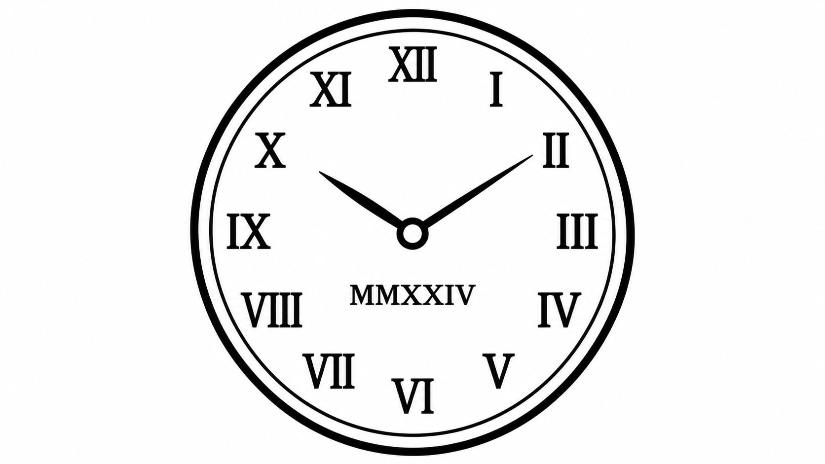
Clocks are where Roman numerals already live, so a dial is a natural home for a date. The catch is arithmetic. A clock face needs the fixed markers I to XII, and those markers can't also spell out 14 February 1990. Something has to give.
The version that works puts the date in a centre cartouche and keeps the dial markers abstract, tick marks rather than numerals, so the two numbering systems never collide. The version that fails tries to make the date do double duty as hour markers, and the wearer ends up with a dial that reads like a mistake.
Making the date and the dial agree
Decide early whether the date is the subject or the setting. If it's the subject, the dial becomes a frame: a ring of ticks, two hands set to a meaningful time, and the numerals at 2 cm in the middle. If the clock is the subject, the date drops to a small inscription along the rim.
Keep the dial wide enough to survive. Under about 4 cm across, rim lettering at 5 mm vanishes within a few years, and pocket-watch style chest pieces need 6 to 8 cm to hold their detail. In 2026, mid-range forearm pieces in the United States were reported at $150 to $350, with small wrist or ankle dates at $80 to $150, according to The Tattoos Designs. Dial work sits at the upper end of that forearm range because it's layout-heavy.
Set the hands deliberately. Two hands pointing at nothing in particular look like an unfinished drawing once the piece is on skin.
6. Roman Numeral Date with Birth or Coordinate Details
Two elements, well matched, beat five elements fighting each other. A birth flower beneath a date, or a pair of coordinates under a year, gives the piece a second layer of meaning without turning it into a collage. The date still anchors the design.
Two elements or three, never four
The discipline here is subtraction. Every element you add costs the date some clarity, and a rib piece with a date, a flower, coordinates and a script line reads as noise at 30 cm.
- Match line weight across elements: a 0.25 mm numeral stroke next to a 0.4 mm flower outline looks like two tattoos stapled together.
- Write coordinates in one format only: decimal degrees or degrees-minutes-seconds, never a mix, and read them back against a map before the appointment.
- Keep the supporting element smaller: a birth flower at 60 percent of the date's height keeps the numerals primary.
Combining a date with another personal marker is close in spirit to a birth clock, and our guide to birth clock tattoos shows how those layered pieces are built.
There's a verification step that's easy to skip. Roman numerals don't encode date order, so XI·IV·MMXX can mean 11 April 2020 or 4 November 2020, as That Painter's roman numeral design guidance points out. Validate day, month and year as three separate fields, then check the finished stencil at the body's actual orientation with a second person reading it against the original date. A rib stencil checked on a table lies. A rib stencil checked standing up doesn't.
7. Stacked Roman Numeral Date in Geometric Layout
A friend leans in to read a date on your inner forearm and stalls on the middle line. The numerals are clean. The order is not. Stacking is the quiet fix for the biggest weakness in the format. Roman numerals carry no built-in date order, so 03/08 reads as 8 March in the United States and 3 August in the UK, Europe and Australia, as Fair Toolbox's roman numeral date guide explains. Put day, month and year on separate lines and the order becomes a design decision rather than a guess the reader has to make.
Days of 12 or below are the ambiguous ones. Above 12, the day reveals the order on its own. If your date sits in that range and people from different countries will read it, a stacked layout or a written month settles it for good.
Lines that stay straight as skin shifts
On a forearm the stack has room to breathe. On an ankle it does not. Three stacked lines with 4 mm between them hold. At 2 mm the lines bleed into each other once the forearm flexes and the ink softens.
A proper grid is what keeps those lines honest years later.
- Build the stack on a grid: equal line lengths read as intentional. Ragged ones read as an accident.
- Choose a rule weight you can tattoo cleanly: 0.5 mm hairlines look sharp in a mock-up and soften on the ankle inside two years.
- Give the band a margin: the top and bottom rules should sit at least 1 cm from the edge of the piece so the geometry does not crowd the surrounding skin.
Specialist calligraphy or geometric numeral work usually costs more than a standard single-line date. The extra sits in the drawing time a proper grid takes, not in the needle time alone.
Brief the artist with the date split into three fields, the gap you want between lines, and which way the stack faces when you stand. A stacked date is the version where the layout itself answers the question a stranger will ask.
How the 7 Roman Numeral Date Tattoo Styles Compare
| Item | Best Placement | Typical Style | Best For |
|---|---|---|---|
| Classic Serif Roman Numeral Date | Forearm, ribs, or back of the neck | Traditional serif lettering, usually in a single line | Timeless anniversaries, birthdays, or memorial dates |
| Fine-Line Minimalist Roman Numeral Date | Wrist, finger, ankle, or behind the ear | Thin strokes, open spacing, optional small accents | Subtle, discreet date tattoos |
| Roman Numeral Date Within a Laurel Wreath | Upper arm, chest, or back | Classical, symmetrical wreath with lettering | Celebrating achievement, honor, or personal milestones |
| Blackletter Roman Numeral Date | Forearm, thigh, or back | Bold gothic lettering with strong contrast | Dramatic, dark, or historical aesthetics |
| Roman Numeral Date Styled as a Clock Face | Forearm or chest | Clock or watch dial, from minimal to detailed | Connecting a significant date with time and memory |
| Roman Numeral Date with Birth or Coordinate Details | Ribs or forearm | Personalized date paired with a symbol or coordinates | Adding personal context to a meaningful date |
| Stacked Roman Numeral Date in Geometric Layout | Forearm, ankle, or upper back | Structured grid or stack with geometric lines | Modern, symmetrical designs or geometric sleeves |
Turning Your Chosen Date Into Ink You Will Still Love
You book the date that marked a birth, a wedding, or a loss, then spend years reading it on skin that moves, creases, and fades. Judge the numerals by how they still read after that time, not by the sharpest photo on a phone.
Serif lettering in one line and a stacked geometric layout keep their shapes for decades when the strokes stay thick enough to heal cleanly and the gaps between characters stay open. Fine line can look crisp for years, then needs touch-ups once the ink softens. Blackletter only works when each numeral is large enough that the thick and thin strokes do not merge. A clock face needs width so the ring and the date do not crowd. A wreath needs a fairly flat plane, or the leaves warp around a curve and swallow the numbers.
Write the date in full words: day, month, and year. Convert it once, then convert it again with a second method, and bring both versions to a tattooist whose healed work you have already seen. Tell them the reference is a starting point. Ask them to redraw it for the placement and to say if the size is too small. A good artist will refuse a design that will not last and will tell you why.
A generator shortens the search, and it can also mislead you if you treat the render as finished art. TattoosAI builds concepts across nineteen styles, with colour options, and Roman numerals sit with the free tools next to the font generator, size chart, and cost calculator. You can generate unlimited concepts, and you are free to use what you generate, including getting it tattooed. The result is a reference for a tattoo artist, not a stencil. The artist adapts it to your body, your skin, and how the design will age, so the final piece rests on that judgment.
Compare three treatments before you book: a single-line serif, a stacked geometric version, and one framed design. Take the one that still reads when you squint at arm's length.
Ready to see your date in three different treatments before you commit? Describe the idea with the date included, then use TattoosAI's free Roman numeral tattoo generator to pick from nineteen styles and colour options. Take a shortlist of concepts to your artist for the final adaptation.